A strong logo is more than just a design; it’s your brand’s unique signature and should send a powerful message to potential customers. Whether you want a complete rebrand or a logo refresh, our Superside experts’ insights will help your enterprise stand out.
A company’s logo carries incredible power—worth a thousand words. A logo influences how customers perceive a brand at first glance. In fact, statistics reveal that 75% of people recognize a brand by its logo.
Smart business leaders know a compelling logo does more than look good. It tells your brand's story, reflects its values and builds customer trust. When used consistently across channels, your logo helps your brand stand out and remain memorable.
Learn the secrets of effective corporate logo design, highlighting strategies from successful companies and how to find the best business logo design services available now.
The Role of a Logo in Enterprise Branding
You need a truly great logo to change your corporate branding from boring to brilliant.
Bring your brand vision to life by keeping these critical considerations in mind:
Importance of a strong logo for large brands
A powerful logo is the heartbeat of any brand’s identity. It helps a brand stand out in a crowded marketplace, distinguishing it from competitors.
A good logo connects with customers and fosters an emotional connection that builds loyalty and trust. It’s also closely linked to your brand value proposition and products or services. Getting this connection right is the first step in designing your logo.
Long-term brand recognition
Compelling corporate logos are versatile and look good on everything from business cards to billboards. They ensure consistent brand representation that remains relevant for years and adapts as the company grows.
A good logo also helps build and maintain brand identity, keeping the brand recognizable in an evolving marketplace.
Is your company rebranding soon? Know how Superside can help your teams during this process and get ready for a successful rollout.
Evolution of enterprise logos
Enterprise logos are constantly changing to keep up with modern design trends. For instance, blue is currently the dominant color for a third of top global brands, and simplicity remains critical, with most major companies using two or fewer colors in their logos.
The same research reveals that 55.6% of logos using text are fully capitalized, and wordmark logos—like Samsung, Sony, Nestlé and IBM, for example—remain popular.
Interestingly, logos with sharp edges are becoming less popular while softer, pillow-like shapes are trending. Animation in logos is also a growing trend.
More and more designers are also tapping into AI to help them create logos and other brand creative. However, many designers and their customers still wonder to what extent they should use artificial intelligence for this all-important exercise.
Corporate Logo Design Best Practices
Before diving into your logo design project, it’s essential to understand what makes a logo effective. Use these guidelines when creating a professional logo design for your enterprise:
1. Simplicity with scalability
A simple logo is easy to recognize and, if done well, cleverly portrays the essence of your brand. A straightforward design also typically works well across various products, channels and marketing materials, making scalability easy.
At Superside, we’ve discovered that tapping into AI can also help brands quickly scale their logo across various formats and materials, facilitating quicker market entry and increased impact.
2. Aligning with corporate identity
A striking logo is just the start; your logo should also visually represent your brand and convey who you are and what you stand for.
Logos express a company’s identity and philosophy through colors, shapes and typography. For example, eco-friendly brands often use green tones, while tech firms often favor sleek designs in dark colors to showcase innovation.
AI-powered logo generators have made design more accessible, but conveying your creative vision to a nonhuman can be challenging. If you need help articulating your design brief, check out our list of the best AI logo prompts.
3. Timeless and professional
Design trends may change, but a strong business logo will endure for decades. Your company logo needs to be timeless to remain recognizable over time.
General Electric’s famous “GE” logo is a great example of a logo that has stood the test of time. It has only undergone minor tweaks in its 130-year history and remains as effective today as it did in the 1890s.
As new trends in AI technology push the boundaries of design, you might be wondering how to keep your logo relevant. Use Superside’s logo design tips to help you craft a corporate trademark that lasts.
4. Consistency across platforms
A good corporate logo has a reliable visual impact across all platforms, including your website, social media ads, event stands, merchandise and more. Consistency helps build brand recognition, so it’s vital to tick this box with every asset you create.
A good example is the Adidas logo. Its three parallel stripes are distinctive and used across everything Adidas sends into the world. Elegantly simple and instantly recognizable, whether on a screen, printed on apparel or featured on footwear, it epitomizes lasting brand power.
5. Global appeal
If your business operates internationally, it needs a logo that appeals to diverse cultures. The best global logos avoid symbols or colors with diverse meanings. This approach helps create a recognizable brand that supports growth in international markets.
The Coca-Cola design is a prime example. Its striking red-and-white color combination and unique, curvy lettering make it a favorite logo worldwide. From New York to Nairobi, the logo sends a singular message to consumers worldwide (a sense of liquid movement and energy) and demonstrates how to develop a visual identity that transcends cultural barriers.
A global network of creative experts can help provide cultural insights for your logo project. With team members across different time zones, you can deliver relevant designs backed by local expertise.
10 Successful Corporate Logo Design Examples
Looking to design an iconic mark but don’t have good logo ideas? Take inspiration from these business logo design examples, showcasing innovative techniques and best practices.
1. Entelo by Superside
Superside created a custom logo and design for Entelo, an innovative hiring software business, as part of its brand refresh. The team created a simple logo using creative typography to highlight the most important aspect: People.
The design elegantly reflects Entelo’s commitment to diversity and inclusion while celebrating the energy of human talent. Its clean and purposeful design ensures the logo stands out beautifully across all platforms, including the company’s website and social platforms.
What we like about it: The logo’s minimal design elements effectively convey powerful values of diversity and community, resonating with audiences worldwide. It demonstrates that strategic simplicity can yield a meaningful impact.
2. Endor Labs by Superside
See our work with Endor Labs here
Software company Endor Labs partnered with Superside to develop its brand identity and create a distinctive logo.
Drawing inspiration from space exploration and science fiction, the Superside team designed a visual identity that captures the innovative spirit of software development.
The carefully crafted typography and bold color choices resonate with software developers—the professionals at the heart of Endor Labs’ target audience.
What we love about it: Its sophisticated references to Star Wars create an instant connection with the tech community, adding a meaningful layer of engagement to the brand.
3. Runway by Superside
Runway, a hub where tech startups accelerate their growth, partnered with Superside to enhance the brand’s identity. The brand’s vision was to create a distinctive symbol of its role as the meeting point for startups, corporate innovators and investors.
By combining a clean, modern font with a purposeful line connecting the first and last letters, the Superside team crafted a professional-looking logo that embodies momentum and connectivity. The bold color choices ensure Runway stands out among competitors.
What we like about it: The design performs brilliantly across all platforms and formats, and its thoughtful lettering and vibrant colors create a memorable visual impact. It really makes for standout social content.
4. TransACT by Superside
See our work with TransACT here
TransACT, a leading education technology business, asked Superside to design a logo that reflects its innovative and progressive culture. The creative had to be versatile to unify all its sub-brands under the TransACT umbrella.
Our creative team used basic, modern typography and a simple yet ingenious graphic element to make the TransACT brand instantly recognizable across all its sub-brands.
What we like about it: The TransACT logo’s success lies in its simplicity, enabling practical application across all sub-brands.
5. Brio by Superside
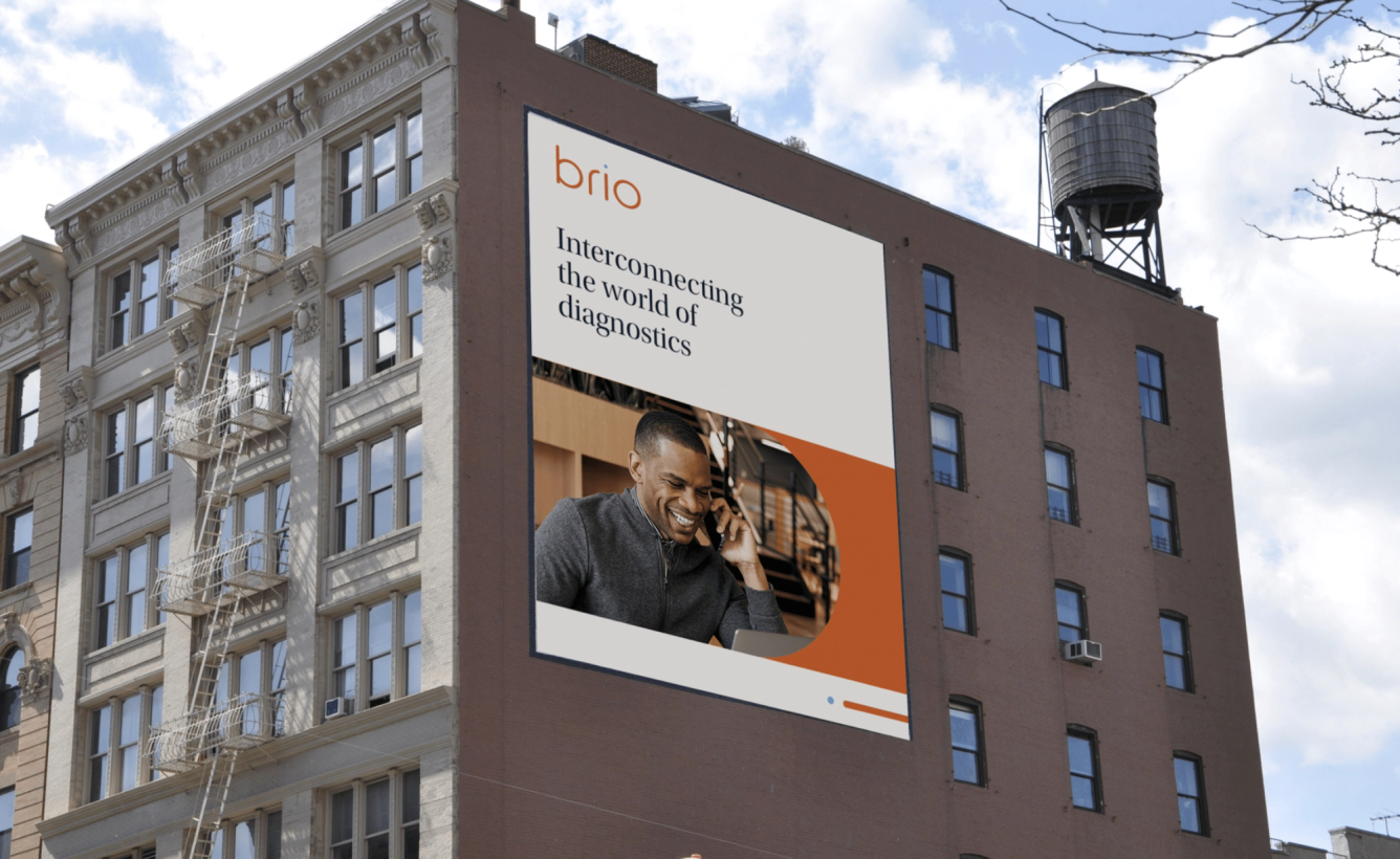
During the pandemic, healthcare technology company Brio needed to adapt quickly to the enfolding health crisis. It partnered with Superside to transform its brand with creative solutions for its logo, website, product packaging and overall identity.
The Superside team crafted a refined logo that reflects essential healthcare values like quality, reliability and trust. The distinctive “i” in Brio’s logo became a key design element, helping to communicate a strong identity across platforms and branding materials.
What we like about it: Its purposeful minimalism and strategic use of white space create an enduring sophistication and professional style that perfectly suits a healthcare innovator.
6. Apple’s minimalist logo
(Source: Hamza Zahir, Pixabay)
Apple’s iconic design is a prime example of an unforgettable corporate logo. Its minimalist apple with a distinctive bite mark is instantly recognizable and easily adapts across various platforms and products, from small app icons to giant billboards.
The clean, straightforward design effectively embodies Apple’s identity of innovative thinking and elegant simplicity. Used consistently for decades, the logo has fostered strong brand recognition and customer loyalty worldwide.
What we like about it: This logo’s ability to remain relevant and impactful, regardless of changing design trends, underscores its effectiveness in representing a global tech leader. It also shows us that details matter.
7. FedEx’s clever use of negative space
(Source: LOGO wine)
The FedEx logo is one of the world’s most memorable brand symbols. Designed in 1994, it has undergone minimal changes over the years, proof of its enduring strength and timeless appeal.
While the bold, striking colors capture your attention, the real genius lies in the arrow between the “E” and “x.” This subtle detail perfectly conveys what FedEx represents: Swift, reliable delivery.
What we like about it: The clever combination of letters, colors and space creates an optical illusion that continues to grab attention.
8. BP’s logo evolution
(Source: LOGO wine)
BP’s logo transformation is a powerful example of purposeful rebranding.
When the global energy giant shifted its focus beyond petroleum, it needed a symbol to match its new vision. The result is a clever sunflower design that combines environmental awareness with energy.
The new logo uses thoughtful green shading and interlocking patterns to show the business’s commitment to sustainability while representing its diverse products and people.
What we like about it: The logo successfully redefined BP’s identity from an oil company to an energy business focused on the future.
9. Instagram’s simplified logo
(Source: Tumisu, Pixabay)
Instagram’s logo journey illustrates the impact of strategic simplification. The early logo featured a detailed retro camera with rainbow stripes, while the 2016 redesign showed that less can be more.
The modern design retains the classic camera shape but transforms it into a simple, striking icon in vibrant gradient colors. This blend of minimalism and bold expression reflects Instagram's evolution from a photo-sharing app to a global social media platform.
What we like about it: It demonstrates how stripping away complexity can create more impact for a business. The plain camera icon meant Instagram could embrace more dramatic colors while keeping its brand instantly recognizable.
10. Starbucks logo adaptations
(Source: Ali Uyar, Pixabay)
The Starbucks logo has changed over time, but it has always kept its core element: The twin-tailed siren. Since 1971, the design has shifted from a detailed brown logo to a simple, clean, green icon.
This evolution shows the importance of staying connected to your brand roots while adapting to modern styles.
What we like about it: The Starbucks logo demonstrates how a brand can maintain its core identity while becoming more sophisticated. The Starbucks siren remains instantly recognizable, whether on an espresso cup, website or storefront, proving consistency builds lasting brand power.
5 Best Corporate Logo Design Services in 2026
Many reputable design companies offer corporate logo design services. When choosing a design partner, consider their experience, ability to grow with your needs and understanding of your brand.
With these criteria in mind, we’ve created a list of the best companies that deliver excellent results for businesses and large corporations.
1. Superside
Services offered:
- Graphic design services
- Brand logo design
- AI creative and AI consulting services
- Video production and motion design services
- Illustration design
- Web design and Webflow development
- Social media and ad creative
- Email design
- Print design services
- Packaging and merch design
- Digital marketing strategy & consulting
- Presentation design and concept creation
- Design systems and product design services
- Immersive design services for AR / 3D solutions
- eBook and digital report design and copywriting services
Based in: Globally distributed across the Americas, Europe, Africa and Asia
Superside takes the trophy for logo design tailored to large companies. Our exceptional design team has extensive experience collaborating with industry giants like Amazon and Shopify.
Beyond professional logo design, our fully-stacked team of brand designers provides an impressive range of branding services that help create cohesive, scalable brand experiences.
We know the intricacies of logo design can be a lot to navigate. Answering these key questions in collaboration with your Superside team will help you narrow down your choice of logo style for maximum impact.
Whether you’re looking for a brand new identity, quick refresh or total overhaul, Superside offers comprehensive design services that help companies stand out in an increasingly crowded market.
Great for: Large corporations, fast-growing companies and agencies looking for affordable, quality graphic and logo design at scale.
2. Jones Knowles Ritchie
(Source: Jones Knowles Ritchie)
Services offered:
- Brand identity
- Logo design
- Film and motion design
- Packaging solutions and print design
- Brand experience
Based in: New York, United States; London, United Kingdom and Shanghai, China
Jones Knowles Ritchie (JKR) is a graphic design studio renowned for its expertise in brand strategy, packaging, motion design, structural design and brand experiences.
Its logo design services played a pivotal role in Burger King’s first global rebrand in two decades, cementing the studio’s place in graphic design history.
JKR has also collaborated with prominent brand icons such as Stella Artois, Budweiser, Fanta and Heinz.
Great for: Global consumer companies striving to refresh and revitalize their logo designs, brand identities and brand kit.
3. Pearlfisher
(Source: Pearlfisher)
Services offered:
- Visual identity (including logo design)
- Digital design
- Motion design
Based in: New York City, New York, United States and London, United Kingdom
This premier design agency has extensive experience working with some of the world’s leading brands, including McDonald’s, Cadbury and SodaStream.
Its unique selling point lies in its ability to understand and anticipate change, creating simple designs for the future. The team develops brand identities that build valuable brand assets and excels in helping brands foresee and navigate change.
Great for: Large consumer brands looking to elevate their brand positioning and brand kit with the perfect logo.
4. Mucho
(Source: Mucho)
Services offered:
- Brand identity
- Digital design
- Brand strategy
- Digital marketing
Based in: Barcelona, Spain; Melbourne, Australia and San Francisco, California, United States
Mucho is an international design firm that focuses on the details and brings creative vision to life through comprehensive design services. The team’s expertise spans multiple disciplines, offering brand strategy, identity creation, motion design, graphic design and ongoing brand management.
The firm has established strong partnerships with notable brands, helping them develop distinctive brand identities.
Mucho’s impressive customer list includes Digio, Pleysier Perkins, Spora and OpenEnvoy.
Great for: Established businesses or ambitious startups keen to explore sophisticated, strategic brand transformation and a standout business logo.
5. Dessein
(Source: Dessein)
Services offered:
- Company logo design
- Visual identity
- Brand strategy
Based in: Perth, Australia
The team at Dessein combines storytelling expertise with problem-solving prowess to create unique branding solutions.
The agency is known for revitalizing major food brands like Cadbury and Natural Vanilla and successfully refreshing logos for clients such as Margaret River Natural Spring Water and Yoni.
Dessein crafts compelling brand identities that strategically align all creative elements. They go from custom logo design and development to comprehensive branding systems.
Great for: Consumer brands looking for a human-centric design focus, whether developing a custom logo or product packaging.
Superside: The Corporate Logo Design Specialists
Your logo is the foundation of your brand, and when you’re running a big business, you absolutely can’t afford to get it wrong.
If you’re serious about growing, you need a partner who understands what major brands want from their logos—an agency with the creative talent and technical know-how to capture your brand’s true spirit. Whether refreshing an existing logo or starting from scratch, it’s worth working with the best in the business.
Get your company name out there by turning your mark into a movement. Book a call with Superside to chat about logo designs and more.


