45 Best Design Blogs To Inspire You In 2024

Whether you’re a professional designer, a creative director, or a non-designer trying to make sense of the design world, design blogs are a great source of inspiration and education. From visual identity to posters to UX, graphic design blogs are a treasure trove of information. You can give yourself a crash course in design, get inspired and keep up on trends and developments in the design world.
The blogosphere is a vast, varied place and the design corner is no exception. You’ll find from dedicated business blogs run by industry pros to design enthusiasts from multiple topics. Some focus on specific areas of design while others are more geared toward education or showcasing artists. Still others touch on just about every aspect of design.
We’ve compiled a list of 45 of the most popular design blogs, broken up into six categories, though some certainly cross over into other areas from time to time.
The Top 45 Design Blogs to Read
It’s a big list, so we broke it up into sections to help you get to the parts you care about.
Branding/Visual Identity Blogs
This category includes blogs that focus on logos, packaging, and all things related to visual brand identity. If you get giddy over great branding, these are the blogs for you!
1. Brand New
A division of Under Consideration, Brand New offers opinions on corporate and brand identity work. This blog reviews rebranding and logo redesign efforts, both the good and the bad, as well as proffering honest takes on what’s happening in the visual identity industry in general. Brand New has six editorial categories, ranging from “Reviewed” where you’ll find the most in-depth coverage, to “Spotted” where new designs are presented without comment or opinion. It’s a great place to put your finger on the pulse of the Visual Identity world.
What Stands Out: Honesty. These folks pull no punches. You’ll get truly honest opinions here from some of the best in the business.
2. The Dieline
The Dieline mission is to “promote the world’s best packaging design” and be a place where the “design community can review, critique, and stay informed of the latest trends and projects.” Founded by Andrew Gibbs whose resume includes branding for Target, Bed Bath & Beyond, and Jelly Belly, the Dieline’s contributors are all carefully selected and highly qualified.
What Stands Out: Organization. Everything is sortable by feature/article type, industry, color, keyword, and substrate which makes it a great place to find inspiration or news for a specific material or industry.
3. BP&O
BP&O – Branding, Packaging, and Opinion is run by Richard Baird, a London-based freelance designer, writer, and household name in the field of visual identity design. Baird lends his expertise to highly detailed and in-depth reviews of logo and packaging design work. His writing style is as erudite and evocative as it is opinionated without being brash or off-putting. It’s a great place to see what an industry pro thinks about some of the most interesting work being done in the field.
What Stands Out: It Takes All Kinds. Baird writes about design from all corners of the globe, including lesser-known brands and work.
4. Logo Design Love
David Airey’s book, Logo Design Love, a guide to creating iconic brand identities, was originally published in 2009 and released its second, updated edition in 2014. The website is curated by David and is entirely devoted to logos and visual identities. The site shares “good ideas and identity-related features.”
What Stands Out: A multitude of perspectives and guidance. You’ll find interesting reads on all aspects of logo design and visual identities from many perspectives. David also links out to his own page which is chock full of advice for design students and designers just starting out.
5. The Logo Smith
Graham Smith is the eponymous founder of The Logo Smith studio and the writer of its blog. His irreverent writing style is as fun as it is informative and useful. He offers reviews and curated collections as well as a section of side projects under a section simply titled “Fun” that features famous logos reimagined in a variety of unique and creative ways. It’s a great place to read about happenings in the field and get inspiration.
What Stands Out: A Good Laugh. Graham’s blog is clever, funny, and irreverent. You won’t find any stuffy snobbery here; just design thoughts, opinions, and advice with some occasionally colorful language and a heavy sprinkling of wit.
6. The Branding Journal
The Branding Journal is an independent online journal that publishes informative articles and shares resources relating to branding strategy worldwide. Here you’ll find articles reporting on the importance of branding, guides for branding strategy, and a lot of great resources.
What Stands Out: Strategy Centered. This site is more focused on strategy than design.
7. BrandStruck
Brandstruck is a fantastic place to find brand strategy inspiration in its raw form. The site itself is a database of brand strategy case studies “dedicated to brand and marketing professionals, allowing them to better understand the positioning of the world’s most admired brands, the similarities and differences between them and to learn more about certain categories.”
What Stands Out: Case Studies and Credibility. The site touts itself as the online database of brand strategy case studies. It’s incredibly robust and curated only by senior brand experts.
8. Ambalaj
Founded in 2008 by designer, Kristina de Verdier, Ambalaj is a showcase of “carefully selected news from the world of consumer insights, design & technology” as well as analyses and reports. The blog is an influential site for design inspiration and is highly focused on sustainability. You’ll find unique topics and curated trend reports that are well worth your time.
What Stands Out: Eco-Minded Innovation. Ambalaj is a fantastic site for eco-minded designers and focuses a great deal on innovation in the design world.
General Design
These blogs cover it all with interdisciplinary content from across the design spectrum. You'll find information and galleries from several different design fields, as well as insights into how video can enhance design through video case studies.
9. Adobe Create
Adobe describes their zine as “for creatives by creatives.” It’s no surprise that this blog covers all the bases in big, beautiful, bold, Adobe fashion. You’ll find content, galleries, and resources for everything; photography, motion graphics, audio, branding ideas and more tutorials than you’ll ever be able to take in a single lifetime.
What Stands Out: Breadth. You’ll find artist interviews and news in addition to a bevy of beautiful visuals.
10. Dribbble
Dribbble’s mission is “to build the world’s best community for creatives to share, grow, and get hired.” It’s essentially a huge show-and-tell for designers. You can browse endlessly for inspiration, get feedback from other designers, and offer feedback as well. You can browse the site for inspiration and share your own work as well!
What Stands Out: Communication & Community. Dribbble is a fantastic source of visual inspiration but also a great way for you to connect with other designers and promote your own work.
11. Envato Tuts +
All this inspiration is wonderful, but without the skills to pull it off, we’re just browsing. The design field is constantly, rapidly changing and evolving so it’s crucial for designers to seek out continuous learning opportunities. Envato Tuts + offers just that. You’ll find tutorials and informative articles for every facet of design.
What Stands Out: Courses. Envato Tuts + offers actual, online courses in a number of areas to help you step up your game and expand your abilities.
12. Creative Bloq
Creative Bloq covers a little bit of everything. You’ll find useful content on graphic design, typography, illustration, art, and web design as well as tips and tricks for designers of all stripes. It’s a great place to pop in for inspiration and news in the industry.
What Stands Out: Buying Guides. Creative Bloq includes a buying guides section to help you pick out anything from watercolor pencils to camera equipment.
13. Abuzeedo
Founded by Fabio Sasso as a personal blog in 2006, Abuzeedo is now a collective of writers from all over the world, sharing articles and resources related to design. It’s a highly visual blog with gorgeous photographs and lots of fantastic inspiration. Topics range from architecture and books to UX and branding.
What Stands Out: Tutorials. You’ll find tutorials and how-to’s galore, particularly for those interested in Adobe Photoshop and Illustrator.
14. Superside
You had to see that coming. Our blog offers perspectives and news on all aspects of design. You’ll find comprehensive lists and informative posts to help you navigate the design world, and even interviews with top design experts from companies like Amazon.
We cover all things design. DesignOps, Digital Marketing, Brand Management, and so on and so on… We’re what you might call obsessed.
We’re also big on helping non-design folk navigate the wonderfully weird (but beautiful) wonderland that is the design world. That’s why we’ve written things like this Marketing Design Guide for Non-Designers and this seriously comprehensive design glossary.
15. Digital Arts Online
Digital Arts is a UK based zine focused on techniques, best practices, and resources. You’ll find inspiration, advice, news, and tutorials across all fields of design. Articles run the gamut from visual design trends to advice on how to brand a festival for Generation Z.
What Stands Out: Guides. Head here for a variety of guides on a broad range of topics from creative hardware and software to business and career success.
16. The Inspiration Grid
This site is precisely what it sounds like. A creative showcase celebrating talented designers from all over the world. You’ll find gorgeous photography, art, design, typography, architecture, fashion, and more in a lovely, endlessly scrollable grid that’s sure to spark your own creative flames.
What Stands Out: Scrollability. You can pull up the menu and browse by category or just scroll through the grid. Either way, be prepared to lose several hours gushing over the work you find here.
17. From Up North
From Up North is part of the Medium family. The editor describes the site as “an online magazine that curates the creative web to deliver you the best and latest news from the creative industry. Sharing inspiration while showcasing amazing creatives across the globe.” You’ll find straight-up, bi-monthly roundups of inspiring designs based on various themes.
What Stands Out: Chill simplicity. From Up North is a wonderfully curated gallery. It’s very good at being exactly what it is: a gallery for the best of the creative industry. Full stop.
18. Made by Folk
Formerly FormFiftyFive, Made by Folk is a well-established international showcase of creative work. It’s a great place to go for inspiration from all over the globe and a must for any designer who wants to keep up on trends. You�’ll find showcases, art for sale, job listings, and even podcasts related to design.
What Stands Out: International Flair. There’s nothing like a global perspective to get the creative juices flowing.
19. The Design Blog
Founded by Croatia based designer, Ena Baćanović, TDB started out as a personal inspiration board and has grown into a carefully curated collection of “high-quality inspiration, featuring works of designers and design studios from all over the world, with the main focus on young designers/ students.”
What Stands Out: Inspiration. Everything on this lovely, scrollable blog is designed to inspire.
20. Creative Overflow
Creative Overflow was created by Jacques van Heerden in 2009. Its mission is to inspire other artists to better themselves, provide inspiration to those that need it, advice to those that struggle, and tutorials to those who want to learn. You’ll find articles written by industry professionals on all manner of design topics.
What Stands Out: Range. Creative Overflow offers inspiration in the form of everything from professional advice to stunning photo galleries.
Graphic Design
This category’s emphasis is on all aspects of graphic design, from trends to how-tos.
21. Graphic Mama
Graphic Mama started out as a side project of a Bulgarian design studio called 2create Studio. Today it’s an industry leader in vector graphics. The blog features articles on all sorts of design-related subjects with a focus on infographics, cartoons, and illustrations.
What Stands Out: Goodies. Graphic Mama offers lots of free templates, vector designs, and other great downloads.
22. Just Creative
Just Creative is run by Jacob Cass, a self-described digital nomad who travels the world while freelancing and blogging. Most of the posts are from Jacob, who has worked for high profile clients like Disney, Nintendo, and Jerry Seinfeld. You’ll find design trend posts as well as product suggestions, course recommendations, and resources as well as opinion pieces on everything from fonts to logo design.
23. You The Designer
You the Designer is a self-described “lifestyle graphic design blog” that focuses on cutting edge trends in the industry. You’ll find it image-heavy and full of inspiration as well as sage advice and useful information.
What Stands Out: Resources and Freebies. In addition to helpful listicles, you’ll find a bevy of freebies for designers.
24. Women of Graphic Design
Women of Graphic Design is “focused on exhibiting the contributions of women in graphic design and exploring issues of gender equality in education provided by design institutions.” You’ll find a wide range of gorgeous and inspired work and is a great place for female designers to get featured.
What Stands Out: A Woman’s Touch. Obviously. The field of graphic design is notoriously male-dominated, so this site is doing very important work by highlighting female designers.
25. Design Soak
Curated by UK designer, Andrew Kelsall, Design Soak is a straightforward design, art, and illustration magazine featuring high-quality content from around the world. You’ll find everything from recycled furniture to posters featured here.
What Stands Out: Scroll and let your mind wander. This is a predominantly image-based blog that’s sure to get your creative juices flowing.
26. Mirador
The self-described “image hunting work of Say What Studio, a graphic design duo based in Paris, France.” Mirador aims to curate and share inspirational work. Here you’ll find galleries of exceptional work by firms and individual designers all over the world.
What Stands Out: Elegance. This is a beautifully curated collection in an easy to browse site with a lot of lovely rabbit holes to lose yourself in.
Illustration
Cartoons, comics, beautiful illustrations galore, it’s all here.
27. Illustration Age
Chock full of hand-picked resources for illustrators, this site includes online classes, digital tools, contacts in the industry, competitions, books, and podcasts. You’ll find a lot of eye candy and useful information.
What Stands Out: Self-Produced Content. These folks produce a lot of high-quality content of their own so it’s not just a re-sharing site.
28. Ape on the Moon
Founded by illustrators Alex Mathers and Phillip Dennis, this site focuses on illustration and the artists who make it. You’ll find interviews, informative articles, and loads of inspiration. They believe in the “value of quality, leading-edge illustration, and animation, and in supporting and promoting those people that create it.”
What Stands Out: People. These guys focus, not just on the art, but on the people who create it.
29. Central Illustration Agency – CIA
Founded in 1983 by Brian Grimwood and a small group of painter, printmakers, and calligraphers, the Central Illustration Agency now “represents a diverse stable of commercial artists and animation studios based all over the world.” Here you’ll find a diverse portfolio featuring the work of some of the best illustrators in the world.
What Stands Out: Large Portfolios. This site features in-depth portfolio offerings from its many featured artists.
30. Little Chimp Society
This is another community centric-site. LCS is all about connecting people and getting artists well-deserved exposure. You’ll find a lot of great inspiration as well as informational articles and interviews with artists and industry experts.
What Stands Out: Community. This site is focused on exposure and artists helping artists.
31. Wrap Magazine
Although it’s primarily a print magazine, published twice a year, championing contemporary illustration, Wrap earns a spot on our list because it has a great Tumblr as well where it features fantastic work from illustrators and graphic designers from all over the globe.
What Stands Out: Pictures Only. This blog isn’t just heavy on the pics, it’s made up entirely of photos. Get ready to scroll for hours, losing yourself in a sea of bright, colorful images both moving and still.
Typography
These blogs are dedicated to the art of the written word, fonts, and typography.
32. Typewolf
This blog is a font smorgasbord for designers and developers. You’ll find opinion pieces, free fonts, resources, and loads of large photos that clearly show off the fonts.
What Stands Out: Perspective. Where most typography blogs are written by a type designer’s perspective, Typewolf is written by designer, Jeremiah Shoaf, who wanted a typography blog written from the perspective of the people who use the fonts every day.
33. Typeroom
Typeroom calls itself "an online platform for the Typophile Generation" and their tagline is “Glorifying Eclectic Typography” so don’t expect to show up here to read a piece written in worship of Helvetica. You will find type-related news from obscure corners of the industry as well as beautiful inspiration pieces, histories, and profiles on artists and designers.
What Stands Out: Quirky. This site is dedicated to being different and it does so beautifully.
34. Typetoken
A great resource for both typography as well as icons, Typetoken is a collaboration between two graphic designers and a web developer so you get perspective from both sides. It’s a great site for inspiration and keeping up with trends, as they do features on both mainstream typography and iconography as well as cutting edge design.
What Stands Out: Duality. The designer/developer dichotomy gives a nice rounded perspective on things.
35. Friends of Type
You’ll mostly find hand-drawn fonts and typography featured on this eclectic site. The majority of the work is original typographic design and lettering created by four friends in an effort to inspire and share with the design community.
What Stands Out: Big. Bold. Splashy. This site eschews thumbnails in favor of full-page images, making it a rich feast for the eyes.
36. Typostrate
This is another site that started as a personal blog but grew into a collection curated by a crew of talented designers. They update roughly once a month with the goal of creating to “a site which shows the passion and power of typography to the world.” You’ll find interesting articles, features, and interviews along with a wealth of resources.
What Stands Out: So Many Sections. From the gallery to a whole section dedicated to inspirational quotes, this site has more beautiful pics than you’ll ever be able to look at.
37. Type Worship
Type Worship is the official blog of 8 Faces magazine. You’ll find inspirational typography, beautiful lettering, reviews, and interviews. The blog began as a personal project of renowned typographer, Jamie Clarke but rapidly grew into one of the largest type and lettering blogs with a following of over 230,000.
What Stands Out: Detail. Each piece is accompanied by detailed information including dimensions, locations, and links.
38. NYC Type
This photoblog is truly unique. It’s made up of 100% original content; photos taken by a semi-anonymous blogger named Luke, as he walks around New York City. He photographs letters from neighborhoods across all five boroughs using his Nikon D700 and a 50mm NIkkor 1.4.
What Stands Out: Lettering in the wild. Most typography blogs feature digital and print work. This one is all fonts and lettering in the real world.
User Experience/Web Design
These blogs are geared toward web designers with resources and information to help build beautiful, functional websites.
39. Template Monster Post
This blog focuses on articles for web designers with a focus on WordPress. You’ll find a bevy of information about free resources and loads of articles to help you navigate the world of freelancing.
What Stands Out: Starting Out. This blog is an absolute must for anyone starting out as a web designer.
40. Smashing Magazine
This bold zine is out to deliver reliable, useful, and practical articles to web designers and developers. Most articles focus on design usability, SEO, UX and other functional aspects of design.
What Stands Out: No trends here. They describe themselves as a fiercely independent bunch who don’t care about trends, they care about “things that work or fail in actual projects.”
41. Designmodo
This is a great all-around resource for web designers. Designmodo provides articles, tutorials and industry news about trends and techniques.
What Stands Out: Market. Designmodo offers what they describe as the “most selective market of digital products for web creatives.”
42. Noupe
Noupe’s goal is to help designers create and communicate effectively. They describe themselves as passionately delivering “stylish and dynamic news for designers and web developers all around the world.” Here you’ll find articles on CSS, web design, graphics, typography, and more.
What Stands Out: Practicality. Noupe walks the line between creative, alternative design and marketability and corporate utility.
43. Graphic Design Junction
From logos and fonts to icons and photography, Graphic Design Junction covers a variety of design topics. GDJ describes itself as an “inspiration showcase junction for web designers and developers.” You’ll find great design news, downloads, and resources for designers and developers.
What Stands Out: Variety and Freebies. GDJ offers a wide variety of topical content and resources including tutorials, vector graphics, fonts, and other freebies.
44. One Extra Pixel
A self-described “digital playground for people who want to learn.” One Extra Pixel offers a wealth of educational resources. You’ll find step-by-step guides as well as tips and tricks from other pros. Their goal is to “share useful tips, news, tutorials, tools, and resources, on design, development and other inspirational topics.”
What Stands Out: Never stop learning. This site is entirely focused on helping designers with professional development.
45. Telepathy
This UX/UI blog is a nice, scrollable format that also features reading lists that allow you to search for articles by field. You’ll find information about all aspects of functional, user-intuitive design from a company dedicated to designing meaningful experiences for clients.
What Stands Out: Simplicity. While their topics are anything but simple, the scrolling format makes this blog visually lovely and easy to read.
Bringing Your Design Ideas to Life
Visual design is critical for every aspect of your brand. As you are crafting or recrafting your brand’s visual identity, you need experts with the right combination of cutting edge, outside-the-box thinking and industry know-how to help you in your journey.
Superside offers graphic design solutions across the spectrum to meet every need. This ranges from magazine design services to video production. We set you up with a dedicated account manager and a team of carefully vetted and selected global specialists to care for your brand identity and see to your graphic design needs.
The best part? We do it at a fraction of the time and cost of a traditional firm. Reach out today and get your business moving into the future.
Built to be an extension of in-house teams, we deliver fast, scalable, world-class design and creative solutions to over 450 globally renowned companies such as Amazon, Meta, Salesforce and Google. Connect with us on LinkedIn.
You may also like these
15 best meme marketing examples from big brands in 2025
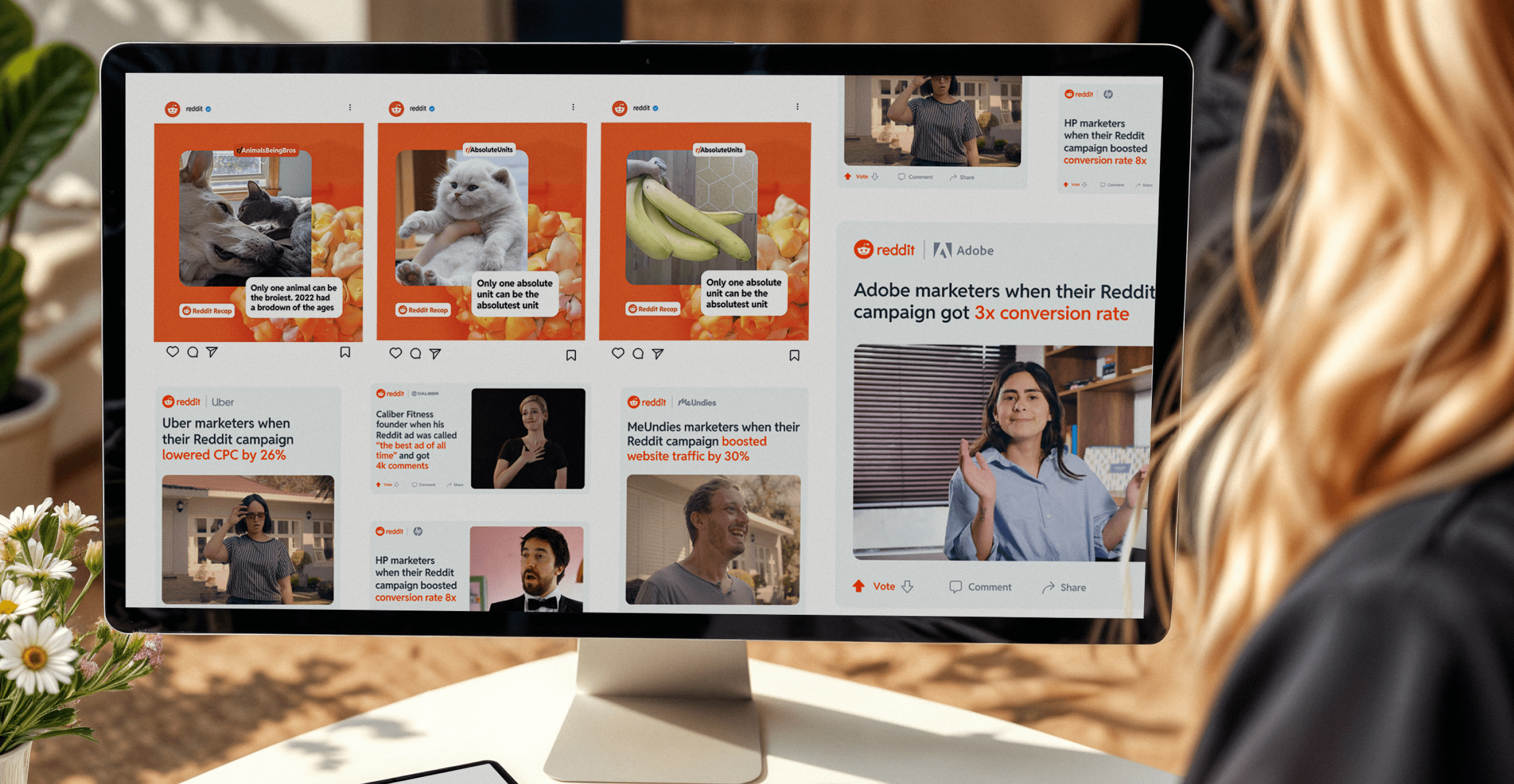
Doge, Pepe the Frog, Grumpy Cat or Flex Tape. Most of us have shared a spot-on meme with friends or coworkers. Still, many brands overlook the fact that memes aren’t just silly jokes but powerful marketing tools.Audiences expect marketing that blends seamlessly into their social feeds, and over 60% of people say they’re more likely to buy from brands that use memes.Memes are humorous, relatable and emotive. When used strategically, they’re a low-cost, high-reward way to get your brand noticed. Plus, marketing memes that tap into current trends and internet culture could drive relevance for your brand.As the world’s leading AI-powered creative service, Superside is your go-to partner for scroll-stopping, brand-boosting creative campaigns that can include memes.But before we get into how Superside can supercharge your growth, let’s break down the magic behind meme marketing, why these visuals work wonders for brands, and 15 real-world meme marketing examples that delivered results. 😉
The creative power of data: How to go beyond numbers
Over the last ten years, access to marketing data has gone from a slow drip to a virtual tsunami of performance data, social media metrics and marketing analytics. Creative teams are swimming in data—unfortunately, without lifeguards.We've talked to over 200 creative leaders who, like you, wish data came with a mute button. In our Overcommitted Report, 76% of leaders said they feel burned out, and 78% say the demands on their teams are exceeding their capacity.The solution? Using data to improve workflows and inspire your team.The problem? Knowing how to cut through the noise (and the data points) to focus on what matters.Simply put, it's not how much data you have but what you do with it. We were lucky to have two creative leaders, Malik Sulieman, Creative Director at Cash App, and Ryan Hammill, Creative Director at ServiceNow, join us on our Overcommitted Virtual Summit to share how they pair data and creative insights to reduce burnout and help their teams create fantastic work.
9 creative OOH advertising examples for inspiration in 2025
Think out-of-home (OOH) advertising is outdated in today’s digital-first world? Think again. OOH ads remain an impactful form of brand communication.From towering billboards along busy highways to interactive digital screens in urban centers, OOH involves capturing attention in the physical world, specifically when people are on the go and can’t see their digital devices.In 2025, the most effective multichannel marketing campaigns blend physical and digital experiences, such as QR codes for exclusive content or AR ads that come to life. These tactics aren’t just trends: they help brands turn public spaces into creative, cultural touchpoints that achieve the most precious thing that most miss to do: be remembered.Ready to grab attention with OOH advertisements? Check out nine of the most impressive recent OOH campaigns and discover what makes this medium so relevant and effective today.The modern power of OOH in brand marketing