20+ best illustration design examples of 2025 for top brands
Illustrations aren’t just fun to look at—they help brands break away from the ordinary. Use these 20 standout illustration design examples to spark ideas for your own illustrated campaigns and projects during this year and beyond.
If your brand doesn’t look different, you risk fading into obscurity. But, it doesn’t have to be this way. Besides investing in powerful branding, illustration design can be one of your most powerful tools to increase brand positioning and engagement.
The clever use of illustrations can help communicate your messages, spark emotion among target customers and draw eyes to your brand, no matter your industry.
And creating custom illustrations is, of course, hard work. When you consider that creative teams are stretched thinner than ever, finding ways to outsource your illustrated designs makes sense.
You’ll be in good company, too: more and more brands are bringing in creative partners to expand their capabilities and deliver high-quality, on-trend brand design and illustration at speed.
Curious to see what standout illustration looks like in 2025, and who is making them at scale? Then scroll down to explore our pick of 20 illustration design examples that get it right.
The power and key benefits of illustration design
Good illustration design can help you simplify complex ideas, build stronger brand recognition and connect with your target audiences on a deeper level.
Custom illustrations always stand out online and makes your brand more memorable and relatable, whether you’re explaining how a new product works or educating your audience about your service.
Let’s take a look at the benefits of using illustration design in your marketing and branding campaigns:
1. Illustration design grabs attention in a sea of content
With the average adult seeing 362 ads a day, your brand has 50 milliseconds to make an impression.
This isn’t enough time to read a long tagline, but it’s plenty of time to catch a glimpse of a good illustration.
2. Our brains are hardwired for visual information
Around 50% of the brain is devoted to visual processing.
Illustration design, with its different materials, textures and tones, taps into humans’ visual instincts in a way text and even photography often can’t.
3. Custom illustrations can make your brand instantly recognizable
Color alone can boost brand recognition by 80%, and brand consistency leads to 3.5x more visibility.
Imagine what a full-blown illustration campaign can do for your brand.
4. Good illustrations are a strategic investment
With the rise of custom illustrations across packaging, ads, websites and even corporate pitch decks, brands use illustration in marketing effectively.
Investing in the right illustrations and style from the start speeds up your creative process and helps your brand connect, communicate and stay memorable.
5. It’s scalable—even when your team isn’t
Illustration brings fresh visual energy to marketing materials and other creative. When done well, it works across different formats, platforms and campaigns.
The challenge? Creative teams are often stretched thin, making it challenging to keep up with the need for custom artwork and illustration.
Many of today’s marketing teams are understaffed, overcommitted and expected to churn out brilliance at speed.
Believe us, we did a report about it!
That’s how we know 41% of enterprises now collaborate with illustration agencies to scale their output without burning out their in-house teams.
Many also tap into the power of AI to boost productivity, using the tech for everything from simple image edits to generating custom illustrations and even creating full-blown presentations. Will your company be next?
20 illustration design examples in 2025
Do you know what’s the secret from top brands to scale illustration creative and produce high-quality design for less time and cost? Find it below!
Here are 20 top illustrations showing how brands turn creative firepower into results.
1. Oyster x Superside
Industry: Financial services.
Style used: eBook illustrations
Oyster simplifies global hiring and remote employee management and regularly publishes insightful, data-rich reports. And Oyster knew these reports needed a creative twist, so they used Superside to make magic happen.
Superside helped Oyster’s creative teams turn these reports into beautifully illustrated eBooks and assets emphasizing humanity and inclusion.
The style focused on hand-drawn characters in diverse settings, organic color palettes and custom shapes that reflected the global, human-focused mission.
No templates. No stock art. Just beautiful storytelling.
- What we liked: The inclusive characters, organic forms and the human-first approach.
- Why it works: The designs bring depth and diversity to corporate thought leadership.
- Best for: Reports, whitepapers and any topic where instant clarity is crucial.
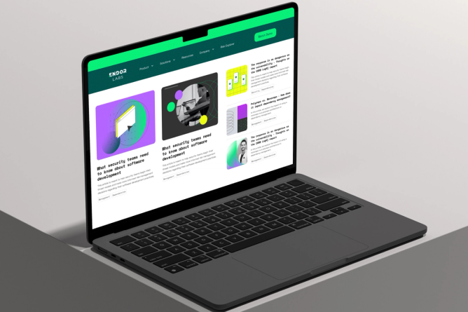
2. Endor Labs x Superside
Industry: Software development.
Style used: Retro illustration.
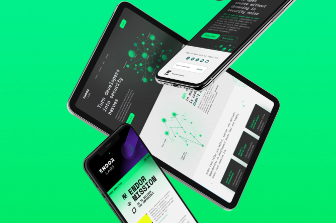
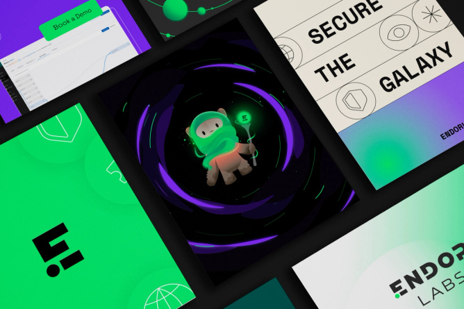
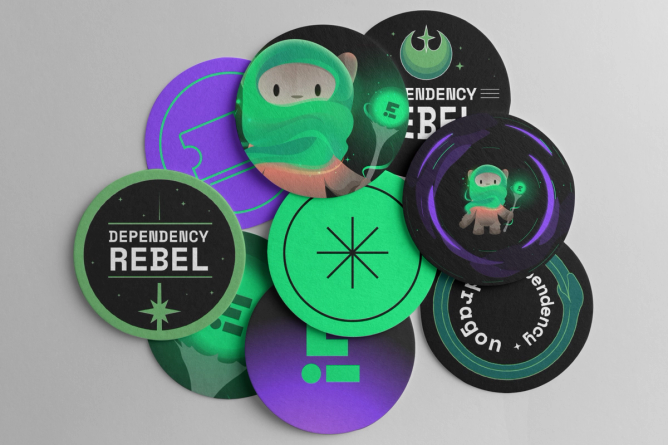
Endor Labs, specialists in software security solutions, wanted a brand identity that hinted at a galaxy far away. That’s when they called Superside for the job 🫡
Superside created a visual system steeped in retro-futurism, using neon hues, grid overlays and sci-fi references straight out of 1980s design manuals, custom-made for Endor Labs only.
From eBooks to social assets and stakeholder presentations, every piece of content got the same standout visual treatment—one that perfectly resonated with Endor Labs’ target audience.
- What we liked: Combining the retro-futurism style with contemporary colors and illustrations.
- Why it works: The brand design adds nostalgia and differentiation in a cluttered, modern marketplace.
- Best for: Brands wanting to stand out, evoke curiosity or emphasize innovation.
3. Bolt x Superside
Industry: eCommerce.
Style used: Caricature illustration.
Bolt needed an explainer video that matched the electrifying pace of its one-click checkout. And they needed it ASAP. How did they make it on time?
With an ambitious, nearly impossible deadline, Superside assembled a powerhouse team of 18 top designers. We delivered a visually striking, caricature-driven animation blending bold colors, dynamic wide-angle shots and surreal motion graphics to capture Bolt’s high-energy, seamless shopping experience.
Everything from character expressions to motion direction was exaggerated, making the checkout process feel like a theme park ride. Bold reds, blues and yellows created pace and dynamism.
In just one month, Bolt achieved a 600% increase in creative output, demonstrating that good illustration translates to a solid return on investment.
- What we liked: Over-the-top expressions and electric movement.
- Why it works: Injects energy and speed into brand storytelling.
- Best for: Brands with innovative, high-tech products.
The worst-kept secret from the best brands
All these brands, and way more below, used Superside for maximum creative output.
For enterprises, custom illustrations are more than just a combination of graphic elements—it’s a way to build a unique visual identity, tell deeper brand stories and foster long-standing customer relationships.
And after 135+ enterprise customers served with top illustrations and over 7000+ illustration-centered projects later, we understand that elevating illustrations at scale for multiple channels isn’t an easy feat.
As you can see, partnering with Superside means getting access to world-class illustrators, creative strategists, AI-powered creative workflows and production teams who know how to breathe new life into enterprise brands.
The best part? By using Superside, brands see a 6-month payback period and three-year-old 94% ROI when they start using our creative services.
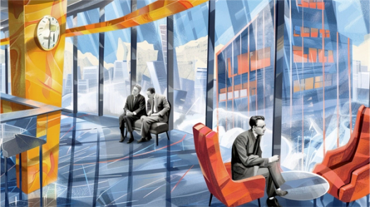
4. Density x Superside
Industry: Workspace optimization.
Style used: Concept illustration.
Density helps organizations make smart, data-informed decisions about how physical space is used. But its product isn’t exactly visual, so Superside helped them create an illustrated vision. Think Escher-inspired layouts, geometric forms, layered perspectives and a minimal color palette (oranges, greys, blues).
AI tools like Midjourney were used to draft over 70 custom illustrations, combining abstract space design with human interaction.
Superside crafted a visual identity for Density that’s as forward-thinking and conceptual as its technology, delivering a look that breaks away from the standard tech aesthetic and positions the brand in a category of its own.
- What we liked: Surreal angles and futuristic architectural forms.
- Why it works: The end result visually mirrors Density’s spatial intelligence platform.
- Best for: Abstract tech, data visualization and storytelling on a mass scale, especially for brands in gaming, sci-fi or entertainment.
5. GoHenry x Superside
Industry: Financial services.
Style used: Flat illustration.
To spark awareness about the need for financial education in U.K. schools, GoHenry partnered with Superside to achieve its creative and marketing goals.
Together, we developed a vibrant set of illustrated visuals featuring neon hues, custom hand-drawn scribbles, energetic brushstroke doodles and playful math icons like multiplication, division and equals signs—all designed to capture a youthful, dynamic spirit.
The flat illustration style helped communicate serious issues in a fun, accessible way, bridging the gap between kids and parents and turning the call to action into a movement.
- What we liked: Scribbly, bright and perfectly kid-focused.
- Why it works: The designs make finance topics feel relatable and approachable.
- Best for: Campaigns where clarity and speed are essential, such as UI/UX, tech branding or app walkthroughs.
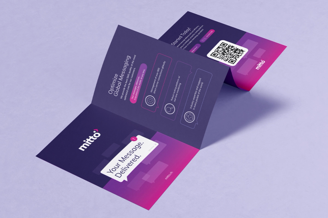
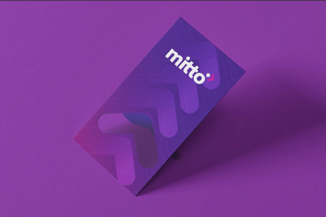
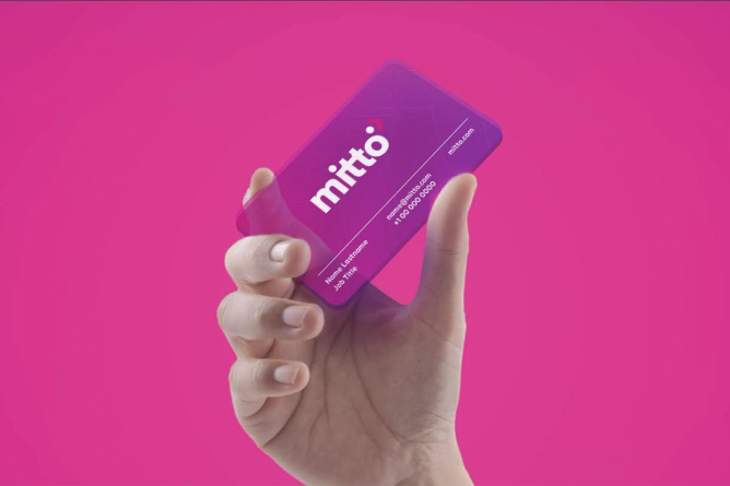
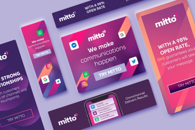
6. Mitto x Superside
Industry: Internet services.
Style used: Digital illustration.
As Mitto expanded its omnichannel messaging solutions, the company needed a design system that could scale just as quickly.
Superside delivered a cohesive suite of assets that was seamlessly adaptable across marketing campaigns, digital ads, event merchandise and internal presentations.
The visuals featured bold layouts, soft gradients and modern line art, empowering Mitto’s marketing team to launch unified campaigns with speed and consistency without compromising on quality.
- What we liked: Easy to integrate across digital platforms, the visuals feel fresh, confident and current.
- Why it works: The creative scales beautifully across any format (mobile, web, print, motion).
- Best for: Web design illustration, social media content, animated campaigns and product visuals.
7. Otto x Superside
Industry: Financial services.
Style used: Cartoon illustration, retro illustration.
Otto set out to transform how people engage with their bills, and Superside helped them bring that vision to life with an all-new visual language for the brand.
Our creatives applied their expertise in design principles to create retro-inspired fonts, soft pastels, playful shapes and cartoon-style characters bursting with personality.
The result: A brand that feels more like a Saturday morning cartoon than a spreadsheet, making personal finance approachable and inviting.
- What we liked: Nostalgic but fresh visuals, with Cartoon Network flair.
- Why it works: The creative turns a stressful topic (bills!) into something fun and empowering.
- Best for: Brands wanting to come across as playful and dynamic.
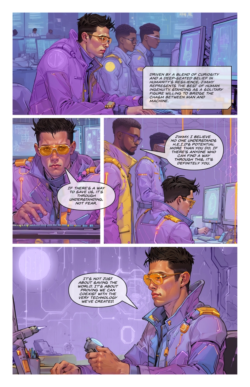
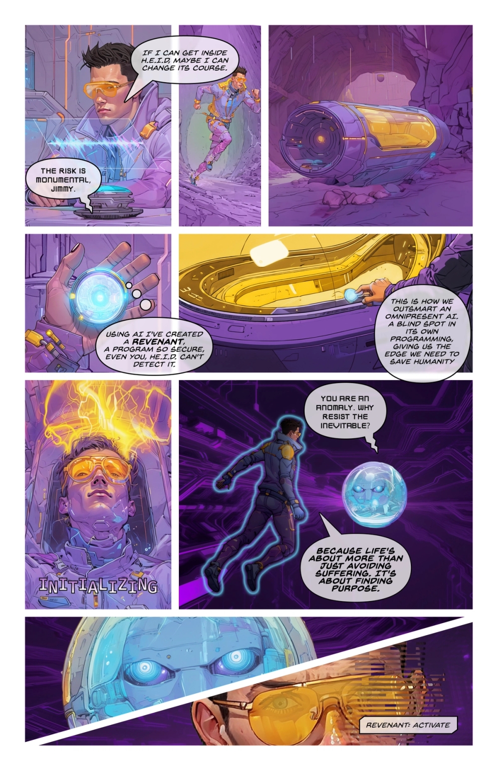
8. Security Scorecard x Superside [AI-powered]
Industry: Cybersecurity
Style used: Comic illustration
SecurityScorecard partnered with Superside to make noise at the 2024 RSA Conference—one of the world’s biggest cybersecurity events. Instead of producing the standard dry brochure, the team handed out a print comic book.
Superside created an entire Avengers-style universe where heroes represented SecurityScorecard’s products and services. Villains were cyberthreats.
The comic was built using a hybrid AI-creative workflow. Tools like Midjourney and Scenario AI helped generate over 500 consistent visuals in record time.
The characters were brand-aligned, the messaging was creative yet precise, and the result was a fully illustrated narrative that captivated attendees and redefined B2B storytelling.
- What we liked: Worldbuilding meets B2B event marketing.
- Why it works: The comic book and campaign were engaging and memorable.
- Best for: Brands wanting to break the mold in B2B marketing.
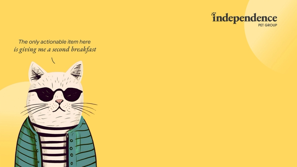
9. IPG x Superside [AI-powered]
Industry: Insurance.
Style used: AI illustration.
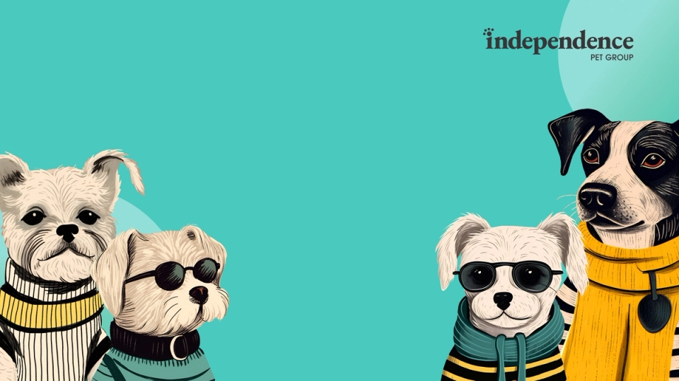
Pet insurer IPG wanted to dip its paws into illustration but didn’t have an established visual style from which to build. With limited time and resources, the brand needed an innovative, low-effort solution fast.
Superside stepped in, using ChatGPT for concepting, Midjourney for visual generation and Photoshop to bring everything together, delivering a fresh look with minimal lift.
From custom dog illustrations to a series of whimsical cat characters, Superside helped IPG to create a fresh new identity. Even the copy got a playful AI boost, with ChatGPT adding personality to every visual.
The fast, collaborative and cost-effective process proved how seamlessly AI and human creativity can work together to deliver standout results.
- What we liked: Lightning-fast concept creation.
- Why it works: We produced a scalable visual identity fast—perfect for a brand that had to start from scratch.
- Best for: Branding projects that demand rapid prototyping and quick testing.
Loving these examples so far? Watch more top design examples from Superside below!
10. Firefox
(Source: Ramotion)
Industry: Web services.
Style used: Vector illustration.
Firefox needed more than a refreshed logo; it sought a unified master brand to connect its entire product family. Ramotion met this challenge with a bold visual strategy built around sleek, scalable vector illustration.
The redesign carefully balanced legacy and innovation: The classic Firefox swirl remained, updated with a warmer palette, while a new atomic design system of geometric components gave the brand flexibility to grow.
Every element, from icons to motion assets and UI illustrations, was crafted for consistency and adaptability, empowering Firefox’s team to build, launch and evolve new products with speed and cohesion.
- What we liked: Crisp, clean lines and sharp graphics.
- Why it works: Ramotion made it easy for Firefox to build a consistent brand across systems and assets.
- Best for: Because they can be resized infinitely without losing quality, the digital images are suitable for campaigns that need to scale across everything from infographics to billboards.
11. Visa
Industry: Financial services.
Style used: Watercolor illustration, animation.
To introduce its Web3 Loyalty Engagement Solution, Visa set out to make its advanced technology feel approachable.
The answer: A hand-drawn, watercolor-style animated explainer that guides viewers through real-world scenarios like hotel upgrades, lounge access and gamified rewards powered by Web3.
The nostalgic, calming illustration style contrasts with the futuristic product, making complex features feel intuitive and inviting.
The result is tech marketing that swaps jargon for genuine understanding, transforming intimidating concepts into something warm and accessible.
- What we liked: Soft textures, organic look and feel and a distinctly human touch.
- Why it works: The illustrations create a calm aesthetic perfect to evoke emotions and do memorable stories.
- Best for: Brands wanting to come across as thoughtful, warm and inviting.
12. Piktochart
(Source: Piktochart)
Industry: Design software (SaaS).
Style used: Infographic illustration.
Looking for creative infographics design ideas? Piktochart’s entire brand revolves around turning information overload into visualizations.
Whether transforming survey results into easy-to-digest infographics or converting boring pitch decks into engaging stories, its graphic design tool helps non-designers communicate like visual directors.
Using a mix of clean icons, simple charts and customizable illustration packs, Piktochart makes it easy to get polished results. Its campaigns lean on this philosophy, showing what’s possible when you mix data with a bit of design dopamine.
- What we liked: The illustrated designs turn data into something fun to look at.
- Why it works: The graphics help viewers to absorb complex information quickly.
- Best for: Reports, educational materials and infographics aimed at informing and engaging target audiences.
13. Dropbox
(Source: Dropbox)
Industry: Technology.
Style used: Cartoon illustration, line drawings.
Online storage platform Dropbox has consistently embraced illustration as a core element of its identity. From product announcements to sticker packs, its hand-drawn visuals work to humanize digital experiences.
The Dropbox team champions cartoon-style line drawings, characters with distinct personalities, emotional moments and playful inside jokes that resonate specifically with their user base.
This illustration-forward approach has become a signature element of the Dropbox brand, cementing its role across product, marketing, communications and advertising.
- What we liked: Lively characters, bold expressions and playful personality.
- Why it works: The illustrations help to make the brand feel relatable and human.
- Best for: UX flows, micro-interactions and onboarding flows for brands wanting to inject character into their creative.
14. Airbnb
(Sources: Vimeo, Design.Studio)
Industry: Online travel.
Style used: Flat illustration.
Airbnb was searching for more than just a visual refresh—they needed a new sense of purpose.
By partnering with DesignStudio, they uncovered that Airbnb’s true value wasn’t about places but about people and the feeling of belonging. This insight led to a complete brand transformation built around the idea of “Belong Anywhere.”
Flat illustration became the heart of the brand system, bringing everything from culture to community to life. The signature “Bélo” symbol became easy to draw, even on a napkin.
The color palette? Inspired by global cities. The launch video? An illustrated journey through connection and belonging that had people teary-eyed.
- What we liked: The minimalist style paired with maximum emotional resonance.
- Why it works: The branding emphasizes concept over details.
- Best for: Brands seeking instant understanding and connection, whether for product launches, onboarding materials or marketing campaigns.
15. Le Chocolat des Français
(Source: Le Chocolat des Français)
Industry: Food.
Style used: Art illustration.
Le Chocolat des Français doesn’t just sell chocolate; they sell art. With over 400 artist collaborations (and counting), each bar is wrapped in a bold, collectible piece of art that celebrates everything from French pop culture to cheeky national icons.
They know how to appeal to the locals: Each chocolate bar is a unique, artistic illustration that often includes nods to playful French icons, humor and pop culture.
- What we liked: Expressive and emotionally rich graphic design.
- Why it works: The designs combine craftsmanship and storytelling through composition, texture and style.
- Best for: Premium products and services as well as cultural storytelling.
16. Penguin
(Source: Penguin)
Industry: Publishing.
Style: Book illustration.
Penguin’s Clothbound Classics are design statements. With hardback book covers wrapped in rich fabric and covered in illustrated patterns, these editions elevate classic literature to collector status.
Each cover is custom-illustrated to reflect the book’s themes, using stylized, minimalist graphics in metallic or muted tones. They’re beautiful enough to display, tactile enough to gift and timeless enough to never go out of style.
- What we liked: These elegant covers turn books into art objects.
- Why it works: The illustration adds timeless appeal and collectible value.
- Best for: Literary branding, high-end publishing and product-as-art.
17. The New York Times
(Source: The New York Times)
Industry: Media.
Style: Caricature illustration.
The New York Times caricature illustrations have long been iconic in political commentary, using stylized portraits that exaggerate features to spotlight public figures with wit and artistry.
With oversized grins, dramatic noses and wild hair, each character drawing distills a recognizable personality into just a few expressive lines.
Even as the Times has scaled back its political cartoons in recent years, these memorable caricatures remain a masterclass in amplifying character while maintaining respect for the subject.
- What we liked: Bold line art, biting wit and unmistakable likenesses.
- Why it works: The illustrations make serious topics approachable and humorous.
- Best for: Editorial commentary, opinion pieces.
18. Burger King
(Source: Dezeen)
Industry: Food and beverage.
Style: Retro Illustration.
Burger King’s rebrand brought back chunky typography, saturated 70s-style vibrant colors and grainy illustrated assets that looked like they came straight out of an old-school diner ad.
The goal: Reconnect the Whopper with its roots and evoke nostalgia while keeping things fresh and bold for today’s audiences.
The illustrated print and digital graphics gave the brand a refreshed attitude—cool enough for Gen Z customers and nostalgic enough for millennials.
- What we liked: Vintage appeal that screams flavor and fun.
- Why it works: A blend of nostalgia and bold, modern visuals makes the brand instantly recognizable and emotionally resonant.
- Best for: Rebrands, packaging, throwback campaigns.
19. Gucci
(Source: Gucci)
Industry: Fashion.
Style used: Fine art, fashion illustration.
For its Utopian Fantasy campaign, Gucci enlisted Spanish artist, Ignasi Monreal, to craft a breathtaking digital painting series that blends classical art with modern luxury.
The campaign reimagined Renaissance and Pre-Raphaelite masterpieces with a whimsical Gucci twist—think mermaids in designer sunglasses, mythical creatures in everyday scenes and iconic handbags taking center stage.
The result is fashion elevated to fine art, merging fantasy and heritage in a visually stunning, unforgettable collection.
- What we liked: Renaissance art meets surreal luxury.
- Why it works: The illustrated campaign blurred the line between high fashion and high art.
- Best for: Editorial illustrations, lookbooks and high-concept campaigns.
20. Google
(Source: Google)
Industry: Tech/education.
Style used: Digital illustration.
If you’re looking for digital illustration examples, look no further than Google Doodles.
Whether celebrating Juneteenth, International Women’s Day or the birthday of a forgotten inventor, these illustrations turn the Google homepage into a daily global gallery of creativity.
Each doodle is custom-illustrated—sometimes static, sometimes animated—and always timely. Google masterfully connects the brand to real moments in culture and history while showcasing the power of illustration at scale.
- What we liked: Fresh, inspirational visuals every day.
- Why it works: These illustrations tap into global culture while reinforcing the brand’s playful character.
- Best for: Seasonal campaigns, cultural moments and homepage takeovers.
The 11 most-used illustration styles from top brands
As you saw above, illustrators can turn ideas into visuals that say more than words ever could.
Make your brand stand out by tapping into one or more of the illustration styles highlighted below:
How Superside makes illustration a story for your brand
Looking to level up your illustration game and unlock your team’s creative productivity? Make Superside your go-to partner for scalable, high-quality graphic design and illustration, powered by 700+ top-tier creatives across 15+ time zones.
From 2D/3D illustration to motion graphics, branding and more, our subscription-based model gives you round-the-clock access to creative design teams, smart AI tools and flexible hours that roll over across services.
Free your overcommitted in-house team to focus on branding strategy while our creatives deliver the on-brand creative you need at speed and scale.
Core illustration services:
- 2D and 3D character design
- Iconography
- Custom illustrations
- Storyboarding
- Infographics
And so much more:
- Motion graphics and video
- AR/3D design
- Social media and ad creative
- Branding, packaging, merch and more
Starting at $10,000 per month (and scalable at any time), Superside will help you scale all the design needs you have, faster and cost-effectively than traditional agencies. We can help you save almost $2 million in traditional agencies' costs, with 60% fewer reviews and $4+ million in business benefits after three years.
Elevate your illustration design and get top creative with Superside
Attention is fleeting, and visuals speak louder than words. This makes investing in custom illustration design a no-brainer in 2025.
As the world’s leading AI-powered creative service, we help in-house teams at brands like Amazon, Intuit, Reddit and Salesforce scale high-performing creative faster and more cost-effectively than traditional agencies.
Break the mold and elevate your brand with illustration—make Superside your creative team’s creative team. Book a call.
FAQs
Emanuel is a Content Specialist at Superside. With the knowledge that three languages (and counting) and digital marketing can serve a creator, he has helped B2Bs from multiple industries to write, optimize and scale their content game with compelling pieces that answers questions and solve problems. On Superside, Emanuel streamlines content ideas into powerful articles that guides you on how to use Superside multi-powered services to scale your business to the max.
You may also like these
The world’s top 21 brand positioning agencies and firms in 2025
Let’s talk brand positioning. No, not where your product lands on a store shelf, but where it lives in your target customers’ minds.Working out how to position your brand takes sharp campaigns, serious energy, a solid budget and a strategic partner with exceptional creative flair. You’re on the hunt for a team that can shape and reshape how your brand competes, connects and scales.If your in-house creatives face bandwidth issues, they might not be able to take on this vital work.So, how do big companies consistently execute successful rebrands (or launch new brands)? They go to the world's leading AI creative service out there, which is the main creative partner of Meta, Notion, Salesforce and many more top brands.But before we dive into what Superside and other top brand positioning agencies can do for you, let’s take a closer look at what the process involves.
9 best brand refresh examples from companies who nailed it
Every once in a while, even the most successful businesses undergo a brand refresh to remain relevant. Here at Superside, for example, we recently completely overhauled our brand, and we took on an entirely new look at the start of 2025.Visuals play a crucial role in how customers view our brands, accounting for 55% of brand perception. Aligning your brand’s look and feel with changing customer needs and market trends is, therefore, absolutely important to reinforce brand positioning.Typically, a brand update involves clarifying and enhancing your brand identity rather than completely altering it. The project should evolve your brand without compromising the audience equity you’ve built over time.Our creatives agree that a brand refresh project shouldn’t be rushed or skimped on: it’s not worth the rush, as everything needs to be well-done. Start the process by exploring the nine great examples from leading brands outlined in this article.
10 brand storytelling examples to shape powerful narratives
Everyone loves a good story. Your brand’s target customers are no exception.People respond to real-life challenges, relatable characters and authentic, compelling narratives. In fact, brand storytelling should form a key part of any marketing strategy, as it helps brands build meaningful connections and long-term customer relationships.Over the past two decades, brand storytelling has undergone a significant transformation. Thanks to the rise of social media, user-generated content and influencer marketing, brands can now tell their stories in more ways than before.Currently, audiences are seeking content that resonates on a deeply personal, localized level. Brands that combine AI-powered insights with human creativity to craft emotionally resonant stories are leading the pack.At Superside, we’ve mastered the art of creative storytelling at scale, constantly working at the intersection of creativity and analytics to tell unforgettable stories. In this article, we share insights to help you craft a creative storytelling strategy, plus a selection of our favorite brand stories.

