


Presentation Design Services
Expert presentation design is your best first impression
Get polished, impactful presentations designed to impress stakeholders and move business forward. Our illustrators, presentation designers, copyeditors, and motion designers give your content the attention it deserves.
 Presentation templates
 Infographics
 Custom presentation design
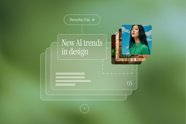
 AI image libraries
 Data visualization
 Creative support for 400+ top global brands
Strategic storytelling
Your idea deserves more than a boring deck
Presentation decks are often the first place that an idea meets an audience. Clarity is your strategic advantage.
Superside helps your team execute with high-quality corporate presentation design that elevates storytelling, reinforces brand identity, and drives business impact. No confusion, rush, or inconsistency.

trusted by teams
Your plug-in presentation design partner
Superside teams have delivered thousands of presentations to happy teams looking for expert presentation design.
Presentation projects delivered
41k+
Teams have used our deck design services
6,650+
Average approval rating from customers
4.8/5
Flexible formats
Expert design across Keynote, PowerPoint, Slides & Figma
From polishing a professional business presentation to delivering a custom pitch deck fast, we cover every high-stakes moment.
Custom presentation design
Turning your content into engaging slides for one-off events, pitches, or initiatives.
Presentation templates
Fully branded slides for your team to easily customize, remix, and scale.
Infographics
Bite-sized visual storytelling for big ideas.
AI image libraries
Presentation-ready custom images aligned with your brand.
Data visualization
Complex data made intuitive and impactful with clean visualization.
Motion for slides
Add polish and engagement with animation and transitions.
Channel-tailored
Designed to do more than look good
Our decks don’t just impress. All kinds of teams use them to align stakeholders, sell dreams, drive action, and support real outcomes.
Internal comms
Keeping your team aligned with executive updates, all-hands, launches and changes.
Sales
Sell the vision with pitch decks, proposals, and sales enablement.
Marketing
Get stakeholder buy-in with campaign decks and quarterly planning.
Events
Grab the attention of a fresh audience with keynotes, conference slides, and webinars.
Investor relations
Inspire confidence with fundraising, board, and shareholder presentations.
And anywhere else
Any topic and length with a wide range of tools to match your team’s preferences.
how superside uses ai
AI-enhanced speed, human-led storytelling
We blend human creativity with smart automation to speed up execution without losing nuance or brand control.
Smarter writing
AI-assisted content writing for faster, sharper slides
Custom visuals
Reusable, presentation-ready imagery based on your brand guidelines
Content flow
Suggestions to help turn your content doc into a structured deck faster

how we work
From content doc to polished deck
Our process makes it easy to go from rough content to refined presentation without hiring, relying on multiple vendors, or overloading your already-busy creatives.
1
Briefing
With a solid understanding of your brand already established, we dig into your goals, audience, and use case of your presentation brief.
2
Concepting
Depending on what you need (a single slide, a template, or an all-important pitch deck), we explore structure, tone, and design direction
3
Sample slides
We deliver some early outputs for you to review and align. If it's a tighter turnaround with a straightforward request, we might skip this step to save time.
4
Design
We build the full deck with polish and precision evident in every slide and detail.
5
Final delivery
We refine and deliver all formats needed, on time and on brand.
Now imagine this creative power behind your next project
This is just one of many creative services—what you do with them is up to you. Let's chat.


related articles
Read more about presentation design for creative teams

7 Best Report Design Services for Annual Reports and More in 2026
Annual reports, stakeholder updates, performance summaries, sales updates and financial statements. These are traditionally dry, data-heavy and hard to get anyone excited about, right? It doesn’t have to be like this anymore. Today, corporate reports are no longer doomed to collect dust. Instead, they’ve become key tools for enterprise brands to build trust, communicate results and inspire stakeholder engagement.
25 Consulting Pitch Deck Examples for 2026 (E&Y, PwC & More)
Achieving the perfect balance between effectiveness and visual appeal in a pitch deck is challenging, and we at Superside have experienced this firsthand. When we entered YC Winter 2016, we crafted a successful pitch deck that played a key role in our success. FAQs
Frequently asked questions
Yes, of course, Presentation Design is included in your Superside design subscription. In fact, you can use any of our comprehensive creative services at every pricing level. This also lets you have the ultimate flexibility as you create presentation decks because you can tap into motion design, illustration and other services all at the same time to make your presentations and decks shine.
Superside specializes in a wide range of presentation design services, presentation templates and graphics, PowerPoint-specific and other platform-specific designs, pitch decks and sales presentations. With a top-tier global talent pool and comprehensive range of creative services, we can also help you integrate a range of data visualization tools and storytelling capabilities like custom illustration, motion design and video production. We've even helped some of our clients create animated and 3D-infographics that can be used in presentation decks, websites and more.
Our presentation design services cater to a diverse range of customers, specifically addressing the needs of scaleups and enterprises of various sizes. The flexibility of our design services allows for seamless adaptation to match the unique demands of your business. Among our satisfied customer base are renowned companies such as Amazon, Shopify and Facebook, just to name a few. Interested in discovering how Superside can cater to your specific requirements? Schedule a call with us and explore the possibilities.
What makes Superside stand out in the world of Presentation Design Services is our exceptional speed and access to a vast pool of top-tier design talent globally. Our fully managed solution is also designed so that we feel and act like an extension of your team. With one subscription, you can request Presentation Design, Ad Design, Social Media Creative and more. Say goodbye to bottlenecks, backlogs and overburdened creative departments. Our project managers and design directors seamlessly integrate into your team and our collaborative platform briefing, commenting and asset delivery easy as pie (charts).
Presentation design is a pivotal tool in ensuring a seamless and visually engaging narrative in any number of business contexts. Presentation design goes beyond mere organization, elevating the overall aesthetic appeal of your Google Slides or PowerPoint presentation. By skillfully integrating attractive layouts, impactful infographics and relevant designs tailored to your brand and messaging, presentation design aims to captivate your audience and leave a lasting impression. Ultimately, the essence of presentation design lies in its ability to enhance the storytelling aspect, whether you're selling a product, service or narrating the compelling story of your company.
The role of a presentation designer encompasses the creative orchestration of all visual elements within a presentation. The presentation designer delves into the core messaging of the presentation and evaluates the necessary number of slides to proficiently convey the intended message. Beyond this, the presentation designer's responsibilities extend to defining key design elements such as the overall style, fonts, icons, images and infographics of pitch decks, Google Slides, or PowerPoint presentation. A crucial aspect of the designer's role is to ensure the seamless integration of these elements, maintaining consistency and adherence to the brand identity throughout.
An expertly crafted business presentation accounts for several factors including: the purpose of the presentation, the brand/business voice and style, the audience, current and best presentation design practices and knowledge of the tools and technology. A well-designed presentation helps the user share essential messaging simply and effectively and speaks to the audience by being engaging on many levels from clear visuals and intriguing animations to seamless branding and melding of all the elements. A great presentation design partner also helps you make this process turnkey, so you can request additional decks whenever you need.
Yes! We develop a budget that aligns if you have larger and more complex needs. Otherwise, all plans are identical, giving you full access to everything you need from Superside, regardless of the size of your monthly budget.
We offer credit card billing or invoicing.