How Doodle Labs Rose as a Challenger Brand
Background
Drowning in a Sea of Navy Blue
“Help! I’m drowning in a sea of navy blue!” Doodle Lab’s Vice President of Marketing, Amol Parikh, thought to himself at an industry trade show a few years ago.
Every brand at the event, including his own, was blending into the landscape. At this moment, he realized he wanted Doodle Labs to define itself as a disruptor brand—by coloring outside lines, especially with colors other than navy blue.
Challenge
It’s Doodle Labs Inside
Our radio components work inside some of the coolest technology, but our brand didn’t reflect this. Instead, it faded into the background. We knew we wanted to create an emotional connection, just like how Intel made a name for itself inside personal computers.

Acting on the recommendation of a friend and industry colleague and unwilling to remain awash in a cerulean netherland, Parikh reached out to Superside to help Doodle Labs forge the foundations of its brilliant new brand.
More than a sea change, Parikh also wanted the brand to emulate the success of Intel and its “Intel Inside” campaign that made it a household name—creating an emotional connection to Doodle Labs' technology.
Before and After Doodle Labs logo
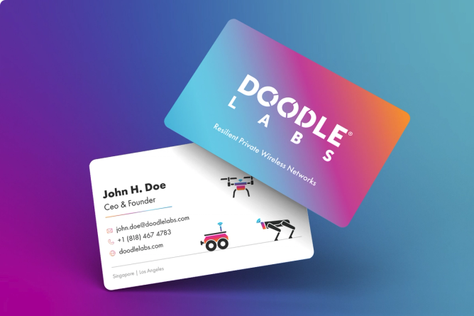
No longer suffering from a case of the blues, the new Doodle Labs logo features a vibrant color spectrum that grows larger as it’s amplified across the middle letters of the company’s name.
Solution
Where To Start When You Need To Stand Out
My previous experience with outsourced creative was really just Upwork or freelancers and it felt like we were starting over every time. With Superside, I have a deeply involved team that’s aware of my brand, my strategy and my needs, which helps us go further and produce faster.

Starting with an onboarding session focused on learning about Doodle Labs and their needs, Superside sprang into action—developing a plan to evolve the existing Doodle Labs logo, which was basically a wordmark with an all-blue color palette, into a fully functional and cutting-edge visual identity system.
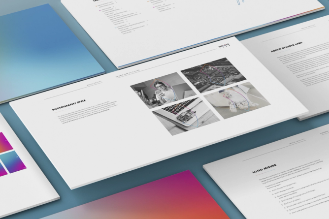
A showcase of pages from the Doodle Labs brand guidelines.
Through close collaboration with its dedicated Superside team, Doodle Labs added a modern logo and favicon, custom color palette and gradients, sophisticated iconography and illustration and overarching usage guidelines to its challenger brand arsenal.
From Brand Guidelines to a Website Refresh
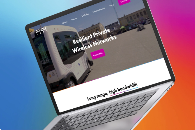
During the time the brand identity and guidelines were being developed, Doodle Labs was also working with Superside to reimagine the company’s primary conversion tool, its website. Many of the elements created within the brand guidelines were developed in parallel with refining the storytelling for the home and product pages.
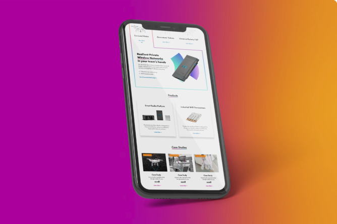
For instance, the Doodle Labs logo now easily stands out against a solid background or an image. Iconography creates consistency, directing the user to either of the three main use cases. And a mix of static and animated infographics, provided as lightweight Lottie files for faster loading times, helps make complex concepts crystal clear.
How iconography was used to help make the website more visual and easier to navigate.
Icon, illustrations and color palette development went hand-in-hand with the storytelling for the Doodle Labs home page and website
Results
Challenge Transmitted and Message Received
I was just on a call with a partner the other day. As we were going through the website and exploring the navigation, his comment was, ‘That’s slick.’

With their hard work now prominent in the market, Parikh and their team have successfully elevated their performance and solidified a robust foundation for storytelling. They share their positive experience working with Superside, praising the exceptional support they've received from the team. As they look forward to upcoming ventures, the feeling of enthusiasm and satisfaction is mutual, with the Superside team equally excited about the continued partnership.
Moving forward will be so much easier because we have all the components we need along with the direction on how to use them. Now we can retweak instead of reinventing.

After launching their new website and brand, Doodle Labs reported a 20% increase in conversion rate.
They also debuted their prismatic new brand at a trade show, earning rave results and unprecedented engagement. People were drawn to the booth, just to see what the excitement was about. They were signing up to learn more and loved the swag with the new brand.
In a recent event, the challenge was to find a novel way to demonstrate how their mobile radio technology helps drones gather mission-critical information.
Doodle Labs had previously tasked Superside with creating an animated infographic to show how its technology transforms communication between people and devices in warehouses, construction and emergency services centers.
In this case, Doodle Labs wanted to leverage 3D design tools to transform their infographic into a compelling 3D demo video.

