14 Best Facebook Ad Examples to Inspire Your 2025 Campaigns


Stuck running through the same Facebook ad examples and best-practice lists, and still can’t get your CTRs and impressions up? It can be frustrating, but don’t give up on this platform—Facebook is still the darling of the marketing world, delivering the best ROI of all social platforms. Instead, put your game face on and make this page of Facebook ad examples your go-to resource for inspiration.
Picking the right social channels is critical to campaign success. This, you know. You’ve spent weeks wading through TikTok tuts and getting lost in LinkedIn’s deepest, darkest corners, trying to assess which channels to use.
All your research points to Facebook. You discover:
- This grand old dame of social platforms has about 3 billion active users. (That’s almost 40% of all humans.)
- 55% of marketers say it’s their top social channel for sharing content.
- 82% of B2B marketers use the platform regularly.
Highly targeted advertising, easy scalability, various ad formats and robust analytics make for a supercharged advertising platform. However, achieving success on Facebook takes more than understanding the platform’s capabilities. You also need to create masterful ad copy, carefully choose your ad visuals and design eye-catching ads.
To help inspire you, check out this list of the 14 best Facebook ad examples across B2B and B2C businesses in 2025. Then, dig deeper by downloading our Definitive Guide to Digital Ad Design. You’ll want to keep referring back to this treasure trove of tips.
Top 5 Facebook Ad Types You Should Use
Let’s start with a quick refresher on the different ad types:
Experimentation is essential to success
Before we dive into examples, it’s worth noting experimentation is the key to success when it comes to a successful Facebook ad campaign (and all ads for that matter). The more ad formats and creative assets you test, the better you can hone in on what works best. And often, our audiences surprise us.
Although UGCs are our most effective ads, we also explore other creative forms, like motion ads, video ads and images. In promoting virtual events, UGC ads are successful. But we’ve also seen high performance from images featuring elements like logos or event speakers’ faces. This approach not only unveils standout performers among less dominant ad categories but also prevents your audience from rapidly growing desensitized to your content.

Even with a higher success rate for a specific Facebook ad type, it’s vital to continue creating and assessing the various ad formats as this can help you avoid ad fatigue.
Ready to put your newfound knowledge to the test and try your hand at Facebook advertising?
Don’t open your Meta Business Suite tab before you’ve scrolled through our round-up of brilliant Facebook ad examples.
The 14 Best Facebook Ad Examples in 2025
1. Superside’s ‘Marketer versus Creative’
Facebook ad type: Video ad
One of Superside’s best-performing video ads, “Marketer versus Creative,” launches straight into a conversation that’s familiar to most marketers and creatives (how many times have you said &*$^@#!! today?).
It’s a Facebook ad example that shows the importance of bringing customer pain points into your ads. Remember to ask yourself: “Why is the audience watching this ad in the first place?”
Once you’ve answered that, make sure your ad stands out from the crowd like this one does by offering a fresh, funny and creative take on the problem. It then segues perfectly into a strong brand message and CTA.
This Facebook video ad:
- Delights with humor.
- Has subtitles and text overlays, making it easy to watch with the sound off.
- Includes a happy, green “Learn more” button to encourage clicks.
Key takeaway: Don't shy away from humor in your Facebook ads, even if you're a B2B brand. Your audience eagerly awaits surprise and delight, especially on social media. Also, start ideation by honing in on your customer’s pain points and how your product or service offers a solution. Remember: The ad should be about them, not you.
2. Superside’s ‘Day in the Life’
Facebook ad type: Video ad, UGC-style ad
This video ad is another strong performer in the Superside stable. The video puts viewers in the shoes of an overworked marketer during campaign week. You quickly become part of the story as the dramatized main character (who resembles one of our target personas) discovers she’s in trouble.
The ad engages the target viewer with a strong narrative and a relatable hero. The Superside message is also delivered halfway through the ad, so even if you don’t watch the entire clip, you've seen the most important message.
Key takeaway: Use UGC-style content and tried-and-tested storytelling mechanisms to keep your Facebook ads relatable. Also, remember that ALL good stories include a:
- Main character (the customer)
- Problem or pain point
- Helpful guide (the brand)
- Solution to a problem
3. Superside’s PointCard Campaign
Facebook ad type: Video ad, Static ad
“Your ad should fit in with the content people want to see but still stand out from competing ads,” says Kyle Weber, Superside’s Associate Creative Director.
When designing Facebook ads, it’s a good idea to disrupt familiarity. In practice, this looks like the sleek but eye-catching designs Superside rolled out for fintech startup PointCard. The ads all combined dynamic neon colors (as opposed to the neutral colors competitors typically used) with simple yet perfectly targeted messaging.
Another key to success was testing and tweaking the campaign repeatedly. For example, when the campaign launched, Superside quickly discovered ads combining orange and white outperformed ads in orange and black. We could tweak our next round of creative, ultimately helping this client increase their CTR by 240%.
Key takeaway: Go against what people expect to see from brands in a particular industry. With more competition than ever, it’s the creative ads—the ones trying something new—that actually break through.
4. Superside’s ‘She used Superside’
Facebook ad type: Static image ad
With static Facebook ads, the combination of ad image and ad copy is everything. As you don’t have many elements to play with in your ad creative, the visual element should be worth a thousand words.
This Superside ad gets it right with a photo and ad copy that, when combined, sends a powerful message. Lisa’s cup of coffee and Cheshire Cat smile says it all. Clear Superside branding—and presenting the problem and the solution in a single frame—add to its success.
The final touch is the green strip over Lisa’s eyes: A nod to the fact that this marketer was perhaps a tad naughty when she weaseled her way out of a tricky work situation.
Key takeaway: This static ad does a lot of work with very little. The magic lies in how the ad copy and ad image complement each other to deliver a strong, relatable, humorous message.
5. GoPro’s ‘Million Dollar Challenge’
Facebook ad types: Video ad, UGC adWhen GoPro released their HERO7 Black camera model in 2018, they also launched one of the most successful ongoing UGC campaigns: The GoPro “Million Dollar Challenge.”The contest encouraged GoPro users to submit their most exciting, creative video clips for a portion of a $1 million prize. This was a fantastic incentive, but other factors contributed to the GoPro video ad campaign’s success.
The curated entry videos featured adrenaline-pumping beats and portrayed a slick, stylish, active lifestyle that resonated with the brand’s target audience. The videos and attractive lifestyle they sold were hard to ignore, even by those who didn’t participate in the competition.
Additionally, GoPro aired the footage and announced the winners at a global premiere, amplifying their Facebook campaign’s message at an event joined by competition participants, influencers and other key stakeholders.
Key takeaway: Sell a lifestyle using the best format for showcasing user content. Then, let the product sell itself.
6. Burger King’s ‘Moldy Whopper’
Facebook ad types: Video ad
For some brands, big risks bring big rewards. Burger King took a walk on the wild side when it released its “Moldy Whopper” video ad in 2020.The purpose of the ad was to highlight the brand’s decision to remove artificial preservatives from their Whopper sandwich. If you watch the video ad, you’ll see how a freshly made Whopper slowly decomposes over time. When the brand shares its message (“The beauty of no artificial preservatives”), you’re sold—especially if you realize the video ad is a clever stab in the direction of McDonald’s, their main competitor.
When Burger King released this ad, it broke many rules about marketing food, causing a stir in the industry. Their Facebook ad became a hot topic of discussion and generated both positive and negative reactions, creating a polarizing moment in pop culture.
Burger King bet on the fact that many of their target customers would pay attention when the ad appeared in their Facebook news feed, and sure enough, this campaign garnered 1.4 million minutes of viewing time.
Key takeaway: Don’t be afraid to go against the grain. It might be risky, but if the boldness of your Facebook ad campaign gets your target customers’ attention, the rewards (e.g., gaining a few other customers) may outweigh the risks (e.g., losing a few others).
(PS: Love the idea of creating video ads? Get inspired by more Facebook video ad examples here.)
7. Slack’s ‘Make Work Better’
Facebook ad types: Static ad, carousel ad
“Make work better.” Interested already, right?
With playful copy and images, Slack’s image and carousel ads dive straight into their target customers’ pain points with a quick one-two visual punch.
Glance at their Facebook ads, and you’ll immediately know they’re selling a product that saves you time (a solution to pain point #1) and makes you more productive (the answer to pain point #2).
The ad images also tap into the target market’s serious and playful side. Business attire is set against ice cream, rainbows, balloons and candy colors, making for eye-catching, visually appealing ad creative.
Last but not least, Slack subtly introduces the idea of a productivity solution for “modern teams”—a message that resonates with business owners and key decision-makers (another important target segment).
Key takeaway: Make your static or Facebook ads stand out by creating a stark contrast or division between two visual elements or concepts within a visual context (i.e., create a visual dichotomy). For example, combining people in business attire with rainbows, ice creams and balloons draws attention because these elements don’t usually go together.
8. Pura Vida’s Ad Campaigns
(Source: Digivizer)
Facebook ad types: Carousel ad, UGC ad, collection adPura Vida engages target customers with their Facebook ads by:
- Selling an enviable, laid-back lifestyle.
- Appealing to their desire to do social good.
- Telling stories in a sequential, visually appealing manner.
Some of the jewelry brand’s most successful ads use the carousel ad format and customer photos, marrying simplicity and authenticity with a string of “wish you were here” moments. Each ad image is visually captivating, encouraging users to swipe through the ads to see more and click the CTA buttons.
A short copy line links the ads to the brand’s origin story: How two friends founded a bracelet empire supporting local artisans in Costa Rica. This message gives target customers yet another good reason to purchase the brand’s products.
Key takeaway: UGC content can be used to sell a brand in an authentic manner (and authenticity resonates with today’s skeptic social media audiences). You can also use your Facebook ads to highlight your company values in an era where consumers care about sustainability and being socially responsible.
9. Lacoste x Polaroid Collaboration ads
Facebook ad type: Augmented reality (AR) adWith Facebook’s Spark AR tool making it easier to use AR in ads, marketers are finding new ways to use this technology in campaigns. One of the best Facebook ad examples in this category formed part of a 2021 Lacoste x Polaroid Collaboration.The two iconic brands joined forces to market a collection of clothing and accessories and limited-edition, crocodile-themed Polaroid cameras.
In the Facebook ads, users could capture fun and funky “Polaroid moments” using their phone cameras. The ads also featured filter effects that paid homage to vintage Polaroid imagery.The result? A highly successful, nostalgic Facebook ad campaign that provided the kind of immersive experience AR ads are known for. Compared to traditional ads, the campaign generated a 7.4-point lift in brand awareness.
Key takeaway: Use AR ads to engineer shareable experiences that build brand awareness.
10. Tazo Tea
[Video embed from: https://vimeo.com/757597409 ]
Facebook ad type: Stories ad
Any experienced marketer will tell you a good ad campaign starts with researching your target audience. But knowing your audience is only half the battle. Once you’ve identified your target personas, you need to get their eyes on your ads.
Tazo nailed both these points when they created this particular ad for Facebook Stories. Words and phrases like “regenerative,” “earth-friendlier” and “good from root to brew” make the Tazo brand attractive to folks who prioritize health and eco-friendly product choices.
The tea brand also does a stellar job of keeping the design clean and simple throughout the story, making the last frame's splash of color pop. This colorful frame (a departure from the bright orange used in the rest of the Story) also signals there’s something for everyone in their product range.
Key takeaway: Use bright, energetic colors and copy to grab attention and deliver a message you know will resonate with your audience.
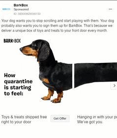
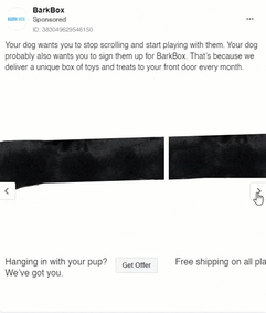
11. BarkBox’s ‘Dachshund’

(Source: EmailDrips)
Facebook ad type: Carousel ad
You’ll probably love this ad and its clever, layered messaging if you have pets.
BarkBox creates an emotional connection with target customers by reminding them about their dog’s playtime. Then they transition into messaging about other ways to spoil your furry friend (like signing up for their product).
The ad kicks off a simple, compelling narrative and the words, “How quarantine is starting to feel.” Knowing that most viewers naturally want to see the dog’s tail, the brand moves them through the frames.
Tapping into a shared experience—COVID-19 quarantine—also makes for a Facebook carousel ad that resonates with a broad audience.
Key takeaway: Carousel ads should drive engagement, shifting users from a passive to an active experience, as this leads to better click-through rates (CTRs) and brand recall. If you use this ad format, carefully consider what would compel the reader to keep swiping and clicking.
12. Monday.com
Facebook ad type: Static ad
If you don’t use motion or sound in your ads, they become much harder to notice among all the other moving images and video ads in the user's Facebook news feed.
So, one way to capture attention with a static ad is to place light text on a dark background. With this ad, Monday.com makes full use of this effect.
But that’s only part of what makes this ad successful: The brand also uses its design to communicate compatibility with Mac. Notice how their logo has morphed to include the Apple leaf and rainbow color scheme? These subtle tweaks link their product to one of the world’s most recognizable brands. Smart.
Key takeaway: A subtle nod to a popular brand, product or idea can create a positive association with your brand. Just make sure the brand or idea you're referencing has positive associations in the minds of your target audience. Associating with something controversial can backfire.
13. Ford ‘Discover Summer’
Source: Leadsbridge
Facebook ad type: Lead ad
Lead ads have a clear purpose: To get target customers’ details. Once the marketing team has this data, they can nurture prospects by sending them valuable info, updates, offers and more. Done well, Facebook lead ads can help drive sales.
Ford’s “Discover Summer” ad series gets this right by tapping into the target audience’s sense of adventure. Anyone looking forward to a summer of kayaking, camping or fishing can relate to the photography used in the ad creative.
Additionally, the ad creates urgency with the promise of limited-time deals during Ford’s Summer Sales Event. This message gets feet into their showrooms, setting the stage for more sales down the line.
Combined with the “Make this your best summer ever” tagline, the brand’s message is clear: Get out there and discover summer—in your new Ford.
Key takeaway: Using emotional appeal in Facebook ads can be extremely effective. Get to grips with your target audience’s emotions, values and aspirations, then tailor your messages to their needs and desires.
14. Nike
(Source: Meta)
Facebook ad type: Static image ad
What’s the first thing that caught your attention in the spread above? Thought so. LeBron dribbling that basketball. Leveraging star power is one of Nike’s strongest ad tactics, which they do well on Facebook.
When you look at the other two ads, you may also notice a theme: Clarity and simplicity in both ad copy and design. The ad creative on the right simultaneously communicates the product benefits and shows a lifestyle that resonates with the target customer. The image is clear and uncluttered, and there’s a straightforward CTA to download the app.
Key takeaway: The best Facebook ads tell you what you need to know at a glance. If your budget allows, hire a celebrity or influencer to sell the lifestyle your audience desires. It’s an age-old tactic that still works like a dream.
Create Facebook Ads That Perform
With the right blend of format, copy, design and CTAs, you can make Facebook work for you in 2025. Researching other brands’ successful ad campaigns is a great start.
But don’t stop here.
You’ve seen some of our own top-performing brand ads (scroll to the top for another look 👆). Now, explore the ads Superside has designed for some of the world’s top brands and get inspired to create your next great Facebook ad campaign.
Emanuel is a Content Specialist at Superside. With the knowledge that three languages (and counting) and digital marketing can serve a creator, he has helped B2Bs from multiple industries to write, optimize and scale their content game with compelling pieces that answers questions and solve problems. On Superside, Emanuel streamlines content ideas into powerful articles that guides you on how to use Superside multi-powered services to scale your business to the max.
You may also like these

The creative power of data: How to go beyond numbers
Over the last ten years, access to marketing data has gone from a slow drip to a virtual tsunami of performance data, social media metrics and marketing analytics. Creative teams are swimming in data—unfortunately, without lifeguards.We've talked to over 200 creative leaders who, like you, wish data came with a mute button. In our Overcommitted Report, 76% of leaders said they feel burned out, and 78% say the demands on their teams are exceeding their capacity.The solution? Using data to improve workflows and inspire your team.The problem? Knowing how to cut through the noise (and the data points) to focus on what matters.Simply put, it's not how much data you have but what you do with it. We were lucky to have two creative leaders, Malik Sulieman, Creative Director at Cash App, and Ryan Hammill, Creative Director at ServiceNow, join us on our Overcommitted Virtual Summit to share how they pair data and creative insights to reduce burnout and help their teams create fantastic work.
Enterprise Graphic Design RFP Best Practices (Checklist Included)
For enterprise and mid-market businesses looking to enhance their creative capabilities and scale overall capacity, issuing graphic design RFPs are an essential part of the formalized procurement process for agencies, contractors and other external partners.RFPs create a structured, transparent framework for assessing and comparing service proposals from different outsourced creative partners.As an internal stakeholder, your opening role is to lay out your creative needs and timelines, communicating efficiently to prospective partners exactly what you’re looking for in a business relationship.In turn, these prospective creative service partners are asked to put their best feet forward demonstrating why their capabilities, capacity, skills, tools and scale are the best fit.On average, respondents spend around 30 hours of writing time developing their proposals. While it varies, you can expect to put just as much time into writing your RFP, evaluating the responses, communicating with procurement and selecting the winner of your work and budget.
8 Creative Agency RFP Templates for Enterprise Teams
Creative agency requests for proposals (RFPs) are conversation starters—incredibly important icebreakers.Mid-market and enterprise teams issuing the requests are introducing their brands, key business challenges and expectations of their creative service partners. Conversely, prospective partners use this information to pull together their responses.It’s a high-stakes, high-effort process for everyone. Communication breakdowns mean neither side gets what they need. More than ⅓ of brands get incomplete or inaccurate responses to their creative service RFPs.
