


6 of the Coolest Craft Beer Label Designs


Craft beer is no longer a quirky drink for intolerable hipsters — it’s become an industry on the rise with a retail value of $27.6 billion, representing 24.1 percent of the beer market share in 2018. That makes it hard for small, independent craft brewers to stand out from the crowd, even after incorporating innovative brewing techniques, such as the distinctive cold IPA brewing method. But designing a distinct label that's not easily forgotten takes more than creativity.
Coolest Craft Beer Label Designs
We may be accustomed to seeing big beer names on the shelves, but it’s the smaller microbrewers that are getting creative with their beer label designs. Let’s check out five of the coolest craft beer labels in the game and discuss what makes their labels stand out from the rest.
1. Around The World Beer Flight
The Around the World Beer Flight is not a new kid on the block, but we love the concept behind their labels and the timeless design. They came up with an eye-catching label design that captures the beer itself, while also playing on the different meanings of the word “flight.” The design emphasizes the idea of experiencing a “true beer flight around the world” with the six-pack from Artificial Horizon.
Inspired by vintage luggage tags, each label represents a major airport around the world. The design is consistent in terms of layout, fonts and background, but each label has different color accents that match the beer type.
Designed by Andrew Austin
2. Camden Town Beer
It would be difficult to not love the Camden Town beer’s latest makeover. The previous labels were pretty good too, but the new ones show improvements and a much fresher, urban vibe to match the product and their consumers.
The new, redesigned craft beer labels are easily noticeable through the bold, block colors and tall, heavy typography. The biggest differentiator, however, is the use of white space that gives the labels a sleek, minimalist look.
The Camden Town Brewery logo was simplified to match the new look. Each beer name remains written in its individual typeface, to emphasize its unique character, while the drop shadow and typeface size are common elements among the labels.
Camden Town Brewery via Brand New
3. Sixpence Stout
The Sixpence Stout Christmas Limited Edition created by Tap East Brewery has a whole story and lots of tradition around it, so it needed a label to do it justice. They told the story of the beer without going overboard on colors or using the classic Christmas shades. Instead, they stuck to the classic black-and-white combo and created the entire label and bottle design around subtle Christmas-related references.
The festive stout was inspired by the traditional Christmas pudding. The waxed bottle neck references the tradition of the coin baked into the pudding for good luck and captures subtle influences of vintage ale labels. The holly placed above the “O” of the stout hints at Christmas traditions.
Designed by Midday Studio
4. Surfing High
Surfing High was created for the hot summer months, so it needed its label design to be fresh, fun and light, just like the beer. The label is a tribute to the surfing culture in Korea; even the typeface is shaped like the waves and the surfer looks appears to be one with the water.
The summer beer label boasts bright colors, fun typeface and lots of white space, which gives it an airy look to match the brand identity.
Surfing High via Digital Arts Online
5. Browar Minister
This one’s bound to stand out even on the most crowded brewery shelf. Minister Brewery, together with illustrator Kinga Offert created a beer identity that goes beyond anything we’ve seen so far.
We love how they tell the story of each beer in a very unique and humorous way, both online, through fun GIFs, and offline through colorful characters. They do a great job of capturing the youth spirit of the brand, positioning themselves as urban and artistic.
Designed by Ostecx Creative & Kinga Offert
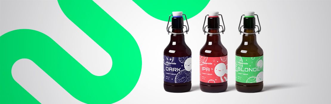
6. The Superside Office Craft Beer
We got so excited seeing the creativity behind craft beer labels and from our recent rebranding, so we decided to have a virtual “beer o’clock” and see what our very own Superside craft beer label might look like through the eyes of our talented designers. Here’s the result.
We started with the Superside brand identity in mind: the bright colors, including our radioactive green, the Superside moon and the Superside logo. We came up with a composition that reflects the brand's key qualities: it's out of this world and has something magical about it. The design follows the brand identity in terms of color, typography and illustrations.
The three labels share the same structure but feel unique. Monochrome color usage enhances the design, but each label has its own colors to match the beer style and make it easier to differentiate.

Now, let’s look at some tactical label design tips that will help make your brew fly off the shelves.
Beer Label Design Tips
1. Design-optimized copywriting
The first thing to take into consideration when designing a label is space. Every element should be created with that in mind. Design-optimized copywriting needs to be concise and clear – think product name, tagline, brand logo and packaging size or weight.
The text should help the design stand out, not outshine it. Take a look at Truman’s core range, for example. If you want to include the brand story or a more detailed product description, consider placing it on the six-pack packaging or online.
Truman's Brewery via Packaging of The World
2. Typography pairing
Fonts are often overlooked, yet font choice can ultimately make or break a great label design. Typography pairing can create continuity between different design elements or help highlight certain information.
For the sake of consistency, it’s important to choose fonts with the other design elements and the overall brand identity in mind. Going for a classic Times New Roman font on a flavorful craft beer label that’s colorful, bold and has a modern, fun look is an uninspired choice. And cramming too many different fonts into a limited space will only confuse the consumer.
Make sure the type is legible, the text size is at least six points and the font color contrasts with the background, so it’s easily readable.
Belgium’s famous Delirium beers use a fun font that matches the name’s meaning (Delirium tremens refers to the shaking that alcoholics experience during withdrawal) and is easy to read.
Huyghe Brewery via HubSpot
3. The importance of white space
When designing a label, white space is your friend. Similar to typography pairing, it can help separate information, but also give the design a modern, minimalist look. If, for example, you have a lot of copy, like Five Point in the image below, or complex decorative elements on your label, create extra space by going for a plain white background.
Five Points via Digital Arts Online
4. Color consistency
People are more likely to stop in front of your product in the supermarket or order it at a bar if you’ve got an attention-grabbing label. Colors can create that effect if used properly. Try to avoid clashing colors and opt for complementary ones instead. Ensure that the colors are consistent with the brand identity, match them with product flavors or use a pop of color against a white or black background, as Misterio does for its craft beer variety.
Make sure to consider the colors of the beer and the bottle, as it can significantly impact your label look. The most common beer bottle colors are green, brown and clear. While this rule is by no means set in stone, it’s often helpful to consumers to use label colors that are easily associated with the beer type. If you’ve built a fun, modern, playful brand identity, a contrasting color scheme will make your product stand out and be more in sync with the overall image.
Hollow Tree via Misterio Brewing
5. Keep the brand in mind
If you already have a branded font and color scheme, keep the label elements in line with the brand identity to help strengthen it and build consistency. Thorough target market and competition research will help solidify your brand image and design a product that caters to the right audience.
If you’re looking for reliable, super design talent and fast turnarounds, trust our dedicated team with your print and label design. Superside it. We’re always on, chasing the sun to deliver the moon.
Cassandra King is the former Head of Content & Community at Superside. She’s a road trip aficionado, advocate for all things glitter, and can usually be found with a camera (or snacks) in hand. Find her on IG @casssandra.king.
You may also like these
An expert 7-step brand strategy framework
In an era where businesses are under pressure to produce results quickly, it’s easy to see branding as just another box to check off. However, a well-thought-out brand strategy framework isn’t just a marketing play—it’s a foundational business tool that helps teams prioritize messaging, work more efficiently and create long-term impact.During Superside’s Overcommitted Virtual Summit, branding expert and Twilio VP of Brand Adam Morgan delved into how companies can build brands that stand the test of time. Morgan, a veteran of branding initiatives at Adobe, Splunk and Twilio, provided a wealth of insights on how to approach branding with intention, align brand identity with business goals and ensure it connects deeply with customers. Dive in to learn more about the importance of purpose, audience alignment and strategic execution—all while keeping in mind the challenges of overcommitment and burnout that many creative teams face.Why branding matters more than everThere's a common misconception about branding strategies that they're just about visuals and logos. Morgan emphasized that brand strategy is about creating an emotional and strategic connection between a company and its audience.
7 top creative support solutions for teams and enterprises
There’s no denying that today’s marketing and creative teams are under more stress than ever. To deliver high-performing, top-quality assets at scale, many teams are getting fewer resources, smaller budgets and tighter deadlines.As an ever-increasing number of brands compete for audience attention, the demand for compelling content is getting higher—and essential for creative teams to meet.It’s no surprise then that in-house marketing and creative teams are turning to advanced creative support solutions to help enhance efficiency, streamline workflows and optimize production processes.From AI-powered design to cloud-based collaboration software and outsourced creative services, these solutions transform how teams work, allowing them to produce more assets faster without compromising quality.Our best advice to teams and enterprises on how to get this right? Make Superside your creative team’s creative team and free up your team to do their best work.
How to find creative partner agencies to boost 2025 strategy
Are your internal creatives battling to keep up as the demand for authentic, trustworthy content grows? For many brands, outsourcing creative makes sound financial sense. Plus, partnering with an experienced creative services team can bring fresh ideas and impressive scalability.80% of customers say that the experience a company provides is just as important as its products or services, meaning that driving great customer experiences is essential in 2025. Once again, creative partnerships pay dividends, as many creative agencies go well beyond KPIs to drive genuine cultural impact and build trust.Unlike traditional agencies, creative partner agencies also typically act as an extension of your team. Work with Superside, for example, and our talented designers will become your creative team’s creative team.