





This email design roundup gives you 32 examples across newsletters, responsive sends, lead nurture, event invites and creative one-offs, each with the single decision that makes it work and the specific move you can lift. Superside's designers build email systems for enterprise teams, so the notes are written from the production side, not the gallery side.
A screenshot tells you an email looked good. It doesn't tell you why, and it definitely doesn't tell you how to get there with your own brand, your own template and four other campaigns due Friday.
The email design examples worth studying are the ones you can take apart. Below are 32 of them, grouped by the job the email is doing, each with a short teardown covering what makes it work and one thing you can steal. Some are famous. Some are small brands doing one clever thing very well.
Our designers picked and annotated every entry. We build email templates and campaigns for in-house teams at scale, which shapes what we notice: how a layout behaves when the copy runs long, whether a hero survives dark mode, what happens on the fortieth variant.
What makes an email design work in 2026
Email design has a constraint no other channel has. You're not designing a page, you're designing something that gets rebuilt by whatever client it lands in, at whatever width, in whatever color scheme the reader picked two years ago and forgot about.
That rebuild is where most designs quietly fail. Apple accounted for 62.26% of tracked opens in July 2026 and Gmail for 27.03%, which puts nearly 90% of your audience inside two rendering environments, according to Litmus Email Client Market Share. Design for those two first and the long tail mostly takes care of itself.
The five things below are what our designers check before anything goes out. They apply whether you're sending a weekly newsletter or a one-off launch announcement.

A visual hierarchy that survives a three-second scan
Good email design decides what the reader sees first, second and third, then makes that order obvious at thumbnail size. Squint at your design. If the first thing your eye lands on isn't the thing you most want read, the hierarchy is wrong.
This is mostly a scale and contrast problem rather than a content problem. One dominant element, one secondary, everything else subordinate.
Layouts that don't break when the content changes
Single-column layouts still win on mobile, but the real test is what happens when the headline runs two lines longer than the mockup, or the product image comes in portrait instead of square. A template that only works with perfect content isn't a template, it's a one-off.
Build with generous padding, flexible image containers and text that can reflow. Then test with the worst content you can imagine, not the best.
Live text, not text baked into images
Image-only emails load slowly, break when images are blocked and are invisible to screen readers. They also tend to look wrong in dark mode, where a white PNG sits on a dark background like a lightbox.
Litmus reports that dark mode is now used by more than a quarter of the user base, which makes it a default rendering condition rather than an edge case. Live text with transparent PNGs and explicit background colors handles it without a second build.
Personalization at the layout level, not just the greeting
Swapping in a first name is the least interesting thing personalization can do. The useful version changes which modules appear, in what order, based on what the reader has actually done.
Design for that. Build modules that work in any order and at any count, so the same template can serve a first-time subscriber and a five-year customer without looking half empty or overstuffed.
One clear action, placed where the decision happens
Most emails have too many calls to action, which is the same as having none. Pick the one action that matters, give it a button with real contrast and enough tap area, and repeat it at the end rather than scattering variations through the body.
Since Apple's Mail Privacy Protection now affects roughly 55% to 60% of opens, open rates have stopped being a reliable read on whether a design worked. Click-through and conversion are the honest metrics now, which raises the stakes on CTA design specifically.
How we chose these 32 examples
Every example here had to clear three bars. It had to make one decision you can point at and learn from, rather than being generally attractive. It had to come from a brand still sending, and it had to be reproducible by a team without a custom build budget.
We cut six entries from the previous version of this article for failing one of those tests, including a few brands that no longer send and one where the email and the brand name didn't match.
The categories below are jobs, not industries. A welcome email and a re-engagement email have more in common with each other than either has with a retailer's Black Friday send, so grouping by intent is more useful when you're designing a specific thing.
Newsletters are the hardest format to sustain because they arrive constantly and get judged against the last one. The design problem is consistency, not novelty. These nine solve it in different ways, from rigid modular systems to personality doing the heavy lifting.
1. 'The Creative Brief' by Superside
Our own weekly newsletter, aimed at marketing, creative and brand leads. The Creative Brief runs on a fixed module set so the design decisions are made once and reused, which is the only way a weekly send stays good past month three.
 (Source: Superside)
- Why it works: A short intro, a compact contents list and then self-contained blocks the reader can skip. The humor sits inside the modules rather than in separate gag units, so a light week and a heavy week look like the same publication.
- Steal this: Define your newsletter as a set of five or six modules and forbid yourself from inventing new ones. Variety comes from which modules you use, not from redesigning the shell. Our newsletter template guide walks through building that set.
2. Morning Brew
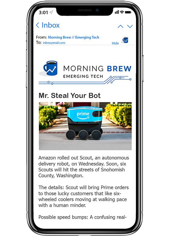
Business news for people reading on a phone before work. Morning Brew is close to the reference implementation for text-led newsletter design.
- Why it works: Almost entirely live text, with a strict typographic hierarchy doing the work that images do elsewhere. It loads instantly, renders identically in every client and stays readable in dark mode with no extra build.
- Steal this: Try designing one issue with no images at all. The constraint forces the type hierarchy to carry the structure, and what you learn transfers back to your image-heavy sends.
 (Source: Morning Brew)
3. The Cut
Editorial content for readers who already have too much to read.

(Source: Reallygoodemails.com)
- Why it works: Spare layout plus one illustrated element per issue. The illustration signals the tone of the piece before a word is read, which does more work than a stock hero photo ever would.
- Steal this: Replace your hero photo with a single commissioned illustration or a piece of custom type. It's cheaper than a shoot and far more ownable.
4. ARMRA
Supplement brand writing to health-conscious readers who follow the category closely.

(Source: Reallygoodemails.com)
- Why it works: The send is pegged to a seasonal moment the reader is physically experiencing, and the palette shifts to match. Relevance is built into the design, not just the subject line.
- Steal this: Build two or three seasonal colorways into your template up front, with the swatches documented. Then a timely send costs a color swap instead of a design round.
5. Absolut
A promotional email that reads as brand advertising first.

(Source: Reallygoodemails.com)
- Why it works: Edge-to-edge brand color and display type at a size most brands lose their nerve over. It's recognizable at thumbnail size in a crowded inbox, which is where the fight actually happens.
- Steal this: Check your emails as thumbnails. If yours is indistinguishable from three competitors at that size, your brand color probably isn't doing enough work.
6. Better Brand
Food brand selling a product that has to look good to sell at all.

(Source: Reallygoodemails.com)
- Why it works: The photography carries the pitch and the copy stays out of its way, arriving only after the appetite is already engaged. The order of persuasion matches how the reader processes food imagery.
- Steal this: When your product is genuinely photogenic, lead with a single large image and cut the introductory copy entirely. Let the caption do the explaining.
7. Futurewise
A skincare brand leaning into a louder personality than the category norm.

(Source: Reallygoodemails.com)
- Why it works: Visual-forward, high-energy layout in a category that defaults to understated minimalism. The design is a positioning statement before it's a product ad.
- Steal this: List the visual conventions of your category, then deliberately break one. Differentiation in the inbox is mostly about looking unlike your competitors.
8. Ganni
A welcome email, which is the highest-engagement send most brands will ever make.

(Source: Reallygoodemails.com)
- Why it works: A short welcome, a small edited selection rather than a full catalog, a discount code and one CTA. It respects the reader's attention at the exact moment they've given the most of it.
- Steal this: Cap your welcome email at three products. Choice paralysis is real and a welcome email is the wrong place to test it.
9. Venmo
A re-engagement send to users who have drifted away from the app.

(Source: Reallygoodemails.com)
- Why it works: One idea, one action, delivered above the fold with almost nothing else on screen. Re-engagement emails get about two seconds of patience and this design assumes exactly that.
- Steal this: Write your re-engagement email as one sentence and one button first. Add back only what you can justify.
Responsive email design examples
Responsive design stopped being a differentiator years ago and became a floor. What separates these five is that they don't just reflow, they're clearly designed for the small screen first and then allowed to breathe on desktop. That's a different starting point and it shows.
10. Apple
Product announcements from the brand that most often gets cited for restraint.

(Source: Pinterest)
- Why it works: A fixed ratio of white space to content that holds at any width, so the mobile and desktop versions feel like the same email rather than two designs. Nothing is cropped, nothing is stacked awkwardly.
- Steal this: Set your padding in relative units and your image containers to a max width rather than a fixed one. Then the composition scales instead of breaking.
11. Mulberry
Luxury fashion retail, where the product image has to stay the hero on a 375px screen.

(Source: Pinterest)
- Why it works: A single dominant photograph with generous space beneath it. On mobile that space becomes the scroll runway, which keeps the product from competing with the CTA.
- Steal this: Give your hero image the whole first screen on mobile and put nothing else in it. Restraint reads as premium and it costs nothing to build.
12. John Lewis
A large retailer with a genuine problem, which is a lot of information and one email to put it in.

(Source: Pinterest)
- Why it works: A grid of compartments that collapses cleanly into a single column. Each cell is a complete unit with its own image, label and link, so the reading order survives the reflow.
- Steal this: Build information-dense emails as self-contained cards rather than as rows. Cards stack. Rows fall apart.
13. Duolingo
Habit and streak notifications, sent at high frequency to a mobile-first audience.
- Why it works: Illustration and flat color instead of photography, which keeps file sizes small and makes dark-mode rendering predictable. At this send frequency, performance is part of the design.
- Steal this: If you send daily or near-daily, switch your hero from photography to vector illustration. The load time difference compounds across a year of sends.
14. Monzo
Financial services communications, where clarity is a regulatory requirement as well as a design goal.
- Why it works: High-contrast live text, generous type sizes and buttons with real tap targets. It's designed so it still works for someone reading on a cracked phone screen in bad light.
- Steal this: Run your template through a contrast checker and set your minimum body size at 16px. Accessibility fixes usually improve conversion for everyone, not just the people who needed them.
Lead-nurturing email design examples
Nurture emails have a harder design brief than most people admit. They have to feel worth opening without an offer to lean on, and they have to work in sequence rather than in isolation. These seven get the sequence part right, which is why their individual designs can afford to be quiet.
15. Re_
A food brand introducing a new line to people who already buy from them.

(Source: Reallygoodemails.com)
- Why it works: One message, a handful of product shots, no cross-sells. The email trusts that a single clear announcement beats a bundle of loosely related news.
- Steal this: Give each nurture email exactly one job. If you can't say what the email is for in five words, it's doing two jobs badly.
16. Rael
An abandoned-cart email with a sense of humor.

(Source: Reallygoodemails.com)
- Why it works: The tone defuses what is fundamentally a nagging email. The design gives the joke room, which is what makes it land rather than read as filler.
- Steal this: Give your automated recovery emails the same creative attention as your campaigns. They send forever and almost nobody redesigns them.
17. Vimeo
A quiz-led email to subscribers of a media service.

(Source: Reallygoodemails.com)
- Why it works: The visual sets up a question the reader wants answered, so the click is curiosity rather than obligation. Interaction is the hook, not a decorative layer on top of one.
- Steal this: Lead with an unanswered question the design itself poses. It converts better than a statement and it's easier to write.
18. Nike
A product and site announcement built on almost nothing.

(Source: Beautiful-email-newsletters.com)
- Why it works: Deliberate sparseness that creates enough curiosity to earn the click. The confidence to leave space is the whole design.
- Steal this: Try a version of your next announcement with 70% of the copy removed. Send it to a segment. The result is usually instructive.
Feature announcements and trial-expiry prompts for a B2B audience.

(Source: Reallygoodemails.com)
- Why it works: Bulleted benefits give a busy reader a complete picture in one scan, and the urgency is factual rather than manufactured. B2B nurture works better when it respects the reader's time than when it borrows retail tactics.
- Steal this: Put the three-bullet summary above the fold in B2B nurture emails. Your reader is deciding whether to keep reading in about two seconds.
20. Headspace
A last-chance email that manages not to feel coercive.

(Source: Reallygoodemails.com)
- Why it works: Warm color, simple illustration and copy that frames the deadline as an opportunity. The design carries the tone that stops a pressure tactic from reading as one.
- Steal this: Rewrite your urgency emails from the reader's benefit rather than your deadline. Same mechanic, much better brand outcome.
21. Notion
Activation emails that arrive while a new user is still deciding whether the product is for them.
- Why it works: Near-plain-text design with one embedded example of the product in use. It reads like a message from a person rather than a campaign, which suits the moment.
- Steal this: Design one email in your onboarding sequence to look unbranded and personal. The contrast against your polished sends is the point.
Event promotion email design examples
Event emails have a deadline baked in, which changes the design job. You're building a small sequence that escalates, not a single beautiful send. These three each solve a different stage of that sequence.
22. Casper's Sleep Symposium
A conference invite for a subject the audience has a personal stake in.

(Source: Beautiful-email-newsletters.com)
- Why it works: One animated element in an otherwise still layout, so the motion draws the eye instead of competing with three other moving things. The speaker list is short with more promised, which gives the follow-up email a reason to exist.
- Steal this: Hold something back from the first invite. An announcement you haven't made yet is the cheapest possible second email.
23. Maze
A registration push for a design event with a hard cutoff.

(Source: Reallygoodemails.com)
- Why it works: A countdown makes the deadline visible rather than stated, and the free registration is named in the button rather than buried in the body.
- Steal this: Put the thing that removes friction into the button text. 'Register for free' outperforms 'Register' because it answers the objection at the point of click.
24. Webflow Conf
A multi-stage campaign for a product conference with both online and in-person tracks.
- Why it works: A consistent visual system across save-the-date, agenda drop, speaker reveal and last call, so each email reinforces the last. By the fourth send the reader recognizes it before reading it.
- Steal this: Design the whole event sequence at once, as one system with four states. Designing them one at a time is how you end up with four unrelated emails.
Creative email design examples
This last group is where the constraints get bent on purpose. These eight are not templates to copy wholesale, they're proof of how much range the format still has when a team decides to use it. Note how often the clever idea is one small decision rather than a whole new layout.
25. Collaborative Fund
An investment firm writing to founders and operators.

(Source: Beautiful-email-newsletters.com)
- Why it works: A two-color palette that would be a disaster handled carelessly, held together by a disciplined layout and a lot of space. Constraint is what makes the boldness readable.
- Steal this: Limit yourself to two brand colors and one neutral for a whole campaign. Restriction produces more distinctive work than a full palette does.
26. Dior
Luxury fashion treating an email like an editorial spread.

(Source: Beautiful-email-newsletters.com)
- Why it works: Jewel tones and a single recurring visual motif tie a product grid into one composition. It reads as a page from a magazine rather than a list of things for sale.
- Steal this: Pick one visual motif and repeat it across every module in the email. Repetition is what turns a grid of products into a story.
27. St Martins
A London bar promoting a seasonal space.

(Source: Reallygoodemails.com)
- Why it works: The typography enacts the message, with the words physically tiered to suggest the terrace. One idea, executed in the type, and the whole email lifts.
- Steal this: Look for a chance to let your headline do something rather than say something. It usually costs one extra hour and it's the thing people remember.
28. Paul Mitchell
An unsubscribe confirmation, which is the least-designed email at most companies.

(Source: Pinterest)
- Why it works: Humor at the exit point, which either wins a reconsideration or leaves a good final impression. Both beat the usual blank confirmation page.
- Steal this: Audit your transactional and system emails. Password resets, receipts and unsubscribes get read at close to 100% and most of them are unstyled.
29. Ami Ami
A wine brand with a difficult product story and an excellent identity.

(Source: Reallygoodemails.com)
- Why it works: The email is a faithful extension of the brand rather than a flattened version of it, with the same cultural references and the same color confidence as the packaging.
- Steal this: Compare your email template against your packaging or your out-of-home work. If the email is the timid one, your template is under-built.
30. Methodical
A coffee roaster making a seasonal send without a seasonal redesign.

(Source: Reallygoodemails.com)
- Why it works: Festive color enters through the product packaging in the photography while the template palette stays fixed. The email feels seasonal and on-brand at the same time.
- Steal this: Bring seasonality in through photography and props rather than through the template. Your brand stays intact and the swap costs nothing to build.
31. Oatly
A brand whose voice is the product differentiator, writing to people who already know that.
- Why it works: Type-led layouts with copy set at display size, so the writing is the visual. The design gets out of the way of the thing that sells.
- Steal this: If your copy is your strongest asset, set it larger. Most brands under-scale their best sentence into body text.
32. Liquid Death
A beverage brand committed to a visual world that has nothing to do with its category.
- Why it works: Total consistency with a deliberately jarring identity, applied without softening for the inbox. The email never apologizes for the brand, which is why it's recognizable in two lines of preview text.
- Steal this: Stop sanding the edges off your brand when it gets to email. The medium is conservative enough already.
How to borrow from these examples without copying them
The failure mode with roundups like this one is a moodboard of other people's brands and an email that looks like all of them. The fix is to take the decision rather than the design.
Work backwards. For each example you liked, write down the constraint the designer was solving, then ask what your equivalent constraint is. Absolut's edge-to-edge color solves thumbnail recognition, so if your version of that problem is a crowded B2B inbox, the answer probably isn't color at all, it's typographic voice.
Then make the decision once and encode it in the template, rather than remaking it every send. That's the difference between a brand that looks consistent and a team that happens to have had a good week.
Most in-house teams know this and still can't do it, for a reason that's structural rather than a skills gap. Superside's Q1 2026 Breakpoint report found that 86% of creative teams are at or beyond capacity and 78% say demand exceeds their ability to deliver. Template work is the first thing dropped when a team is running at capacity, and it's the thing that would have saved the time.
How Superside keeps email design consistent at volume
Superside is a human-led, AI-first creative partner. Our designers, writers and motion artists work as an extension of in-house teams, with AI built into the workflow rather than bolted on. You can read more about how that human-led, AI-powered model works in practice.
On email specifically, the problem customers bring us is rarely one email. It's forty of them a quarter, across markets and segments, all of which have to look like the same brand. Consistency at that volume is a systems problem before it's a design problem.
That's the job Brand Brain does. It holds your voice rules, spacing, color tokens, specs and the accumulated feedback from every past send as validated knowledge, so the fortieth email in a campaign starts from the same understanding as the first instead of drifting a little further each week. Nobody on your side has to re-explain the rules to a new designer, because the context is already there.
The results show up in the boring metrics first. As reported in the Forrester Total Economic Impact™ study, commissioned by Superside (April 2025), the composite organization avoided more than 60% of its feedback rounds. You can read the full TEI report for the methodology behind that figure.
Two examples from our own customer work, both on the email side of the house.
- Healthmine grew newsletter subscriptions 20x and lifted webinar registrations 160% after rebuilding their creative program with us.
- PointCard turned roughly 30 concepts into 441 finished assets and saw click-through rates climb 240%, which is the same modular-system logic applied to paid creative instead of email.
Behind both is a bench of 500+ creatives across 67 countries, so the specialist you need for an animated hero or a six-market localization is on the same contract as the designer doing your weekly send. You can see more of the work on our work page, and the designers themselves on our creative talent page.
Being AI-first means AI isn't just powering individual tools. It's embedded across the entire creative model, from how teams are trained to how brand knowledge compounds over time.
FAQs
This is the quality you can create with Superside
Discover how Supersiders help global brands
launch high-impact campaigns at scale with top design.
We're your creative team's creative team.
Join 70K+ creatives and marketers
Subscribe to The Creative Brief for the latest events,
articles and insights sparking industry-wide interest.
Your AI-ready creative team
Superside combines strategic AI consulting with
AI-powered creative workflows to unlock scalable,
efficient and on-brand creative output.

Your creative team's creative team
Choose the world's leading AI-powered creative service
and get high-performing ads, videos, experiences and
more at scale, on your schedule and to your standards.


