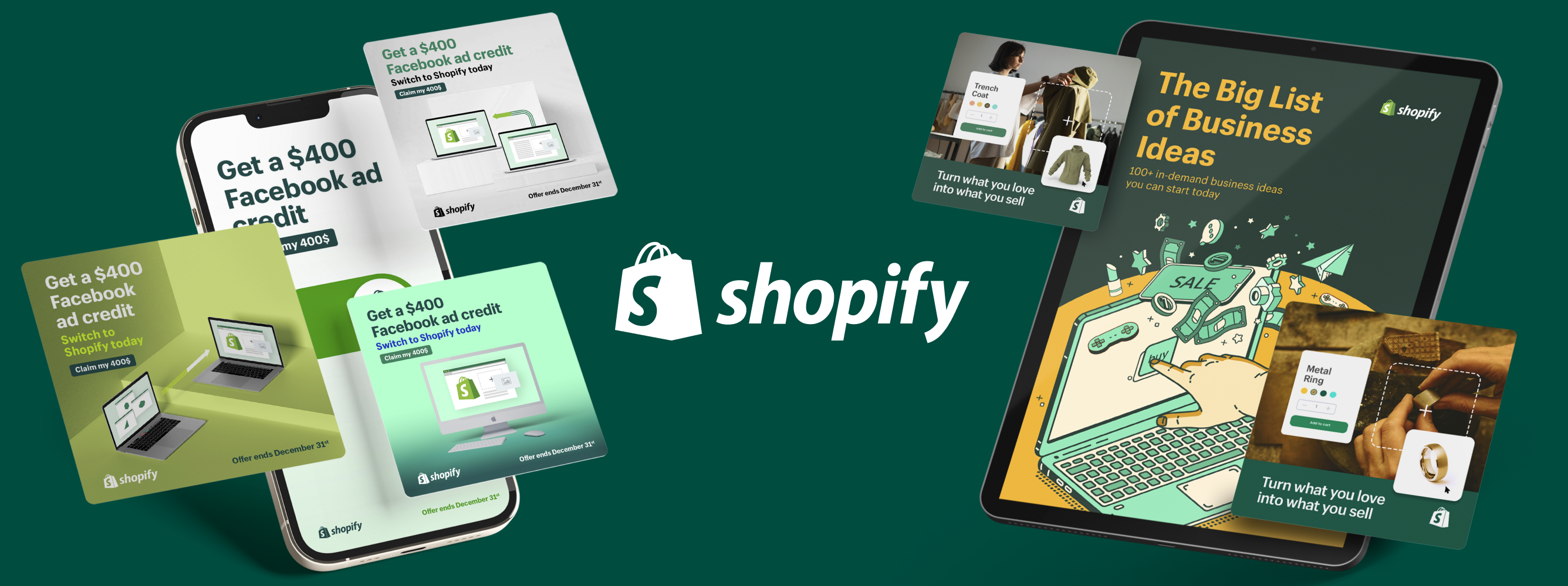
15 Free Ad Templates To Save You Time (And Money)

The average person comes across up to 10,000 ads every single day.
Think about this for a second: Out of all the ads you’ve seen today, which ones can you remember?
Chances are, you’re going through countless images in your mind right now–images that were designed specifically to pique your interest. But, like I said, how many of them actually stick out in your mind?
Designing ads goes beyond aesthetics.It’s about creating a meaningful experience for the consumer in a way that resonates with them for a long time.
This is why finding the right ad templateis key to making your brand stand out.
Let's Dive in:
What Are Ad Templates?
Ad templates refer to pre-built layouts of varying sizes, styles and features which can be used to create full-fledged ads for various platforms.
You can modify these templates as you wish with the option to update your logo, add images, customize fonts and various other design components of your choice.
So without wasting any more time, here’s a full list of free ad templates online along with recommended ad specs and easy design tips.
Facebook Ad Templates
a. Feed
Ad Specs:
- File type: JPG or PNG for images; MP4, MOV or GIF for videos
- Resolution: At least 1080 x 1080 pixels
- Aspect ratio: 1.91:1 to 1:1 for images; 1:1 (for desktop or mobile) or 4:5 (for mobile only)
- Text: 125 characters
- Headline: 27 characters
- Description: 27 characters
- Video duration: 1 second to 241 minutes
- Video captions/sound: Optional but recommended.
Quick design tips:
1. Snappy copy
According to research conducted by the Mobile Marketing Association, our brains need less than half a second to engage with mobile advertising. Make sure you limit all text to a few words.
2. Consistency
Make sure your ad’s design is similar to your landing page’s design. This involves using the same type of colors, fonts and imagery.
3. Highlight value
Using bold letters and color contrast is a good way to highlight key points in an ad.
4. A/B test
Facebook gives you the option to run A/B tests(link to article on A/B Testing and Split Testing once published) which can help you zero in on the right design for your ad.
Read More: How PointCard Used Superside to Boost Their Ad CTR by 240%
b. Stories
Ad Specs:
- File type:JPG or PNG for images;MP4 or MOV for videos
- Maximum duration: 5 secs for images; 60 secs for videos
- Aspect ratio: 9:16 and 4:5 to 1.91:
- Maximum file size: 30 MB for images; 4 GB for videos
- Subtitles/Captions: Need to be added to videos
- Sound: Optional
Quick design tips:
1. Simplicity
A simple design that includes a captivating background image, short copy and limited graphics works well for stories.
2. Pick colors wisely
Choose a color palette according to the market you’re targeting. Follow the 60-30-10 rule: 60% of one neutral color, 30% of a color meant to evoke emotions and 10% of an accent color. Fun fact: Blue is the most popular color in the world.
3. Key messages
Place your key message or brand elements right at the beginning of the ad. This is necessary because people view stories faster than any other form of content.
4. Mixed formats
Campaigns with mixed format assets (motion and static) have a higher chance of driving more value for lower-funnel metrics.
c. Carousel
Ad specs:
- File type: JPG or PNG for images; MP4, MOV or GIF for videos
- Resolution: 1080 x 1080 pixels
- Aspect ratio: 1:1
- Number of carousel cards: Minimum 2; maximum 10
- Video length: Up to 240 minutes (15 seconds recommended)
- Headline: 40 characters
- Link description: 20 characters
Quick design tips:
1. Unique image
Make sure the first image of the carousel is unique enough to encourage customers to swipe through the rest of the ad post.
2. Pay attention to all components
Don’t ignore all the other elements that go into making a great carousel ad post including creative headlines, fun descriptions and CTA buttons.
3. Make the post cohesive
Since you will be using multiple images/videos in the same post, try and include content with comparable themes.
4. Connect to your landing page
Small businesses can use carousels to display all their inventory.
Download Free Ad Templates For Facebook
Canva
Browse through thousands of high-quality Facebook ad templates for carousels, stories and feed for free.
vistacreate
Perfect if you’re looking for the right visual for your feed ad or want to create an entertaining video story.
PicMonkey
Opt for a free trial and get access to a huge collection of customizable ad templates.
Read More: How to Design Effective Facebook Ads in 2023
Instagram Ad Templates
a. Feed
Ad specs:
- File type: JPG or PNG for images; MP4, MOV or GIF for videos
- Resolution: 1080 x 1080 pixels
- Aspect ratio: 1.91:1 to 1:1 for images, collection and carousel; 1:1 (for desktop or mobile) or 4:5 (for mobile only) for videos
- Video duration: 1 second to 241 minutes
- Number of carousel cards: 2 to 10
- Headline: 27 characters for images and videos; 32 characters for carousel; 40 characters for collection
- Landing Page URL: Required for carousel and collection
Quick design tips:
1. Humanize your brand
When you show real people using your product or service, you’ll be able to make it seem more relatable. Images with people in them perform better.
2. Neutral background
Make certain details of your product stand out by having a plain backdrop.
3. Focal point
Creating a focal point can make product recognition easier for viewers.
4. Captions
Include enough text or captions to provide context for videos that appear with the sound off.
b. Reels
Ad specs:
- File type: MP4 or MOV
- Resolution: Minimum 500 x 888 pixels; 1080 x 1920 pixels recommended
- Aspect ratio: 9:16
- Video length: 15-30 seconds
- Captions/Sound: Optional but strongly recommended
Quick design tips:
1. Use Reels Insights as a content guide
Take a look at your Reels analytics to determine which style of content to make.
2. Add audio
Instagram recommends using music in reels as it can help your content blend in with all the other reels–making it seem more organic.
3. Avoid too many visual distractions
Try not to place too many stickers or GIFs in one reel.
4. Include a CTA button
Point your customers in the right direction by including a clear call-to-action in your reels.
Quick design tips:
1. Vertical format
Stories are likely to be viewed full screen so make sure your ad is designed to deliver the perfect mobile experience.
2. Interactive
You can always get more creative and include polls or quizzes to encourage viewers to interact with your stories.
3. Brand your stories
Viewers need to instantly recognize your brand so use the same colors as your company’s logo or website.
4. Announce offers
With the limited timeframe available to capture consumer interest, story ads can also be used to announce incentives such as discounts or free shipping.
Download Free Ad Templates For Instagram
postermywall
Get access to over 390,000 high-quality Instagram ad templates along with easy-to-use editing features in a jiffy.
pixelied
Making Instagram ads will be a breeze with these ready-made templates available for every occasion.
Vimeo
Sign up for free and start creating captivating Instagram video ads by choosing from hundreds of templates.
Read More: 11 Instagram Ads to Inspire You
Google Ad Templates
Ad specs:
- Top performing ad sizes: Medium rectangle 300 x 250; Large rectangle 336 x 280; Leaderboard 728 x 90; Half page 300 x 600; Large mobile banner 320 x 100; Netboard 580 x 400
- Skyscraper display ad sizes: Wide skyscraper 160 x 600; Skyscraper 120 x 600; Portrait 300 x 1050; Half-page 300 x 600
- Leaderboard display ad sizes: Leaderboard 728 x 90; Large leaderboard 970 x 90; Billboard 970 x 250; Top banner 930 x 180; Panorama 980 x 120
- Mobile ad sizes: Large mobile banner 320 x 100; Mobile banner 320 x 50
- Size limit for image ads: 150 KB
Quick design tips:
1. Don’t overlay logos and text
Google recommends using images with naturally embedded logos and text.
2. Use organic backgrounds
Natural shadows and lighting work better as compared to digital backgrounds.
3. Create contrast
This is especially helpful for making your CTA button pop. Use contrasting color or edit brightness and saturation.
4. Refresh campaigns
Take advantage of holidays and popular events to come up with new design ideas for old campaigns.
Download Free Ad Templates For Google
Template.net
If you’re looking for Google ad templates, you’ll have plenty to choose from by signing up for as little as $2 per month or simply use the free ad templatesinstead.
PhotoAdKing
Create a free account and get access to a nifty display ads maker that allows you to customize pre-built templates as you wish.
Envato Elements
Sign up for a 7-day free trial and choose from various templates of varying sizes for your Google ad design.
Ad specs:
- Sizes:300 x 250 (popular); 468 x 60 (banner); 728 x 90 (leaderboard banner); 250 x 250 (square); 120 x 600 (skyscraper); 320 x 50 (mobile leaderboard)
- Size limit: 150 KB
Quick design tips:
1. Clean design
A banner cluttered with too many messages orimages is not likely to be effective in persuading consumers to take action.
2. Show off your product
Banner ads provide an opportunity to prominently display your product and potentially entice customers into buying it.
3. Don’t make it boring
Get creative with your copy and design by using catchy headlines, vibrant colors and different font sizes.
4. Add animations
Static banner ads are not likely to get you the same attention as ones with some movement in them.
Download Free Ad Templates for Banners
Creatopy
Make the most of their huge collection of free design templates–categorized according to industry types.
Desygner
You don’t even need to create an account to start using their free ad templates which come with easy editing tools as well.
BannerBoo
Each template offers free fonts, optimized Google Adwords, GIF Animations and an HTML5 constructor. Jackpot!
Read More: Tips for Effective Banner Ads
TikTok Ad Templates
Ad specs:
- File type: MP4, MOV, MPEG, 3GP or AVI
- Resolution: 720 px (popular); 540 x 960 or 640 x 640
- Aspect ratio: 9:16, 1:1, or 16:9
- Video duration: 5-60 seconds; 21-34 seconds (recommended)
- Ad description: 1-100 characters (no emojis)
Quick design tips:
1. Show the product first
According to TikTok, 63% of all videos that show their product or key message within the first 3 seconds get the highest click-through rate (CTR).
2. Jump on trends
Using new effects or the latest editing trends can help your brand get noticed faster.
3. Overlay text
40% of auction ads with the highest view-through rate (VTR) have used text-overlays including stickers and effects.
4. Music
Use songs that'll appeal to your target audience.
Download Free Ad Templates For TikTok
Promo
Keep your credit card aside and select from any of the eye-catching video ad templates for your brand.
Kapwing
From reaction videos to vlogs, find a template that’ll go perfectly well with your campaign, apply a few edits and you’re good to go!
Simplified
Apart from adding your own colors, text, music and illustrations, you can even use an AI copywriter to generate copy for your TikTok template.
Read More: Everything You Need to Know About TikTok Advertising
The Best Ad-vice
With so many helpful online resources available, making ads is no longer a mammoth task for designers and marketers. As newer opportunities open up for increasing brand awareness, businesses can greatly benefit from leveraging online tools that allow maximum creative freedom while keeping advertising costs low.
People Also Ask
What are ad templates?
Ad templates refer to pre-built layouts of varying sizes, styles and features which can be used to create full-fledged ads for various platforms.
Why are ad templates used?
Ad templates help save time as you can customize them however you like. You can even find free ad templates online that can help you reduce your advertising costs.
How are ad templates used?
AAd templates feature pre-built layouts which can be modified using editing tools. Options include updating your logo, adding images, customizing fonts and various other design components of your choice.
What platforms can ad templates be used for?
You can find templates for specific platforms such as Facebook, Instagram, TikTok and Google–allowing you to build ads within minutes.
Sofie is an SEO and content specialist. From being a journalist at your daily news television broadcast, to producing films and writing travel blogs; she has ended up at the more technical side of content and has a nose for sniffing out the creative pieces that will make your competitors look like digital noobs.
When not busy operationalising Content, she is happily cooking up a storm, hiking through the mountains or searching for the best flight tickets to her next travel destination.
You may also like these

The creative power of data: How to go beyond numbers
Over the last ten years, access to marketing data has gone from a slow drip to a virtual tsunami of performance data, social media metrics and marketing analytics. Creative teams are swimming in data—unfortunately, without lifeguards.We've talked to over 200 creative leaders who, like you, wish data came with a mute button. In our Overcommitted Report, 76% of leaders said they feel burned out, and 78% say the demands on their teams are exceeding their capacity.The solution? Using data to improve workflows and inspire your team.The problem? Knowing how to cut through the noise (and the data points) to focus on what matters.Simply put, it's not how much data you have but what you do with it. We were lucky to have two creative leaders, Malik Sulieman, Creative Director at Cash App, and Ryan Hammill, Creative Director at ServiceNow, join us on our Overcommitted Virtual Summit to share how they pair data and creative insights to reduce burnout and help their teams create fantastic work.
Enterprise Graphic Design RFP Best Practices (Checklist Included)
For enterprise and mid-market businesses looking to enhance their creative capabilities and scale overall capacity, issuing graphic design RFPs are an essential part of the formalized procurement process for agencies, contractors and other external partners.RFPs create a structured, transparent framework for assessing and comparing service proposals from different outsourced creative partners.As an internal stakeholder, your opening role is to lay out your creative needs and timelines, communicating efficiently to prospective partners exactly what you’re looking for in a business relationship.In turn, these prospective creative service partners are asked to put their best feet forward demonstrating why their capabilities, capacity, skills, tools and scale are the best fit.On average, respondents spend around 30 hours of writing time developing their proposals. While it varies, you can expect to put just as much time into writing your RFP, evaluating the responses, communicating with procurement and selecting the winner of your work and budget.
8 Creative Agency RFP Templates for Enterprise Teams
Creative agency requests for proposals (RFPs) are conversation starters—incredibly important icebreakers.Mid-market and enterprise teams issuing the requests are introducing their brands, key business challenges and expectations of their creative service partners. Conversely, prospective partners use this information to pull together their responses.It’s a high-stakes, high-effort process for everyone. Communication breakdowns mean neither side gets what they need. More than ⅓ of brands get incomplete or inaccurate responses to their creative service RFPs.


