The Definitive Guide To Cross-Channel Marketing

Marketing is not an island.
You can’t develop an efficient marketing campaign without taking into account the needs of the consumer.
While consumer behavior remains as unpredictable as ever, it can be a challenge for brands to keep track of what they want (and when they want it).
That’s where cross-channel marketing comes in. As technology continues to make our world smaller, multiple platforms offer many opportunities for marketers to create a cohesive communication strategy that helps connect their brand with their target audience while staying true to their brand identity.
Want to create a truly seamless cross-channel marketing strategy? There are a few things you’ll need—mainly quality design and a clear roadmap—which we’ll explore below.
What Is Cross-Channel Marketing?
Cross-channel marketing is all about having a holistic marketing strategy that communicates the company message across all marketing channels. From social media to print ads, the core of a cross-channel strategy focuses on brand consistency and clear messaging.
Messages for these channels are designed to provide a unified experience for the consumer with a focus on moving them across the different stages of the customer journey.
Unlike other similar forms of multichannel marketing, cross-channel marketing is more targeted in its approach as it is undertaken for a single campaign.
For example, if a customer adds something from your website to their cart but abandons it midway, the next step in such a strategy would entail having a reminder message pop up on the website, encouraging them to finish their purchase.
Or, in a pro marketing move, you could create an email automation that instantly sends out a reminder if something has been sitting in their cart for a certain period of time. This is the core meaning of cross-channel marketing.
Read More: How Pakt Used Superside to Create a Consistent Brand Across All Channels
Benefits Of Cross-Channel Marketing
Adopting a cross-channel strategy can reap major benefits for marketers in the long run. Aside from building trust with the customer, it is also effective in personalizing the whole brand experience for them.
Once marketers gain a better understanding of customers’ problems, they can tweak certain elements of their campaign to show how their product or service can potentially provide digital solutions to those specific problems. To gain awareness of your customers’ problems you can prioritize social listening in multiple social media channels like LinkedIn, Twitter, and Facebook. If you’re lucky, you can also find potential customers on the way, and by extracting some of their emails via a LinkedIn email finder, you can add them to your campaign list and send them customized and helpful emails about your services.
This can lead to increased engagement as customers will be more eager to interact with the brand and find out how it can make their lives easier.
Not only can cross-channel marketing help attract new consumers, but it can also be used to nurture a sense of loyalty in old customers.
This will, of course, greatly depend on how quickly customer issues are resolved with a service desk —combined with a genuine interest in making their overall experience as seamless as possible.
Apart from building brand recognition, brand consistency will help differentiate your product or service from those of competitors.
It’s also an easy way to build a positive image in the minds of your consumers through the use of strategic colors, images, videos and key messages.
Interestingly, a recent study concluded that consistency in branding efforts can lead to a 20% increase in revenue for the company.
How To Maintain A Consistent Brand Identity Design
Achieving design consistency can be a piece of cake when you know how to go about doing it right.
1. Develop a brand style guide
Create a brand style manual, with clear design guidelines, that include the company’s mission, logo, color palette, fonts, tone of voice, imagery and any other visual elements. This will help the rest of the design team stay on brand.
A. Brand colors:
Arrange a color scheme that reflects your brand identity traits. First, look into color psychology to understand what each color means. Then, choose colors that closely match those traits: select a core color followed by 2-4 secondary colors.
B. Fonts:
This will be closely related to your brand’s personality. Certain font types such as serifs are ideal for traditional brands looking to earn respectability and trust. Sans Serif fonts, on the other hand, go well with modern brands, giving their copy a clean and sleek look.
C. Logo:
Your brand guidelines need to clearly display which variations of your company’s logo are acceptable. This should include both vertical and horizontal placements.
D. Images:
Set rules for the type of images that can be used in any of the marketing materials. For example, are images of people okay? If so, what types of people? You can even mention which filters are acceptable for the brand.
E. Tone of voice:
Curate a list of terms and phrases that can help your copywriters better understand how the brand wants to communicate with its customers—do they want a fun and humorous approach? Or a serious and respectable one?
2. Make your creative assets accessible
It’s always a good idea to invest in an asset management tool that helps you organize your on-brand materials in one place. This way, your marketing and design teams can easily access your visual assets such as product images, color guides, ad templates, etc. while working on different campaigns. But most importantly, it’ll help your brand identity design remain consistent at all times.
3. Plan in advance
Whether it’s a seasonal campaign or a promotional event, it’s necessary to stay on top of things, including edits that need to be made to ensure brand consistency. The only way to achieve this is to plan ahead for campaigns, especially when you have quite a few of them happening around the same time. When you start preparing weeks in advance, you’ll have enough time to schedule all your marketing assets and review performances.
4. Recycle design elements
There’s no harm in reusing content by giving it a new look or design. It’ll save you and your team plenty of time and effort. Plus, it’ll also give you a chance to reach out to newer audiences who probably haven’t seen the old content yet.
5 Examples Of Brand Consistency Done Right
1. Packt
As a publishing company that specializes in educational IT books and videos, Packt initially struggled to establish a consistent brand image. After growing massively as a company for over two years, it was time for a major brand overhaul.
We were approached by Oliver Huggins, Product Director at Packt, who wanted to update the company’s brand guidelines with clear design frameworks and templates.
Superside’s design team started from scratch, focusing on creating a visual identity that resonated with their audience. Adopting a data-driven approach, we decided on a strong minimalist design—especially for the landing pages—that now looked clean and consistent.
The same sleek design was also extended to their logo, which retained the company’s signature brackets. At the end of the brand refresh, Packt’s “no-frills” design helped it regain the trust of its customers and maintain authority in software development.
You can read the full Packt Case Study here
2. PointCard
When it comes to Fintech companies, most designers think it’s easier to settle for a subtle, minimal look that’s all business and no play. However, PointCard decided to differentiate itself from its competitors by opting for a more bold design that included neon colors and eye-catching headlines.
Clearly, they wanted to change the way people thought about banking: making it seem more fun and friendly to their audience. Partnering with our designers, the PointCard team developed fresh ideas and concepts for their upcoming ad campaigns.
From “unboxing” video ads with motion design to showcasing a lifestyle built around exclusivity, the company launched various projects that helped increase brand awareness, boost engagement and ultimately, build a consistent brand identity.
PointCard’s marketing success also proved that it pays to stand out from the crowd: whether it’s by creating a unique visual style or by deliberately taking a counter-intuitive approach.
You can read the full PointCard Case Study here
3. Brio
Brio Systems demonstrated brand consistency at its best by undergoing a major creative revamp—right in the middle of a pandemic.
With the need for an efficient COVID testing service increasing across the US, the healthcare company decided to position itself as a safe and reliable expert by building a fresh visual identity: including a new website, product packaging and other marketing materials.
Reaching out to Superside for a complete brand overhaul, our creative team started with the core aspect of the company’s branding: designing its logo. But one thing was certain: Brio Systems needed creative direction, and they needed it fast.
From then on, Superside focused on building a holistic brand experience that would help showcase the company’s efficiency in all facets of COVID testing and logistics. This involved integrating a consistently fresh and straightforward design in all of its marketing collateral including business cards, eBooks and lab testing kits.
With major improvements in brand image, Brio’s case proved that you don’t need to have a long-standing history of brand consistency: you can begin anytime, even during a pandemic.
You can read the full Brio Case Study here
4. Antler
Visionary brands were not born to fit in: as is the case with Antler; an early-stage venture capital firm known to invest in some of the world’s most promising tech companies and solutions.
Reimagining such a brand meant exploring ground-breaking concepts and ideas that could easily be translated into exceptional visuals. It was difficult to overlook the global appeal of Antler’s vision: which is why we decided to humanize the brand by celebrating inspirational people making a difference in the world.
This was reflected in Antler’s marketing copy as well as the color palette which maintained the brand’s primary red color but with different shades occasionally added to bring a warmer, human feel to their brand. Shades of green including teal, dark teal and mint green created a more distinct, fresher look.
Images featuring close-ups of founders helped to further amplify the brand’s message. At the end of the 3-month project, it became evident that brand consistency goes well beyond creating pleasing aesthetics: it’s also about highlighting the value a brand can bring into people’s lives.
You can read more about our Antler work here
Otto
If you ever thought paying bills was boring, meet Otto. As the one-stop shop for managing bills and subscriptions, the brand wanted to reinvent the way bills are paid and turn it into something fun and playful. Since Otto did not have a style guide, this gave Superside enough creative freedom to think of an entirely new concept: illustrations.
These helped to convey more emotions than regular images would—and they looked aesthetically pleasing too—giving the company a softer, friendlier vibe. The illustrations featured several popular purchases including food, electronics, fashion accessories and make-up items. This was done with a view to capturing people’s interest while creating brand awareness.
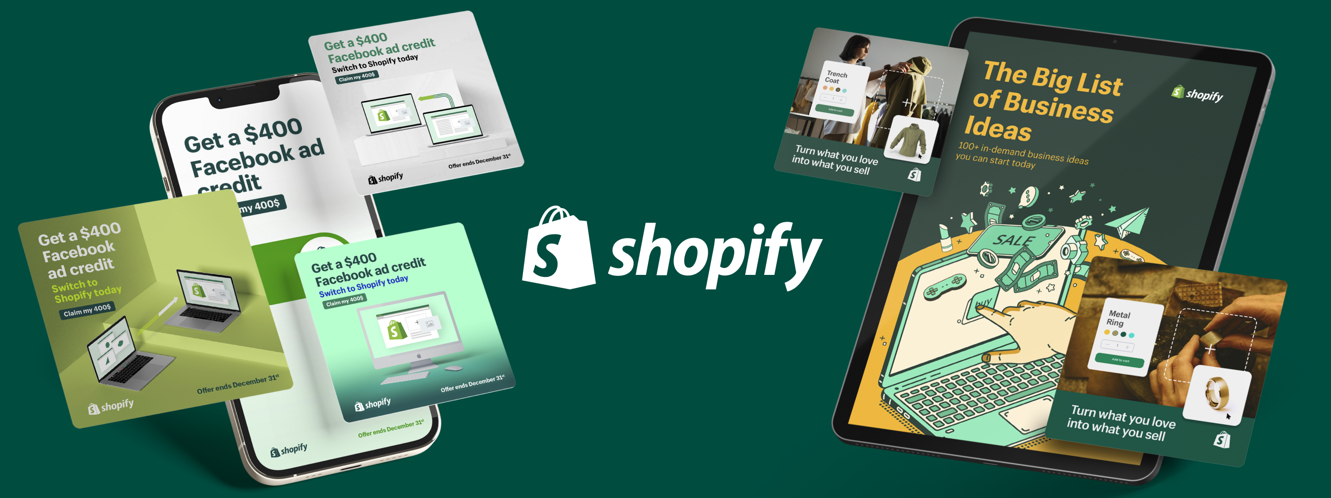
It’s interesting to note that illustrations are also a part of design strategies for many big brands including Reddit, Shopify and Salesforce (all of which use Superside for their design needs). This is an important lesson in brand consistency: if you’re working on developing a brand identity design, there’s no harm in doing it in a way that brings joy to your customers, regardless of which industry you’re in.
You can read more about our Otto work here
How to Grow Your Brand Consistently
A successful cross-channel marketing strategy is one that values the customers’ needs above everything else. Once you’ve gathered enough data about your consumers, you should work on developing meaningful interactions with them at every touchpoint. If your cross-channel strategy does not include a clear plan for brand consistency, then your efforts are bound to go unnoticed.
Brands that seek to please their target audience understand the importance of having a clear visual identity which can help them become easily recognizable in the market. This includes a seamless integration of specific design elements across all channels while staying true to the brand’s core message.
As technology advances and artificial intelligence (AI) becomes more common, brands will be in a better position to anticipate consumer expectations and respond to them in real time. This implies that companies must be prepared to adopt newer tools that could potentially help them learn more about their target audience.
Sofie is an SEO and content specialist. From being a journalist at your daily news television broadcast, to producing films and writing travel blogs; she has ended up at the more technical side of content and has a nose for sniffing out the creative pieces that will make your competitors look like digital noobs.
When not busy operationalising Content, she is happily cooking up a storm, hiking through the mountains or searching for the best flight tickets to her next travel destination.
You may also like these

An expert 7-step brand strategy framework
In an era where businesses are under pressure to produce results quickly, it’s easy to see branding as just another box to check off. However, a well-thought-out brand strategy framework isn’t just a marketing play—it’s a foundational business tool that helps teams prioritize messaging, work more efficiently and create long-term impact.During Superside’s Overcommitted Virtual Summit, branding expert and Twilio VP of Brand Adam Morgan delved into how companies can build brands that stand the test of time. Morgan, a veteran of branding initiatives at Adobe, Splunk and Twilio, provided a wealth of insights on how to approach branding with intention, align brand identity with business goals and ensure it connects deeply with customers. Dive in to learn more about the importance of purpose, audience alignment and strategic execution—all while keeping in mind the challenges of overcommitment and burnout that many creative teams face.Why branding matters more than everThere's a common misconception about branding strategies that they're just about visuals and logos. Morgan emphasized that brand strategy is about creating an emotional and strategic connection between a company and its audience.
7 top creative support solutions for teams and enterprises
There’s no denying that today’s marketing and creative teams are under more stress than ever. To deliver high-performing, top-quality assets at scale, many teams are getting fewer resources, smaller budgets and tighter deadlines.As an ever-increasing number of brands compete for audience attention, the demand for compelling content is getting higher—and essential for creative teams to meet.It’s no surprise then that in-house marketing and creative teams are turning to advanced creative support solutions to help enhance efficiency, streamline workflows and optimize production processes.From AI-powered design to cloud-based collaboration software and outsourced creative services, these solutions transform how teams work, allowing them to produce more assets faster without compromising quality.Our best advice to teams and enterprises on how to get this right? Make Superside your creative team’s creative team and free up your team to do their best work.
How to find creative partner agencies to boost 2025 strategy
Are your internal creatives battling to keep up as the demand for authentic, trustworthy content grows? For many brands, outsourcing creative makes sound financial sense. Plus, partnering with an experienced creative services team can bring fresh ideas and impressive scalability.80% of customers say that the experience a company provides is just as important as its products or services, meaning that driving great customer experiences is essential in 2025. Once again, creative partnerships pay dividends, as many creative agencies go well beyond KPIs to drive genuine cultural impact and build trust.Unlike traditional agencies, creative partner agencies also typically act as an extension of your team. Work with Superside, for example, and our talented designers will become your creative team’s creative team.


