


The Evolution of Fashion Magazine Cover Designs


With respect to Anna Wintour’s notion that “The best cover is always the next one, the one you haven’t seen yet,” the evolution of graphic design behind some of the world’s most iconic fashion magazines is certainly something to commemorate.
In light of the recent annual Met Gala that invited celebrities and cultural icons alike to embody the extravagant spirit of “camp,” we decided to take a look at how various fashion magazines have drastically changed their cover design over the decades.
From Vogue to Cosmopolitan, Harper’s Bazaar to Vanity Fair, the evolution of front covers is symbolic of ever-changing social movements. Through bolder font, increasingly vibrant colors, and far more sexually explicit images, the magazine covers have served as a timeline of cultural relevance and digital design progress.
We’ve compiled fashion magazine covers by decade from the 1900s to present day that demonstrate the obvious evolution of design, specifically, what the design tells us about the decade.
1900s: The ‘Virtuous’ Modern Woman
Cosmopolitan
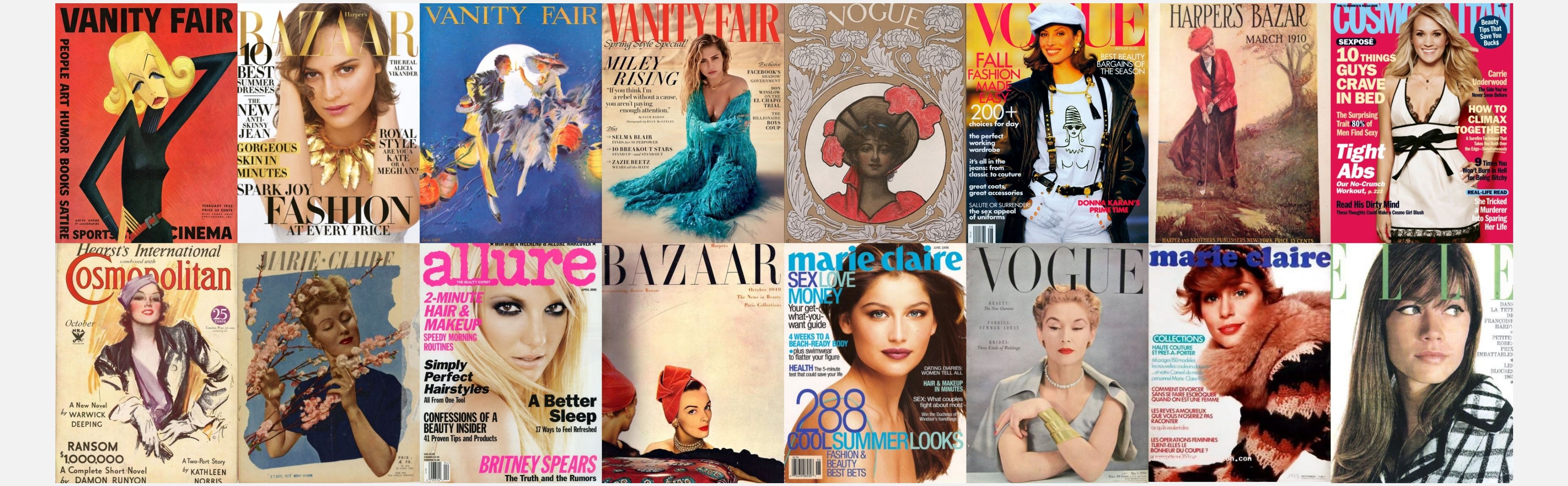
Originally a literary publication, Cosmopolitan is the modern woman’s reference for all things sexual, relationships, entertainment, and beauty. The front cover illustrations of the magazine’s beginnings illustrated wholesome women and famed artwork, a contrast to the more recent covers that are far more sexualized.
This cover from the 1900s is a prime example of the captivating artwork that the magazine was once so well known for. The cover includes no text, aside from the publication’s name, and the colors are quite dull compared to modern day covers.
Vogue
Revered as the “fashion encyclopedia,” Vogue Magazine debuted in 1892 and has delivered the most relevant fashion styles ever since. Despite its unwavering commitment to being a fashion-centered publication, the magazine has evolved tremendously over the years, reflecting a shift in both style and culture.
This early cover of Vogue shows an illustration of a woman in a red dress, accessorized with a hat and red flowers. The cover itself is quite plain, with a simple floral design surrounding the illustration and the name of the publication at the top. Aside from the red, there is nothing too visually striking about this magazine’s early cover.
1910s: The Jazz Age
Vanity Fair
One year after purchasing the magazine known as Dress (1913), Condé Nast revamped and relaunched it, appointing it with the new title we all know and love today: Vanity Fair. This cover portrays a bold, visually compelling design that truly represents the elaborate, Jazz-Age-inspired leadership of Frank Crownishield.
In his first editor’s letter, Crownishield declared that “young men and young women, full of courage, originality, and genius, are everywhere to be met with.” The magazine’s crisp typography sits boldly above an illustration of a man and woman dancing in the moonlight, embodying the vivacious spirit of the Jazz Age.
Harper’s Bazaar
Founded by New York-based publishing firm Harper & Brothers, the magazine was born in 1867, originally spelled as Harper’s Bazar until the “a” was added decades later. As the early issues advertised, this publication was launched with the intention of being “a repository of fashion, pleasure, and instruction,” for the modern US woman.
This cover from the ‘10s focuses on an illustrated woman golfing, thus representing both the theme and target audience of the magazine: women’s lifestyle. There is little text on the cover, aside from the publication name with the date underneath, as well as the publishing firm and price. But certainly no text eluding to the magazine’s content.
1920s: The Roaring ‘20s
Vogue
Illustrated by Georges Lepape, this ‘20s cover upholds Vogue’s classy reputation and reveals a different typography than what readers see on the magazine’s cover today. This typography, from nearly 100 years ago, boasts an elegant, free-hand style that more closely resembles artwork than the modern digitally-designed covers. This contrast in typography between present day Vogue covers and early 20th century covers is credited to the fact that cover lines were relatively inexistent in the early years. Text and logos were not confined to a consistent size or placement, giving room for various typography.
The cover’s minimalist design offers a visual appeal unique to other publications that feature more intricate – arguably a bit cluttered – designs.
Harper’s Bazaar
Harper’s Bazaar’s covers were in full swing in the 1920s with such vivid color and design. This cover truly embodies the themes of the Roaring ‘20s, with an illustrated woman in an elaborate red, yellow, and orange dress dancing carefree above outstretched arms.
There is little if any text on the cover and the magazine’s logo spelling has not yet changed to the ‘double a’ spelling that readers are familiar with today.
1930s: The Great Depression
Cosmopolitan
During the Great Depression that pummeled the nation throughout the ‘30s, women met with a new role that extended well beyond the traditional household caretaking. To make ends meet, many women in the 1930s rolled up their sleeves and entered the workforce. According to the Censuses taken in 1930 and 1940, the number of women holding professional jobs increased by 20.
This Cosmopolitan cover certainly depicts a far more confident woman than past cover illustrations. The cover also shows bolder, more vibrant colors of red and purple, with text that is significantly larger and more distinct.
Vanity Fair
The 1930s witnessed the temporary death of Vanity Fair at the hands of the Great Depression. With far more concerning matters on people’s minds, Vanity Fair’s usual audience lost interest in the publication’s usual lighthearted satirical content.
The artistic illustration in this cover shows a sad woman, a fair depiction of mutually felt emotions that were running rampant during the Depression.
1940s: World War II.
Harper’s Bazaar
Fashion expert Carmel Snow was at the helm of Harper’s Bazaar during the 1940s, later passing on the battalion to her niece, Nancy White. During the family’s long reign over the magazine, Art Director Alexey Brodovitch branded his mark into the publication with his “innovative art direction.” The magazine has earned an undisputed reputation for its visual style, even being referred to as “a photographer’s magazine.”
This cover demonstrates an evident shift in design, one of the most notable features being the change in spelling of the publication that we know today. Another change is in regards to the artwork, which is far more realistic and captivating than prior decades.
Marie Claire
A magazine so provocative and enticing that it required police to guard the newsstands that sold it, Marie Claire was launched by Jean Prouvost in 1937. The magazine’s immediate success could be best credited to its fashion and beauty-centric content combined with serious journalism that featured lengthy, controversial articles.
This 1940’s cover reveals the magazine’s iconic design, produced on luxury paper and displaying an airy layout with beautiful illustrations and sketches.
1950s: The Rise of Female Stars
Cosmopolitan
Cosmopolitan made a significant shift in cover design during this decade. With female icons taking the global stage by storm, such as Marilyn Monroe, Audrey Hepburn, and Elizabeth Taylor, the magazine began using actual photographs of women.
This cover shows Julie Harris posing front and center with text underneath. Unlike its predecessors, the cover’s text has nothing to do with recent novels and all to do with the star’s rise to fame.
Vogue
Once Vogue began to embrace Didone typefaces in the ‘50s, it became a permanent design component of the front cover that we still see to this day. This typeface boasts delicate hairline strokes that settle nicely over photographs, as well as bolder strokes that make the text readable and avoid weighing down the overall visual look.
The cover itself is certainly more chic than past issues, with a grey background and a photographed woman surrounded by black text. The text is delicate and fine, preserving the classy and simple design that is signature to Vogue.
1960s: The Sexual Revolution
Cosmopolitan
When Helen Gurley Brown stepped up as editor-in-chief of the magazine in the ‘60s, she implemented the theme of the decade’s ‘sexual revolution’ to completely revamp Cosmopolitan. The once wholesome, literary magazine transformed into a provocative publication, attracting the more modern sexually-liberated woman.
The famed illustrations and front cover artwork were replaced by photographs of female icons in little clothing and in sexually explicit poses. With magazine sales booming, the front cover design’s new direction towards single, sexually-free, career-oriented women proved to be a massive success.
Elle
Launched in 1945 by Hélène Gordon Lazareff, Elle was hardly a fashion-centered publication in its early years. Lazareff set out to produce a publication that would put “a particular emphasis on freedom, feminist demands, and the consumer society,” says the French National Audiovisual Institute.
This cover from the ‘60s shows the model looking over her shoulder, dressed in a conservative, stylish jacket. The cover design is simple, featuring an overall black and white layout with only the magazine title serving as a pop of color.
1970s: Out with the Old and In with the Bold
Vogue
This issue shows the continuation of the bold color trend introduced in the ‘60s, but leans much further away from the magazine’s usual simplistic, elegant design. There is significantly more text on the cover, delivered in a variety colors and font sizes.
While Vogue traditionally steered clear of sexually explicit visuals, especially compared to Cosmopolitan, there is a slightly more sexual undertone to this cover. With the model sensually glaring at the camera, this is perhaps a deliberate representation of the sexual freedom that more women embodied in the prior decade.
Marie Claire
It seems simplicity went out of style in 1970s, as this Marie Claire cover also illustrates far more color and diverse typography than the minimalist covers of past decades. The publication’s title stands out proudly in bold color and larger font. There is also more text on the cover than ever before, with contrasting red and blue colors.
1980s: Striking Fashion…and Colors
Vanity Fair
The magazine that had once been revered as the “gold standard for the so-called smart magazines of the era” resurrected in 1983 and was taken over by Tina Brown in ’84. Brown propelled Vanity Fair into the second half of the 20th century, with a reservoir of photographers, writers, and iconic celebrities.
This cover features the photographed King of Pop surrounded by bold text. There is little written content on the cover page, giving the magazine a sharp, striking effect.
Harper’s Bazaar
This cover signifies the increasingly popular use of bold colors, in addition to significantly more text than what the magazine included in past editions. A range of colorful fonts and varying font sizes paint this issue of Harper’s Bazaar, which seems to be more focused on sexuality than fashion.
Aside from the suggestive textual content, the model’s facial expression is for more seductive than past cover photographs.
1990s: A Farewell to the 20th Century
Vogue
Vogue continued to implement bold color choice and diverse font sizes to create visually enticing covers. The publication’s signature logo remained the same, positioned behind the full-length photograph of the featured woman. Powerful female role models of the decade were continuously featured on the publication’s covers.
Marie Claire
Like many of the other fashion magazines that we’ve seen, Marie Claire eventually evolved from the more virtuous female illustrations to a theme of liberation in regards to sexuality, career, and fashion.
As opposed to past publications, this Marie Claire cover from the ‘90s focuses far less on fashion, showing only the model’s face and bare shoulders. Bright blue colors stretch across the issue in the form of bold, sexually eluding text.
2000s: The Turn of the Century
Cosmopolitan
Introducing the Cosmopolitan of the 21st century. Clad in an array of bold colors, varying text styles, and ever-present sexual dialogue, this modern issue is a prime example of the drastic change in design that accompanied the turn of the century.
Allure
Founded in 1991 by Linda Wells, this beauty-centric magazine quickly emerged as one of Condé Nast’s leading beauty publications. Allure’s front cover that we see here reveals the bright colors and font types that are so prominent among women’s magazines of the 2000s. The font types range from smaller to large, making for a visually riveting cover.
2019: Where are They Now?
Vanity Fair
After a quarter of a century at the helm of the magazine, Graydon Carter bequeathed his title to Vanity Fair’s present day editor-in-chief, Radhika Jones. This cover attests to the magazine’s commitment to relaying relevant pop culture and stunning photographs. Miley Cyrus, one of the most relevant pop icons of today, is featured on this 2019 cover.
Despite the publication’s tumultuous history – from initial launch to post-Depression downfall to its ‘80s resurrection – it has remained a relevant literary icon well into the 21st century.
Harper’s Bazaar
America’s first-ever fashion magazine has truly stuck to its guns, continuing to serve as the influential women’s lifestyle publication that it intended to be from its birth.
A culmination of the most recent fashion and cultural happenings, this cover reveals a more intricate magazine logo. Although it has much more text than its original issues, the complimentary bold color choice of black, gold, and white create a clean, visually appealing design.
Allure
Michelle Lee, the magazine’s present-day editor-in-chief, confirmed that there was a new look in the works for the magazine that was unveiled in March. Terms that include “refresh” and “evolution” best describe the magazine’s most recent evolution.
Compared to the cover from the 2000s, this 2019 cover is far more simplistic with little text. The “Spring Goes Bold” print accurately describes the cover’s design theme, with bold font color, a bold yellow background, and even bold eyebrows on the famed model, Kendall Jenner.
Looking Forward into the Future
The evolution of design in fashion magazine front covers serve as a visual timeline of our history. Advancements to the graphic design relay the societal feelings and changes that were so prevalent in each decade. “Together, these magazine covers reveal a peek into our history,” says filmmaker Karen X. Cheng. “Sure, we’ve gotten more sexualized. More Superficial,” Cheng continues. “But we’ve also gotten more open-minded. At each step along the way, society has pushed the limits of what’s considered acceptable.” It will certainly be interesting to discover how fashion magazines will continue to push these limits moving forward.
Graphic design boasts an undeniable importance for industries across diverse backgrounds. Whether it be logos, advertisements, or brand identity, it is critical for a business’s success to deliver high-quality graphic design.
Superside's graphic design services offer a selection of top-rated design professionals who exhibit impeccable qualifications and graphic design skills. Our solutions range from magazine design services to motion design. Paired with our dedicated account managers who are on standby 24/7 and you have yourself results that exceed design and brand expectations.
You may also like these

25 best multichannel brand campaigns in 2025 for inspiration
The evidence is clear: Multichannel marketing works.In fact, recent research reveals that 95% of marketers believe that integrating multiple marketing channels in ad campaigns improves audience targeting, according to industry. Companies with strong multichannel marketing campaigns experience a 9.5% rise in annual revenue and 91% higher customer retention rates.With so many top campaigns and great ideas out there, you might be wondering what can work best for your business this year, based on marketing goals, your industry and who's able to scale as much as you need.A leading creative subscription service like Superside offers a powerful way to grow your business with speed and efficiency, as we have done with top brands and enterprises for years now.Of course, taking inspiration from others is a wise place to start. Work through this curated list of creative ad campaign examples to find ideas for your next campaign.
15 Corporate Presentation Design Ideas & Services for 2025
Compelling presentations are deal-makers: They captivate audiences and drive decisive outcomes.In fact, the visual storytelling research is pretty convincing. 85% of people remember what they observed in a presentation three hours later, compared to 70% who recall what they heard. After three days, 60% remember the images, but only 10% remember the spoken content.Your presentations must be first-rate. They should simplify complex ideas, showcase information in an easy-to-grasp way, and tell persuasive stories.As an industry leader in corporate presentation design, Superside combines innovative tools, creative expertise and strategic thinking to craft professional visual stories for customers worldwide.You'll find the info on this page invaluable if you’re looking for the best enterprise presentation design service. Superside’s team shares a few killer corporate presentation design ideas to help you lift your game.
The 15 Types of Graphic Design in 2025 (With Real Examples)
Graphic design is more than just aesthetic appeal. It is a critical element of communication that can be used to inform, persuade, and engage audiences. When done well, graphic design can help businesses to reach new customers, build brand awareness, and drive sales.In this article, I'll take a look at the different types of graphic design and share examples of each.Fundamentals Every Graphic Designer Should KnowGraphic design focuses on creating visual content to communicate messages clearly and effectively, but this is just the tip of the iceberg.All the visual elements, graphic design principles and graphic design skills necessary to succeed create a cocktail that varies depending on the type of graphic design you are working on.