
Movie posters first appeared in 1895, when L'Arroseur Arrosé, a short black-and-white silent film, had its first screening. In the beginning, movie posters' role was to advertise incoming films, and once the run was complete, they were sent back to the distributor. In the U.S. the National Screen Service was the only company responsible for film poster distribution; they sent the posters between theaters throughout the country. After 1984, studios assumed control of their own posters and began producing and distributing them more broadly.
Design standards are constantly changing, though the movie business draws on a combination of fresh ideas and proven tricks. There are two standard sizes for movie posters in the U.S.: One Sheet is 27”x40” and Bus Stop is 40”x60”. Over the years, trends for movie posters have evolved from hand-painted designs to highly-graphical productions that rely on tried-and-true styles of fonts, colors, and positioning. But more on that later—first, let’s look at the 50+ movie posters from 2019 that made it to the Academy Awards, and then we’ll discuss how they fit in or stand out from the trends.
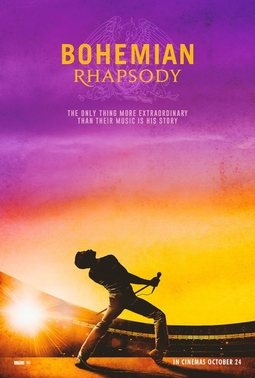
Bohemian Rhapsody
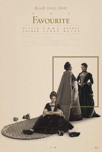
The Favourite
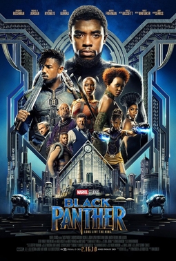
Black Panther
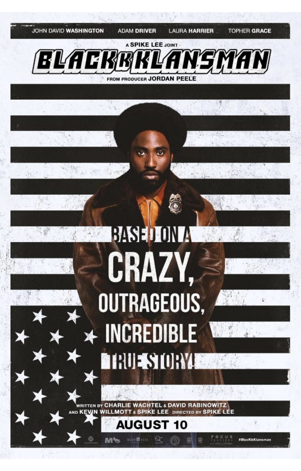
BlacKkKlansman
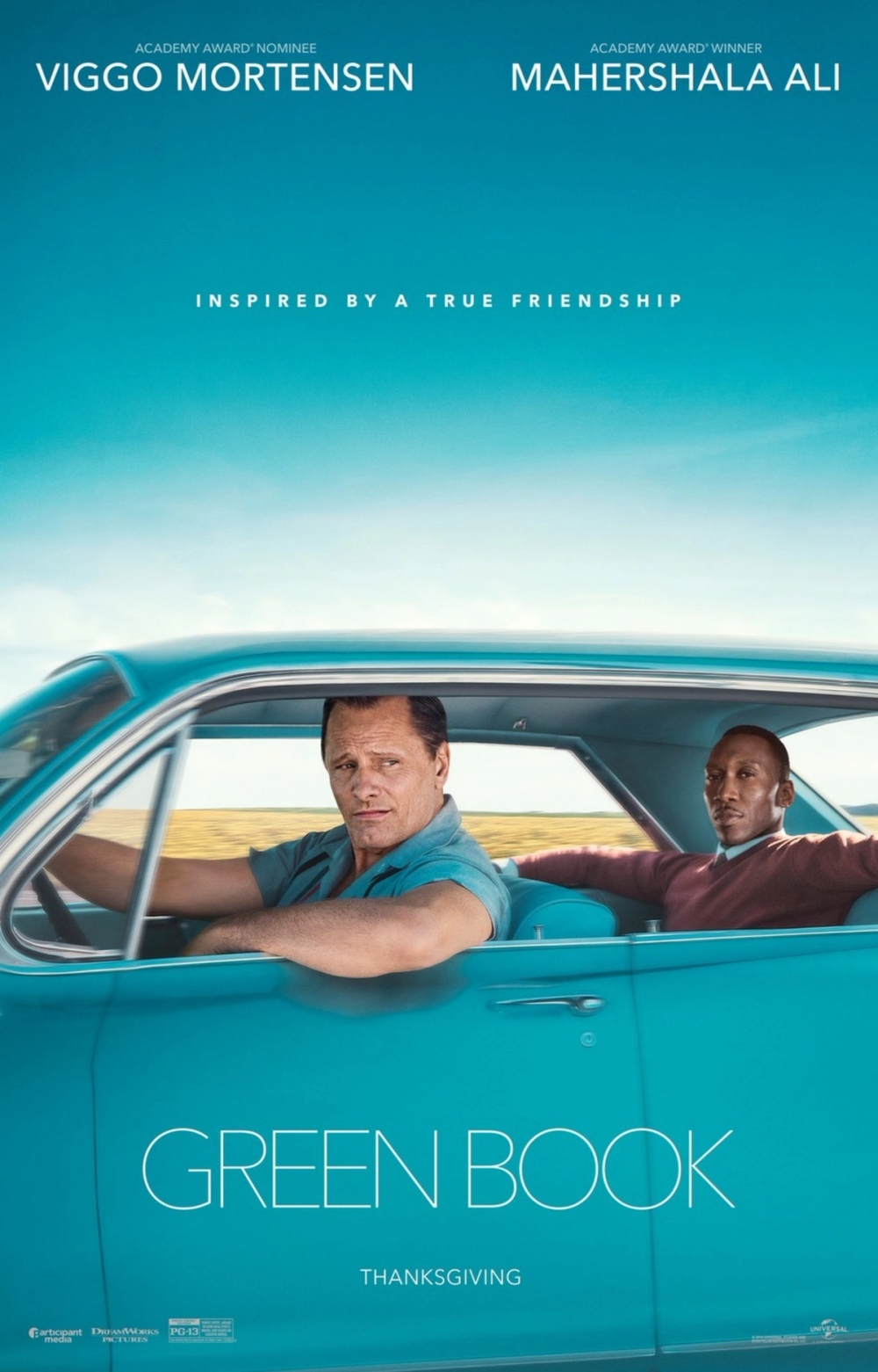
Green Book
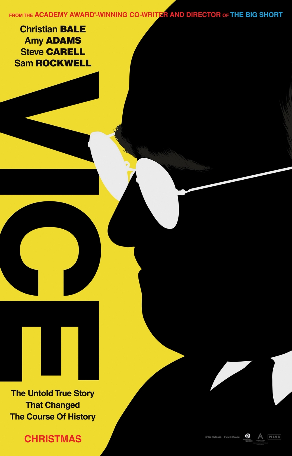
Vice
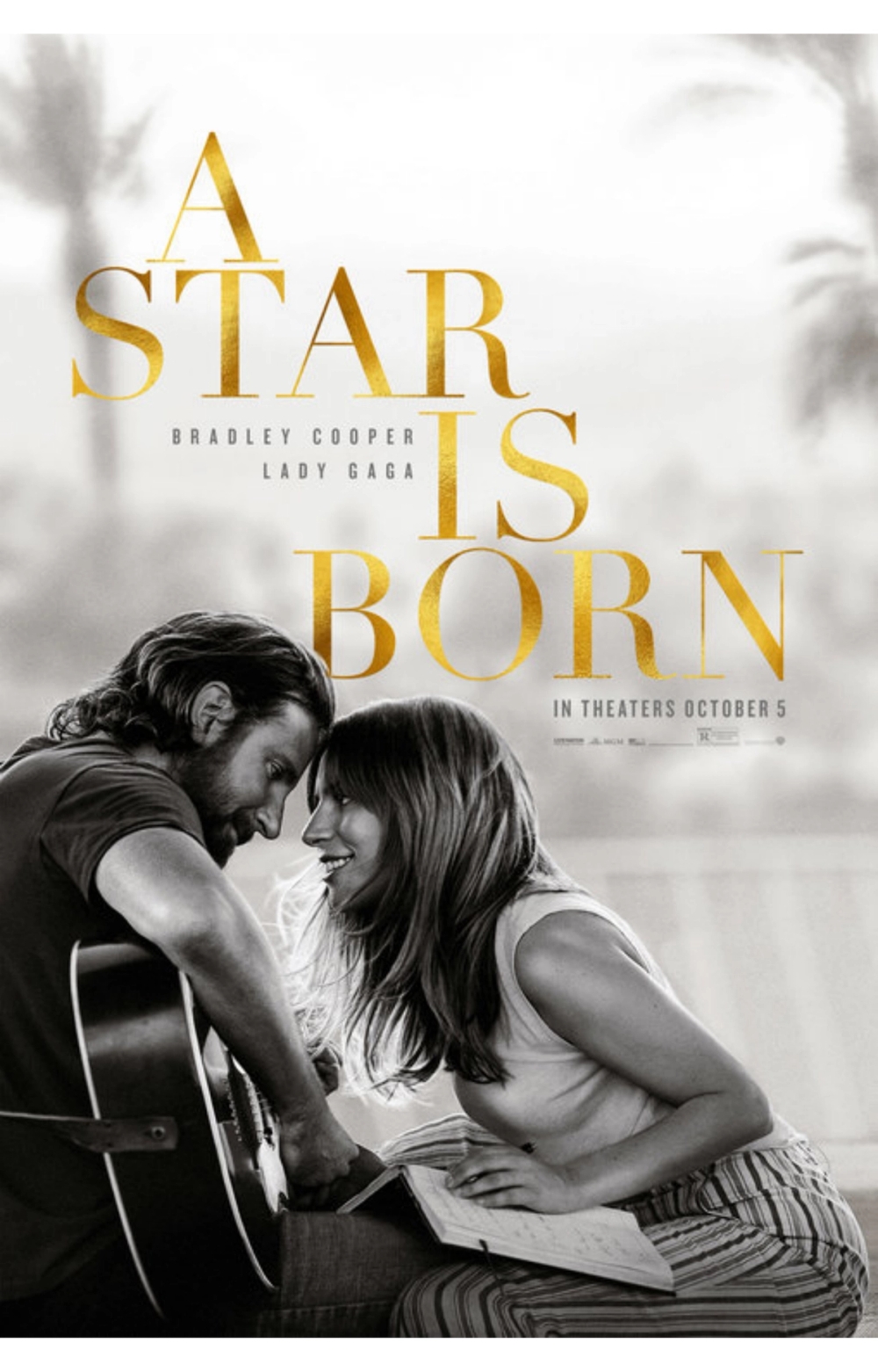
A Star Is Born
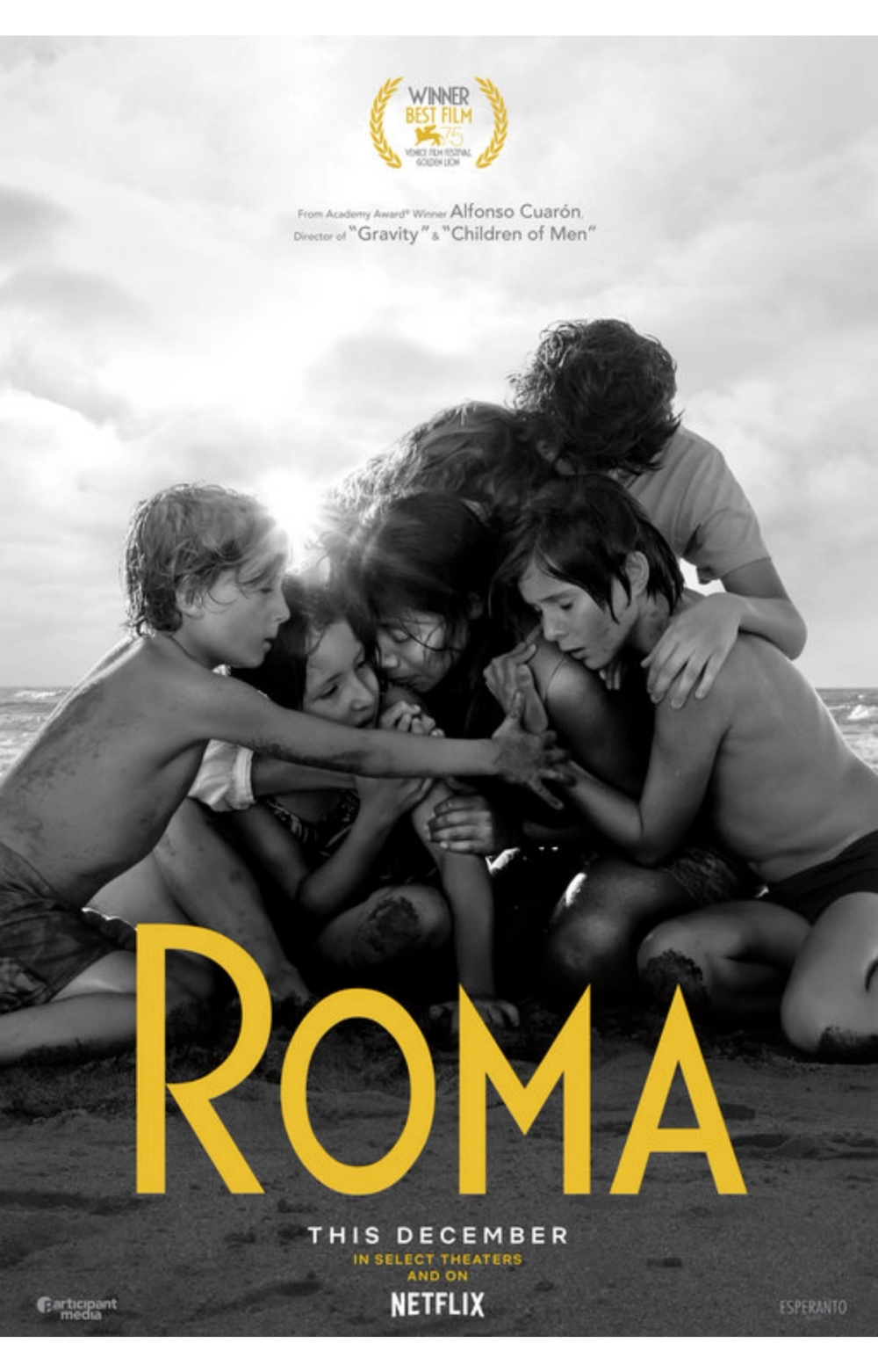
Roma
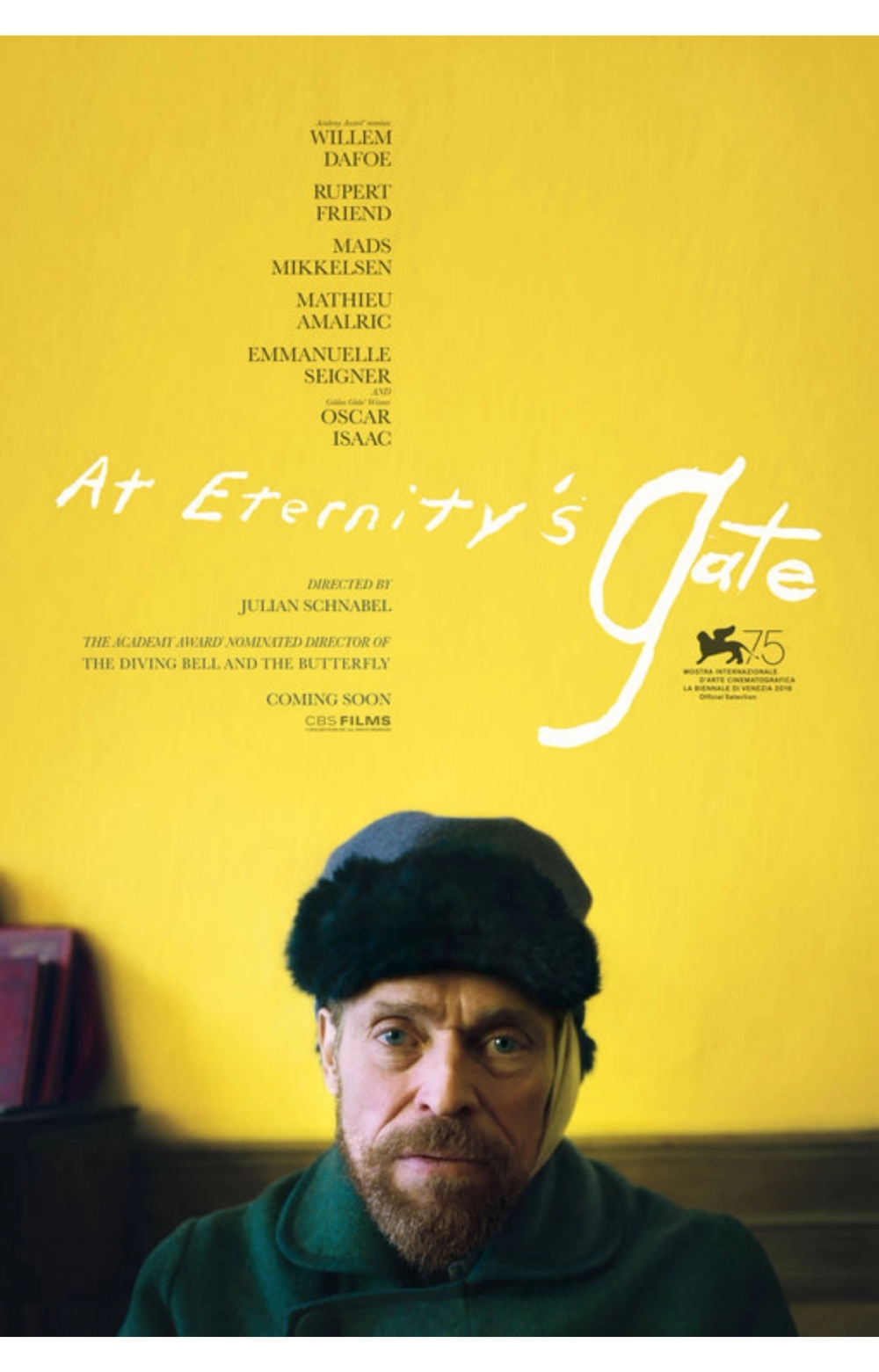
At Eternity's Gate
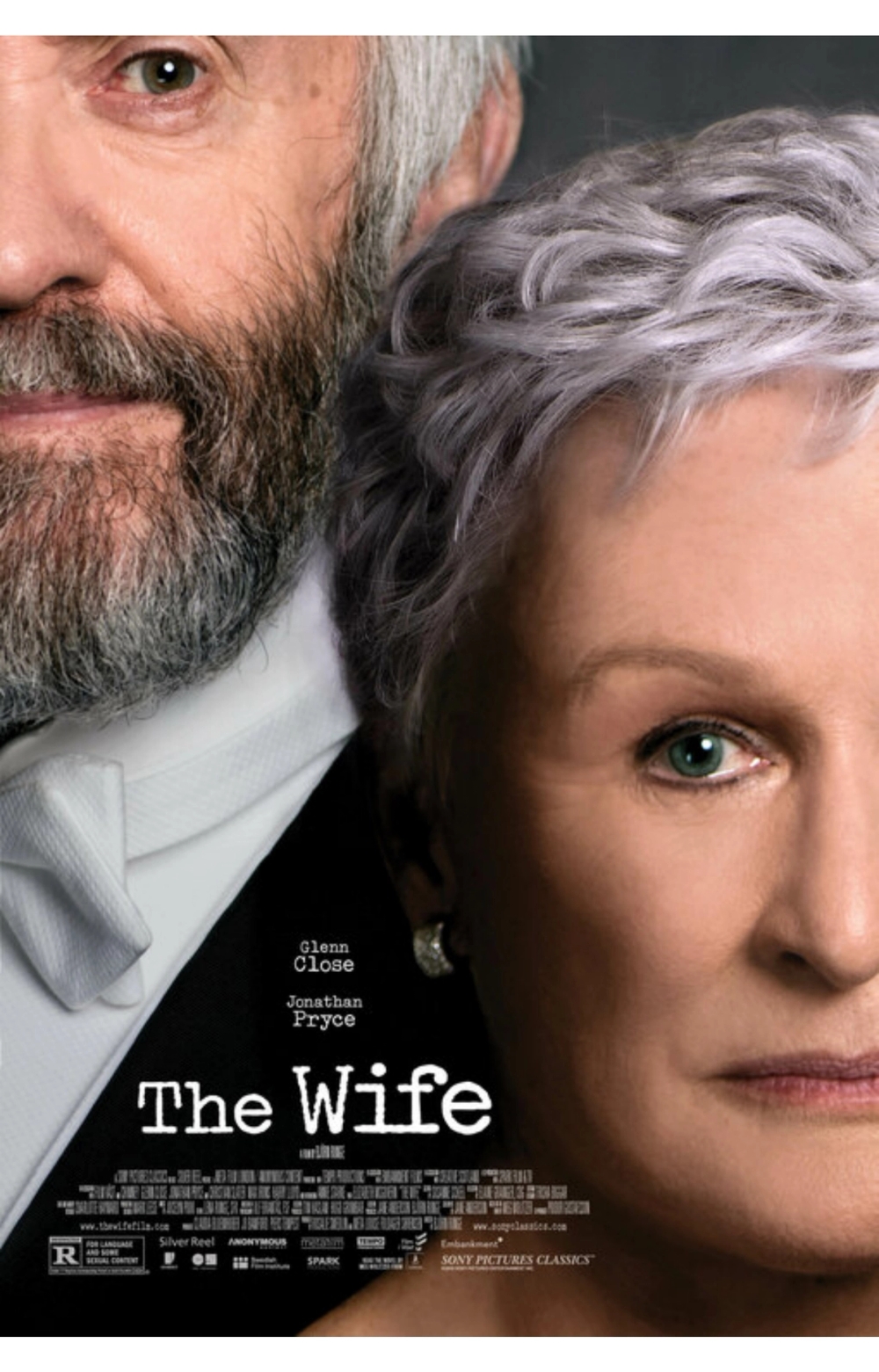
The Wife
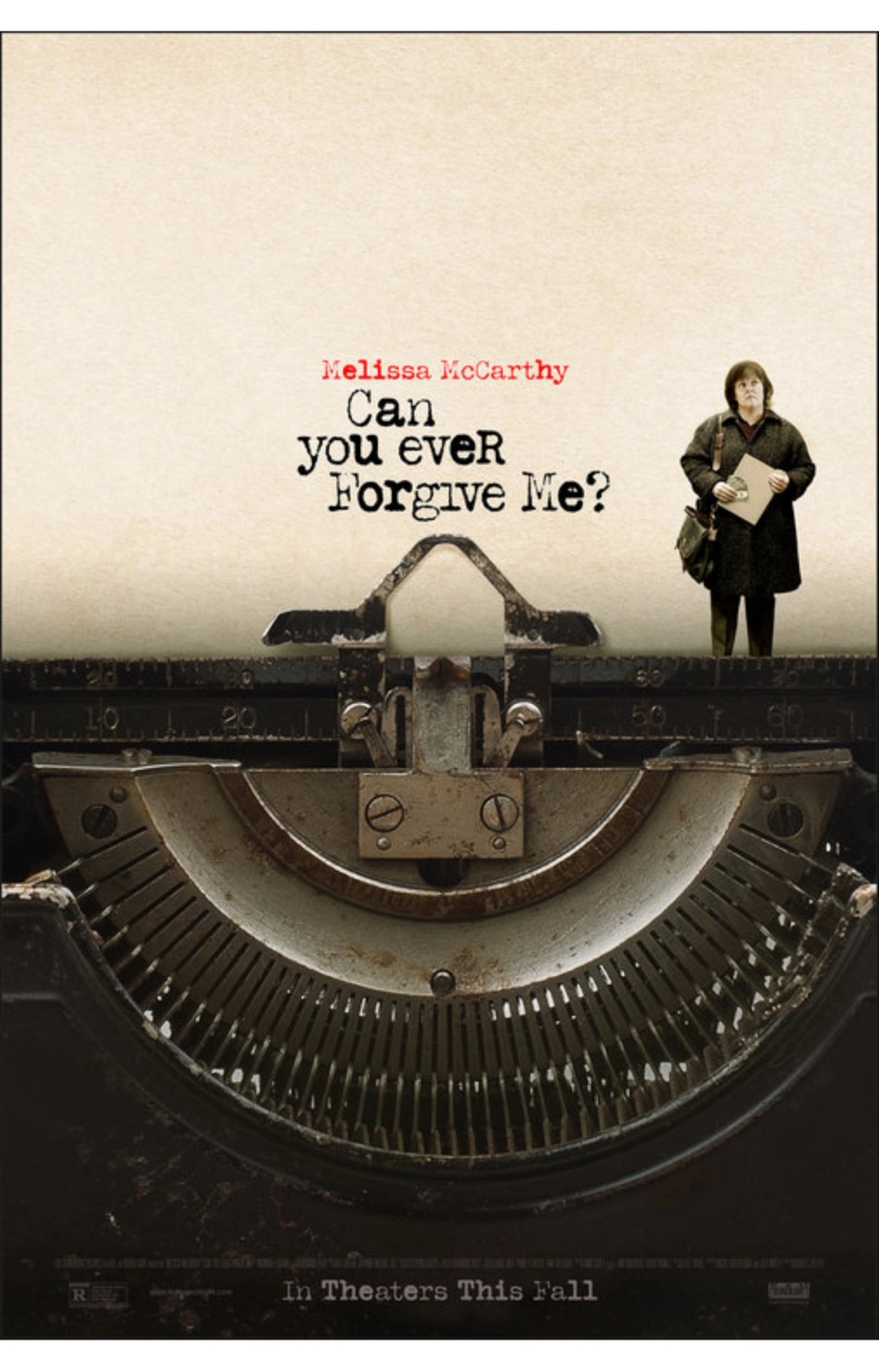
Can You Ever Forgive Me?
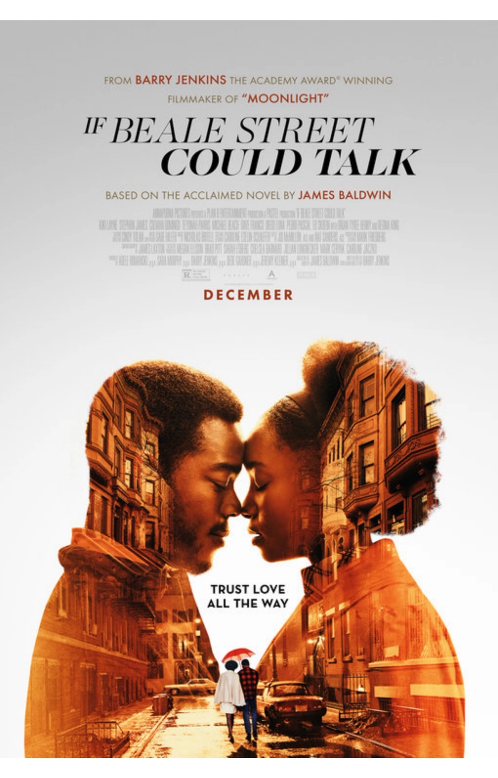
If Beale Street Could Talk
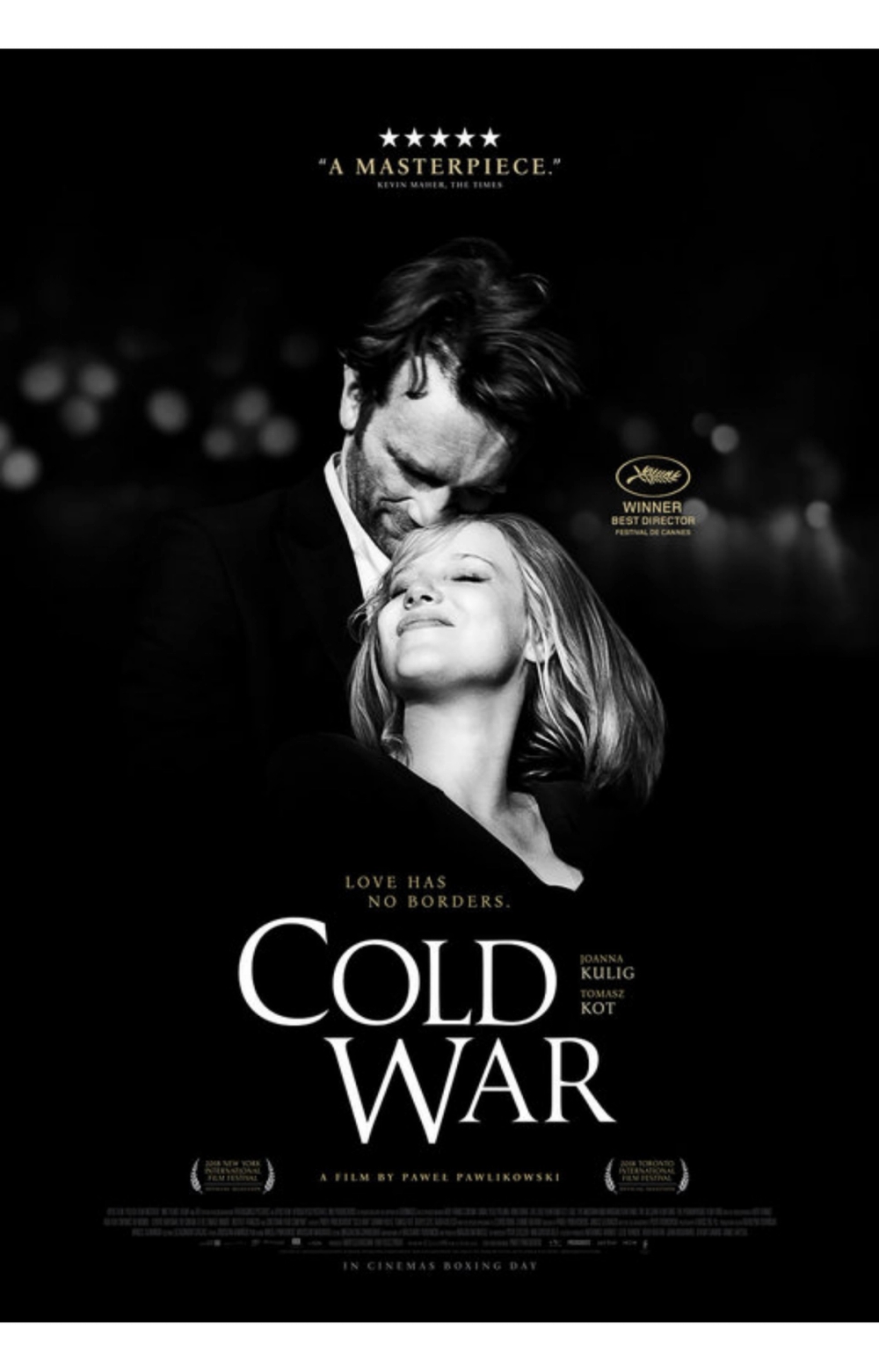
Cold War
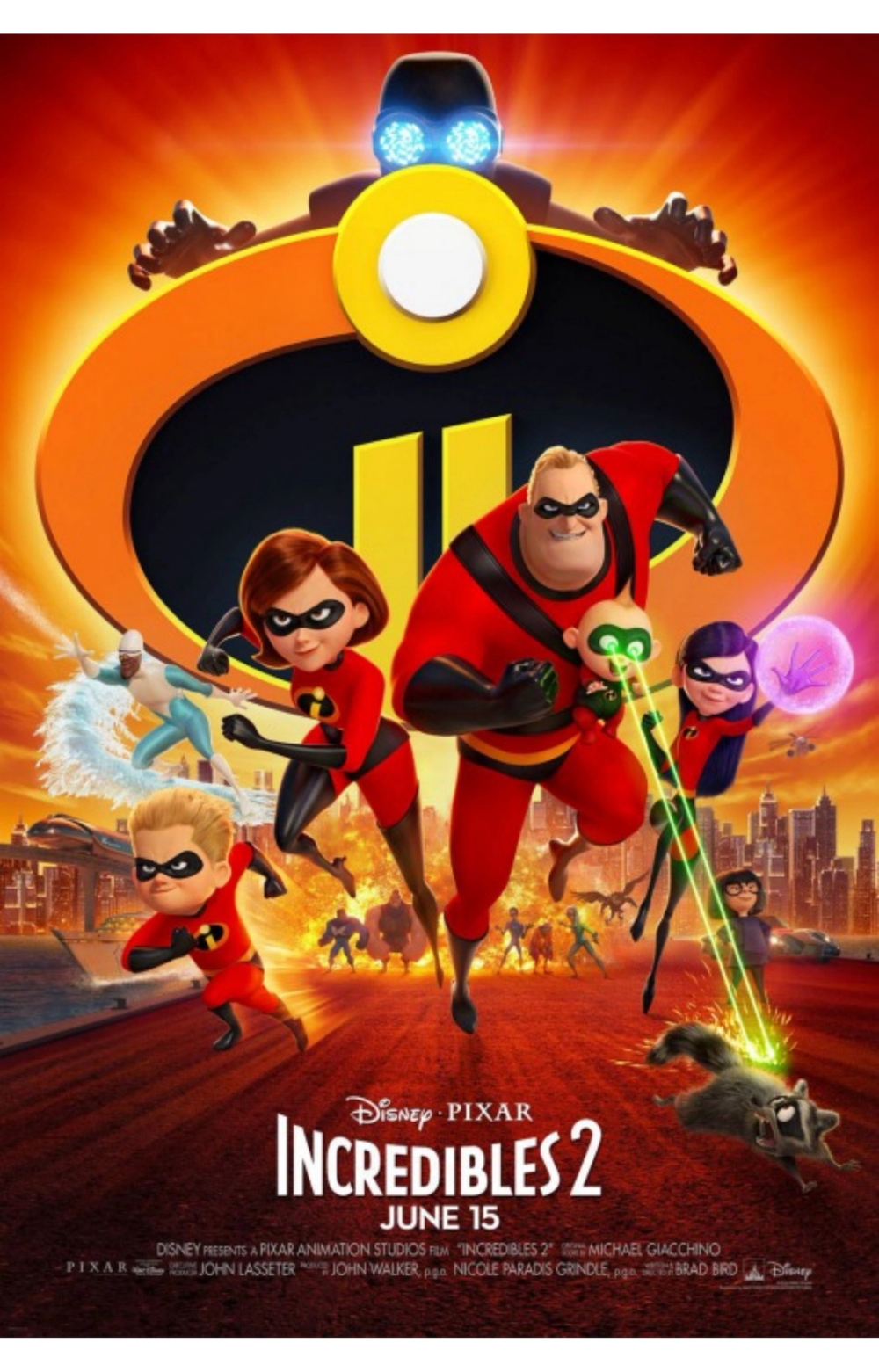
Incredibles 2
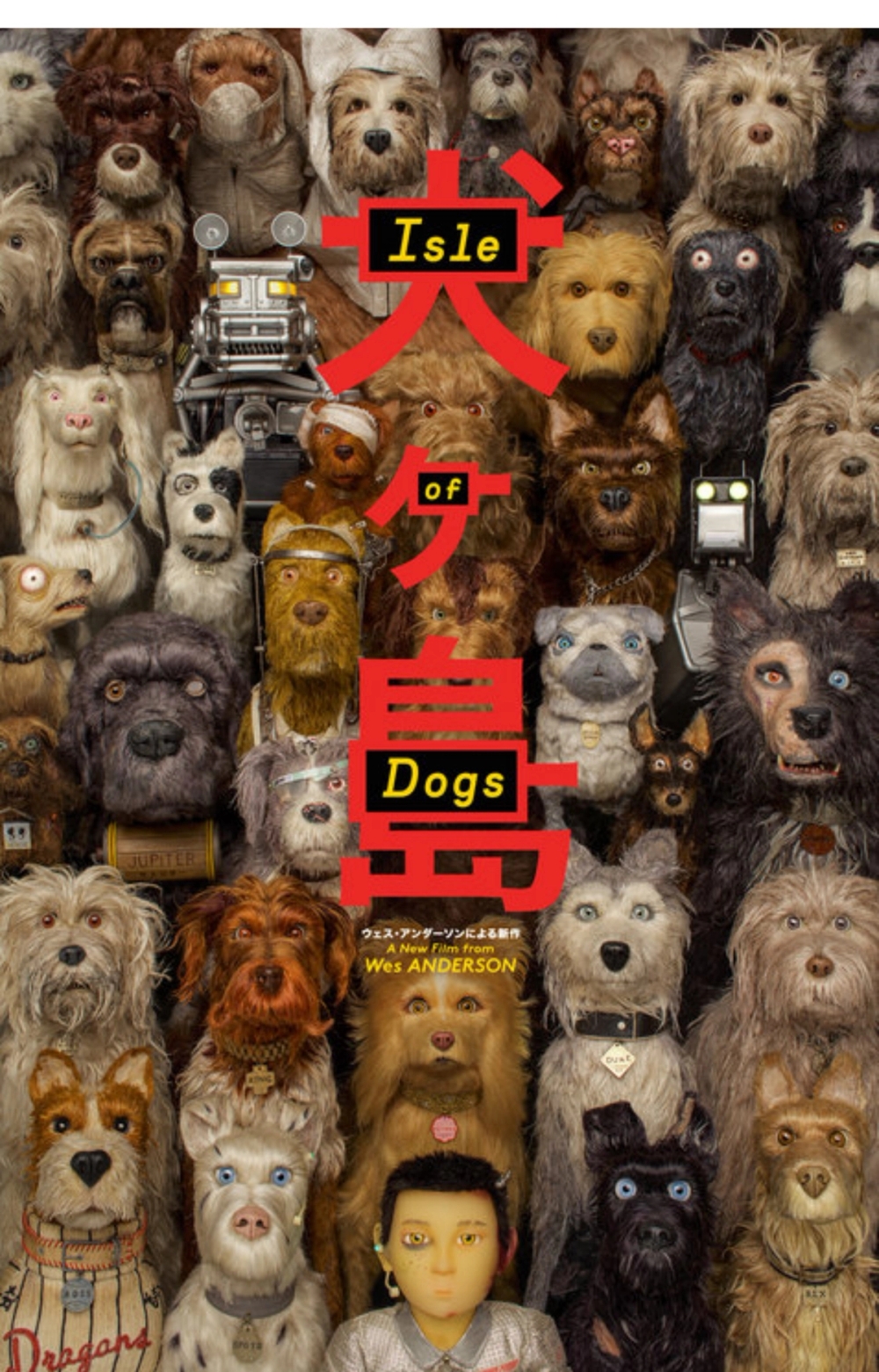
Isle of Dogs
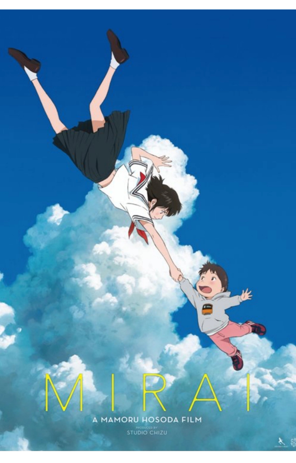
Mirai
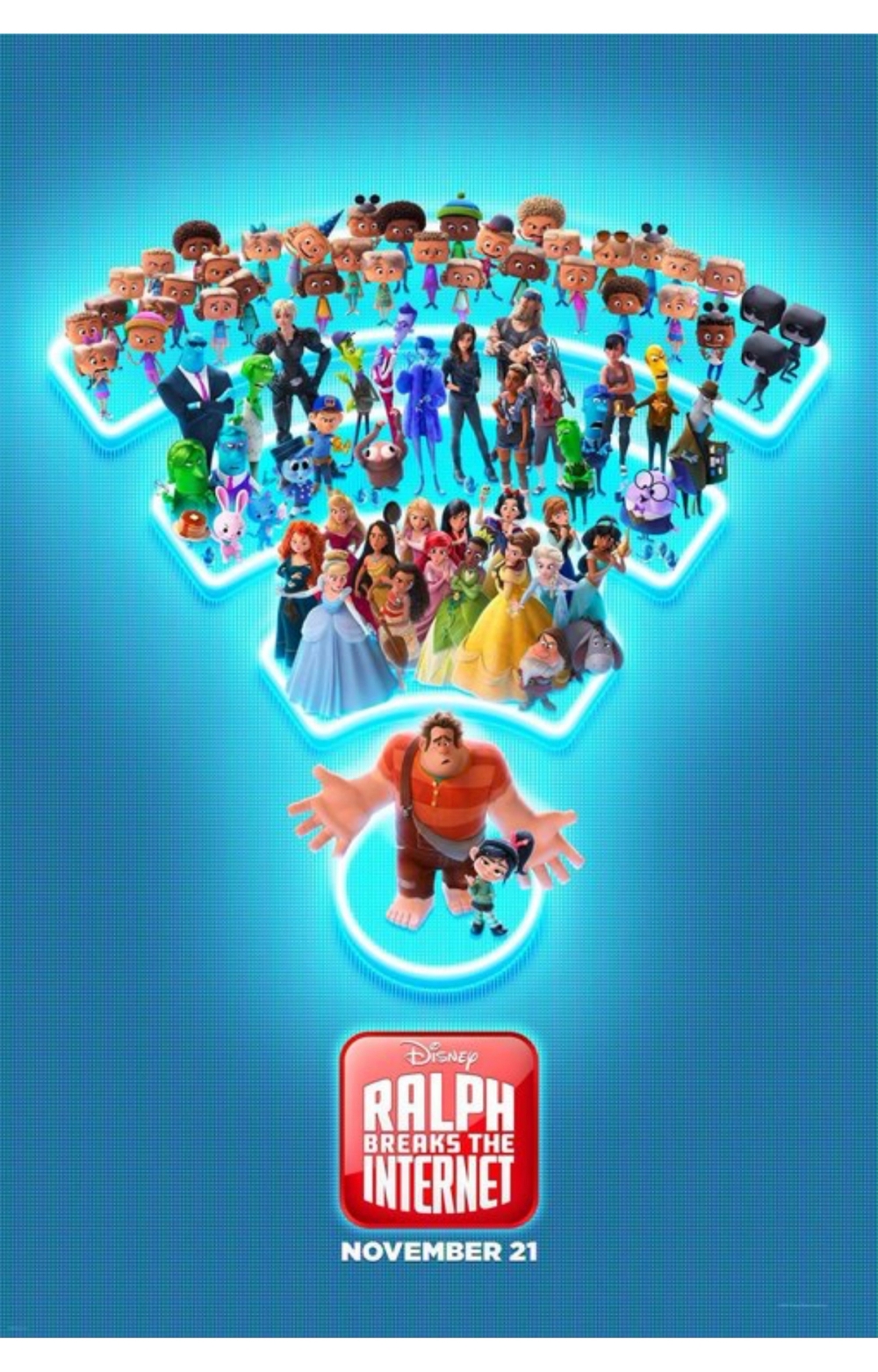
Ralph Breaks the Internet
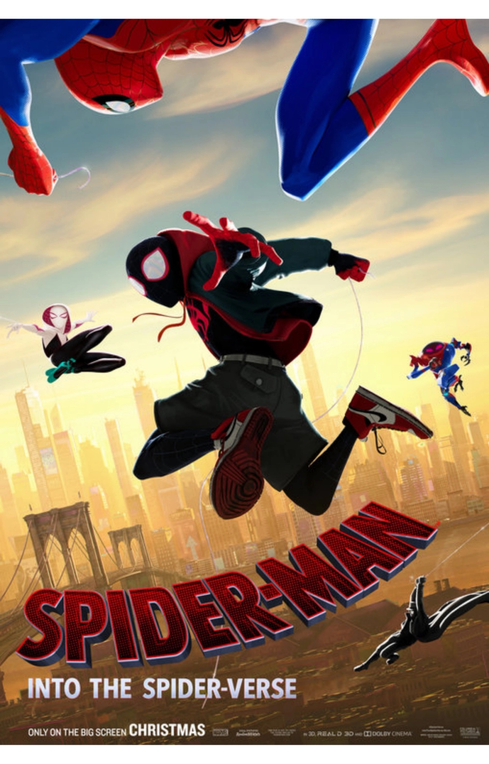
Spider-Man: Into the Spider-Verse
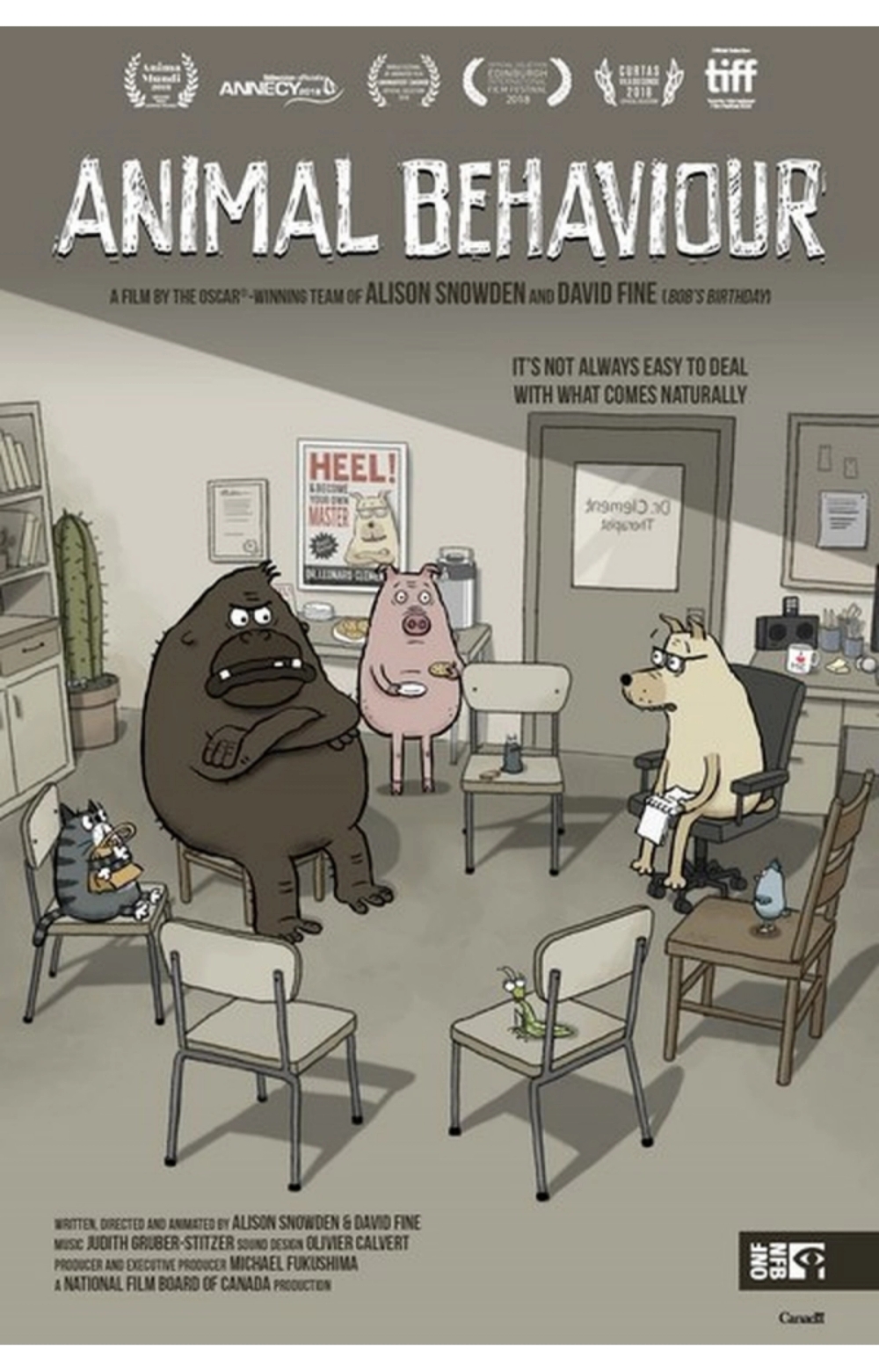
Animal Behaviour
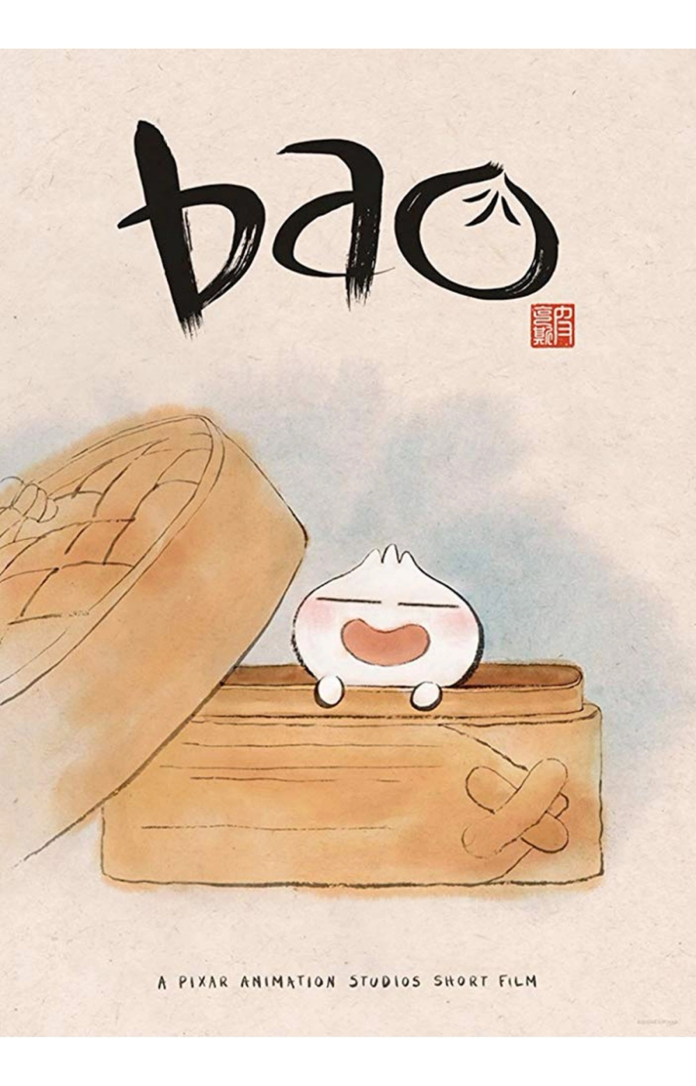
Bao
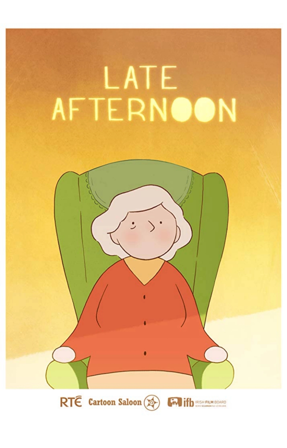
Late Afternoon
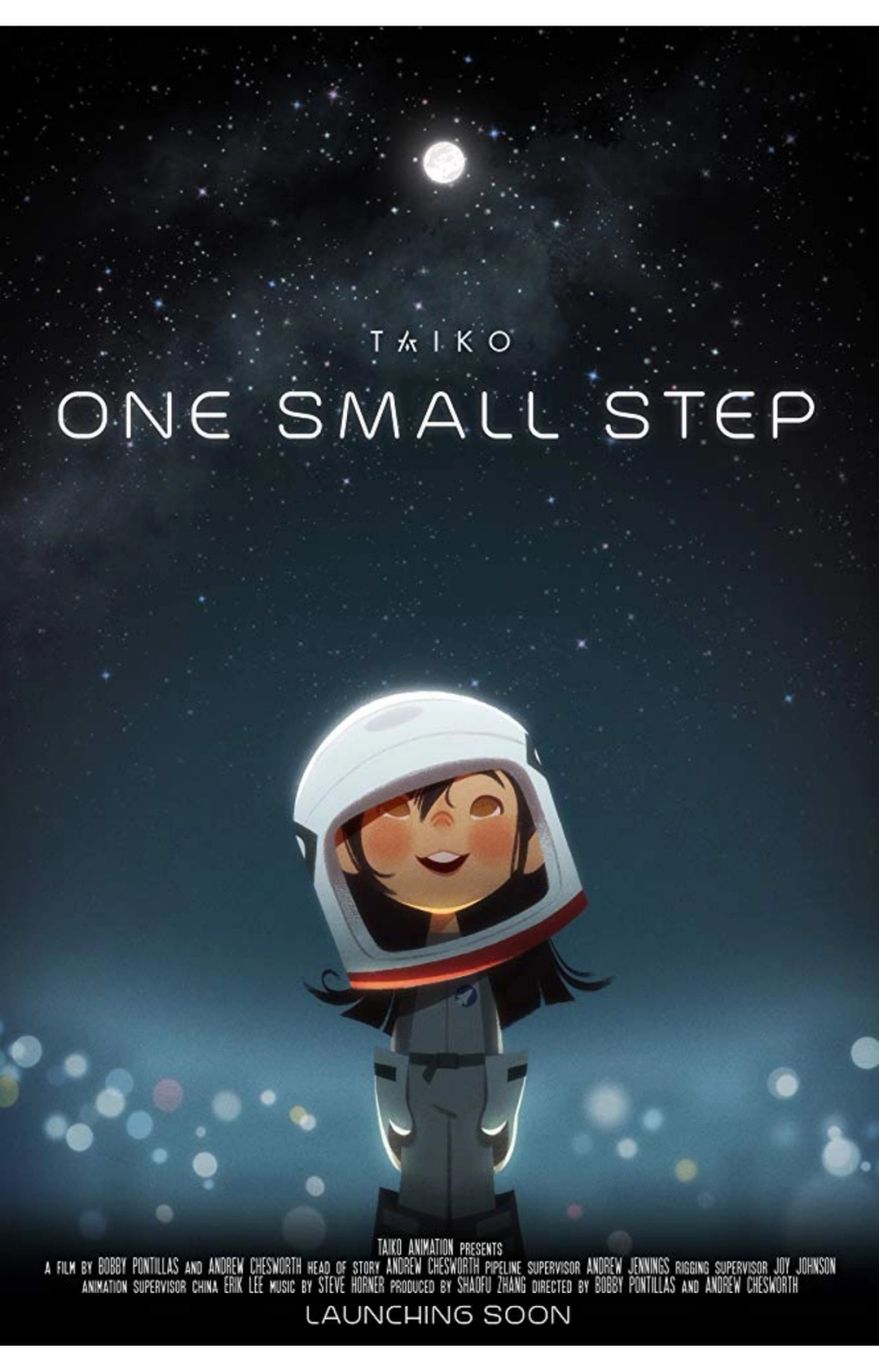
One Small Step
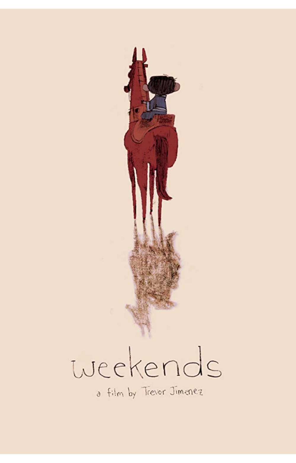
Weekends
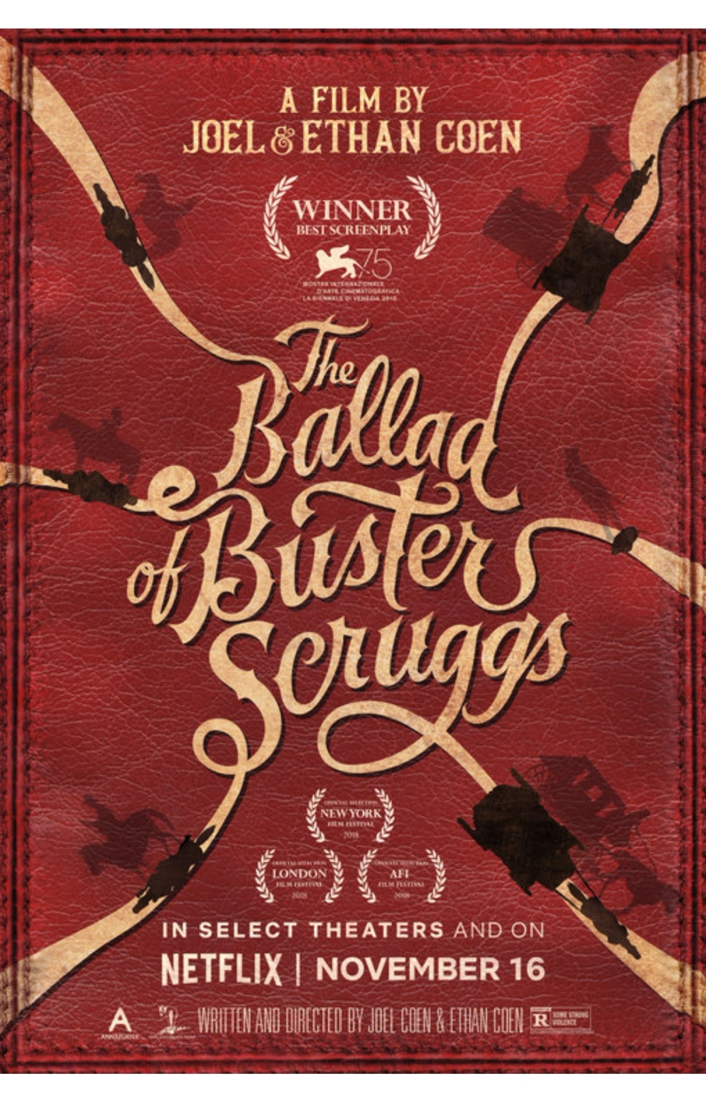
The Ballad of Buster Scruggs
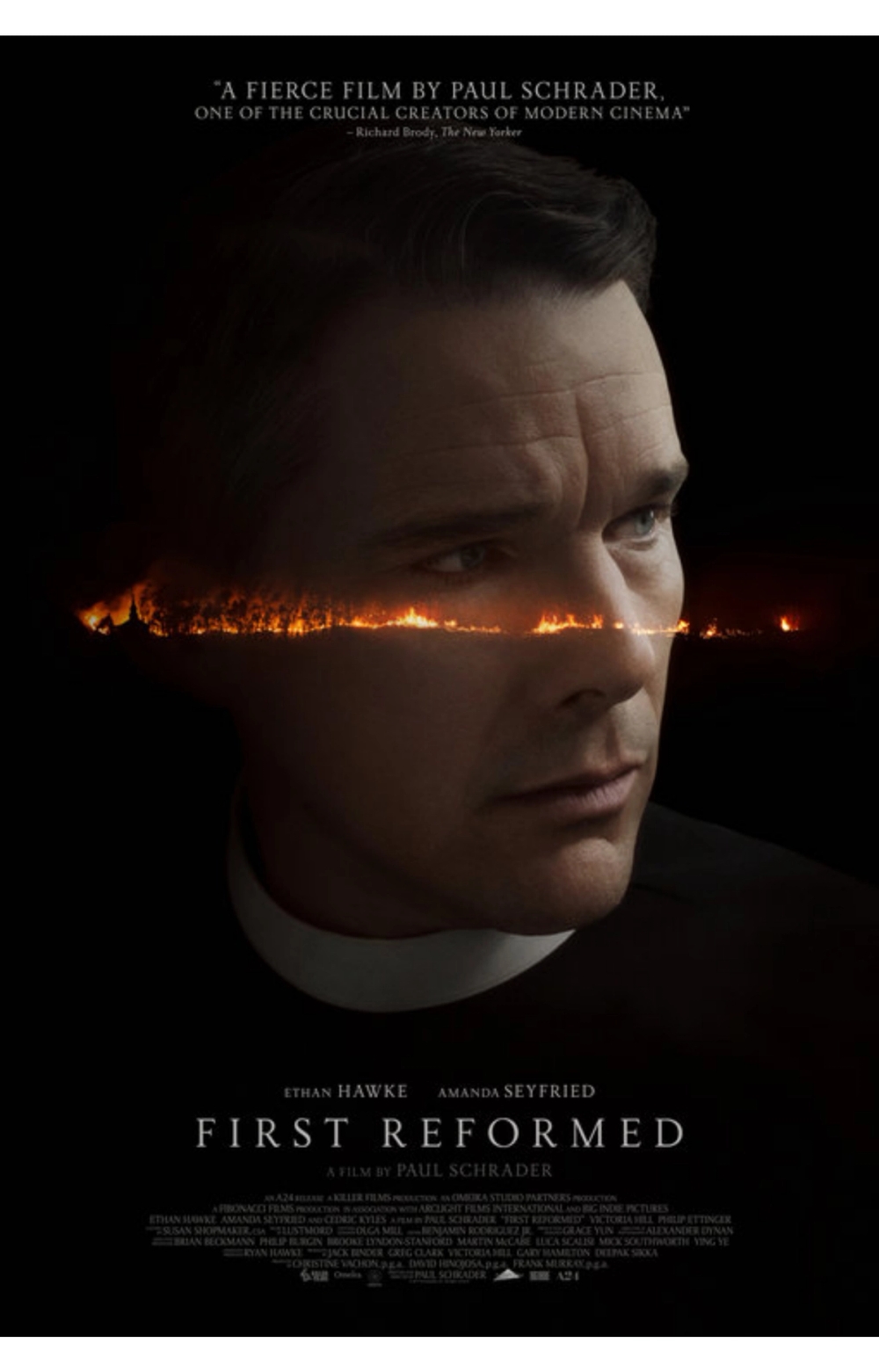
First Reformed
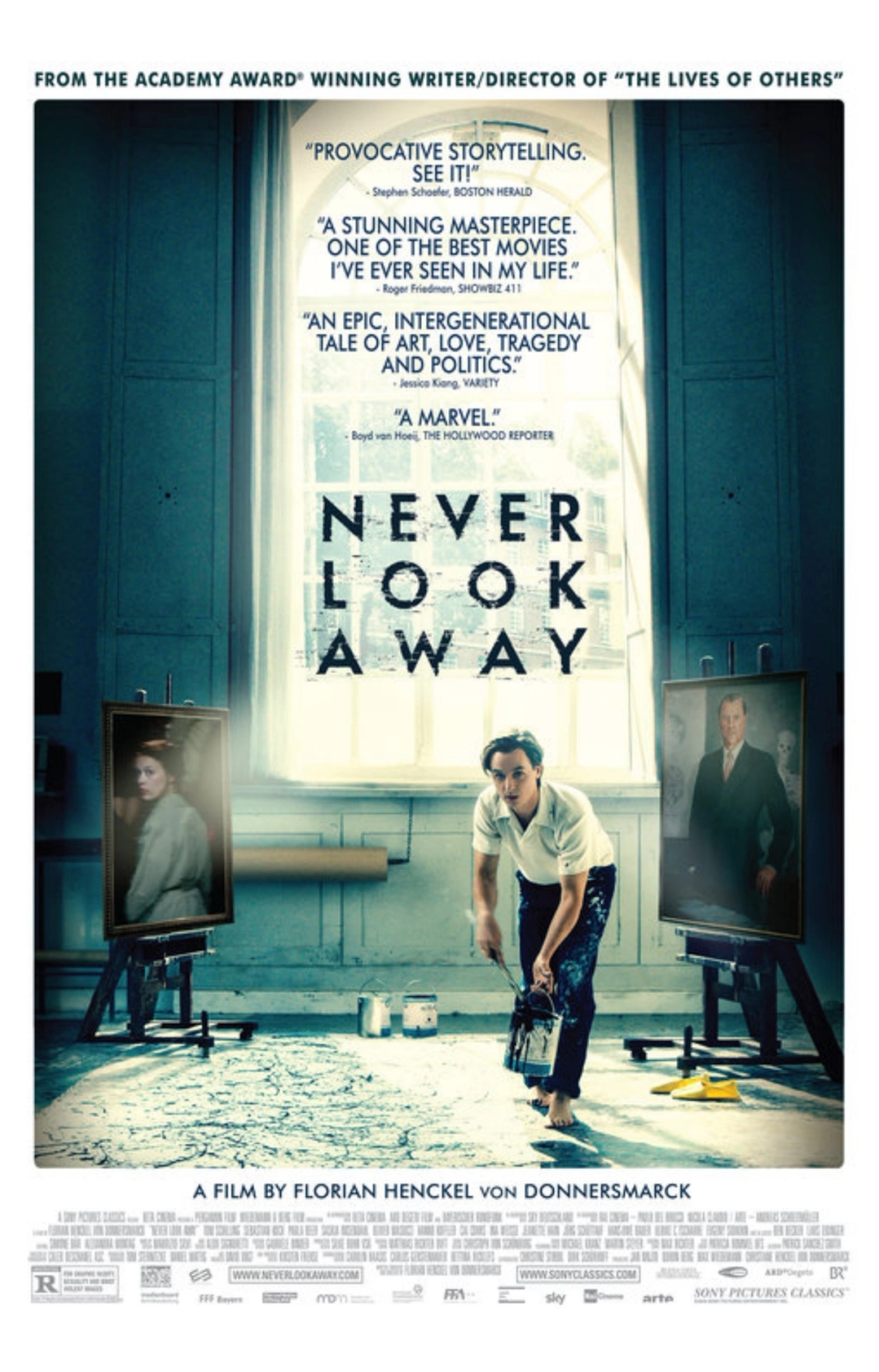
Never Look Away
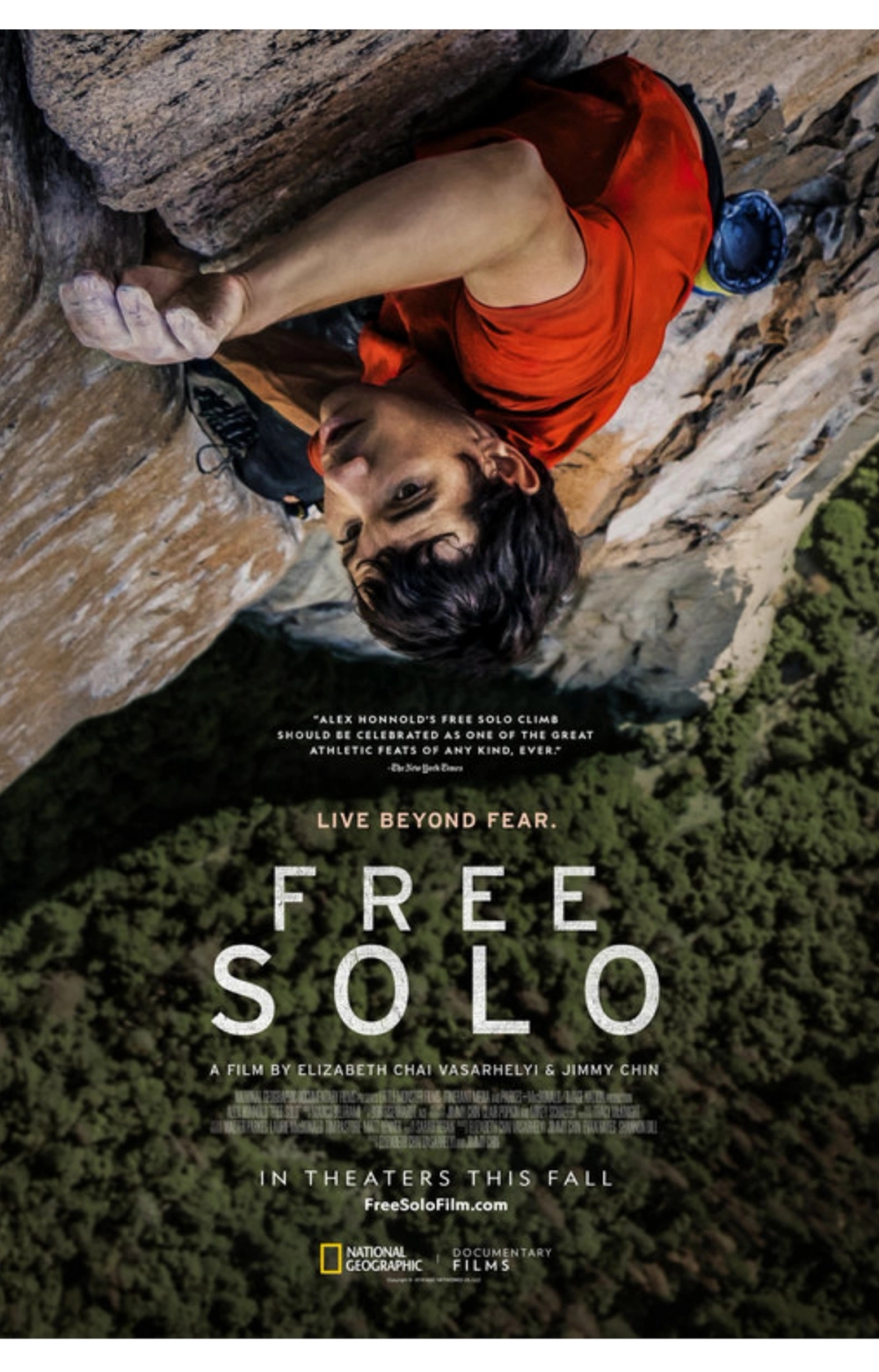
Free Solo
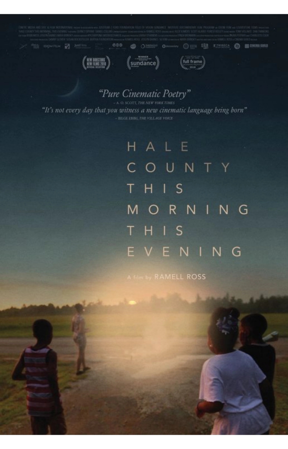
Hale County This Morning, This Evening
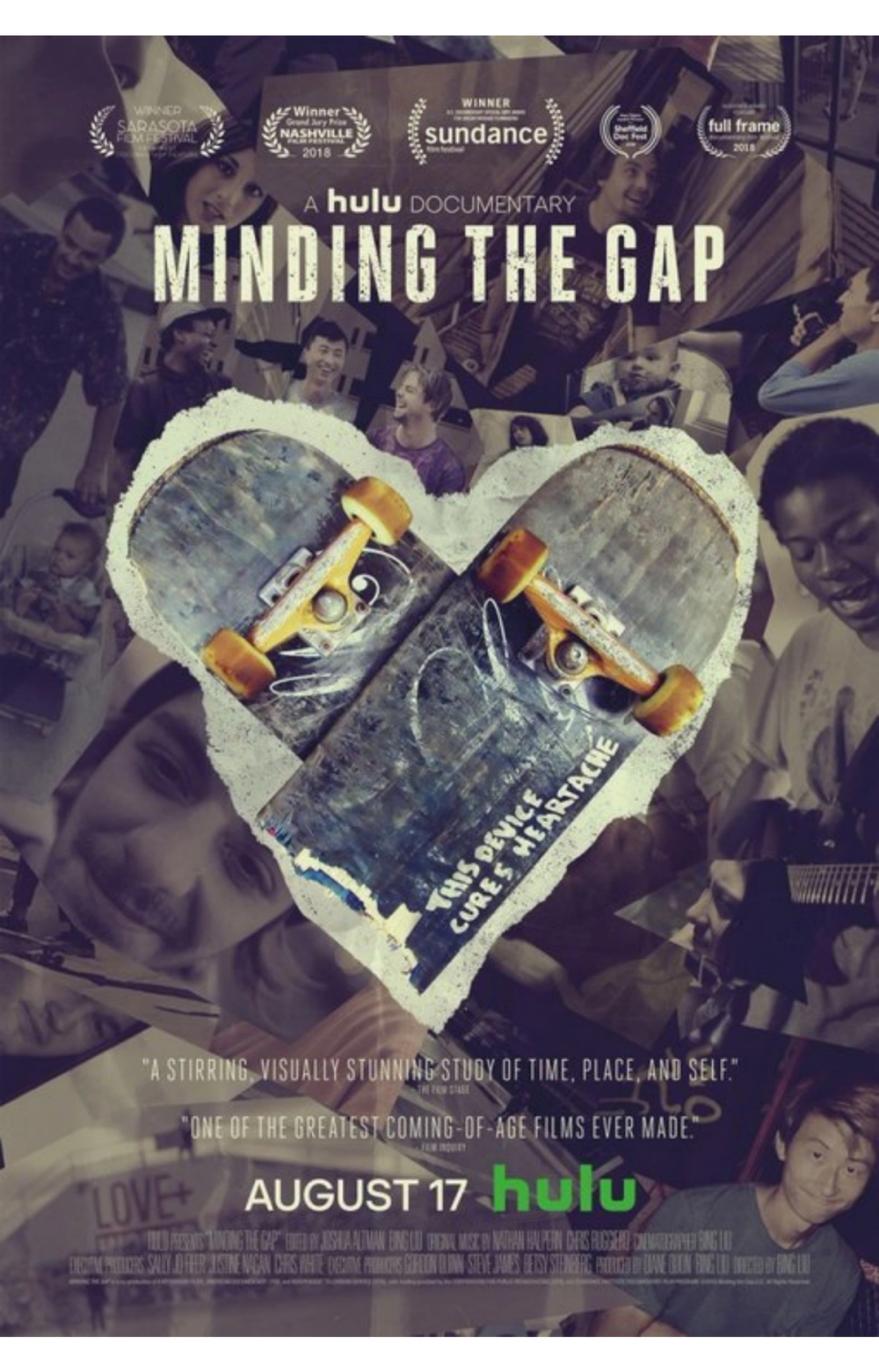
Minding the Gap
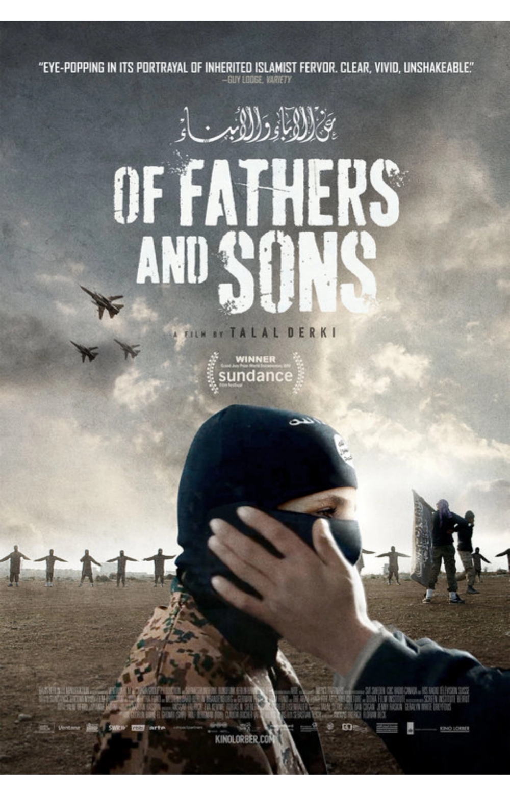
Of Fathers and Sons
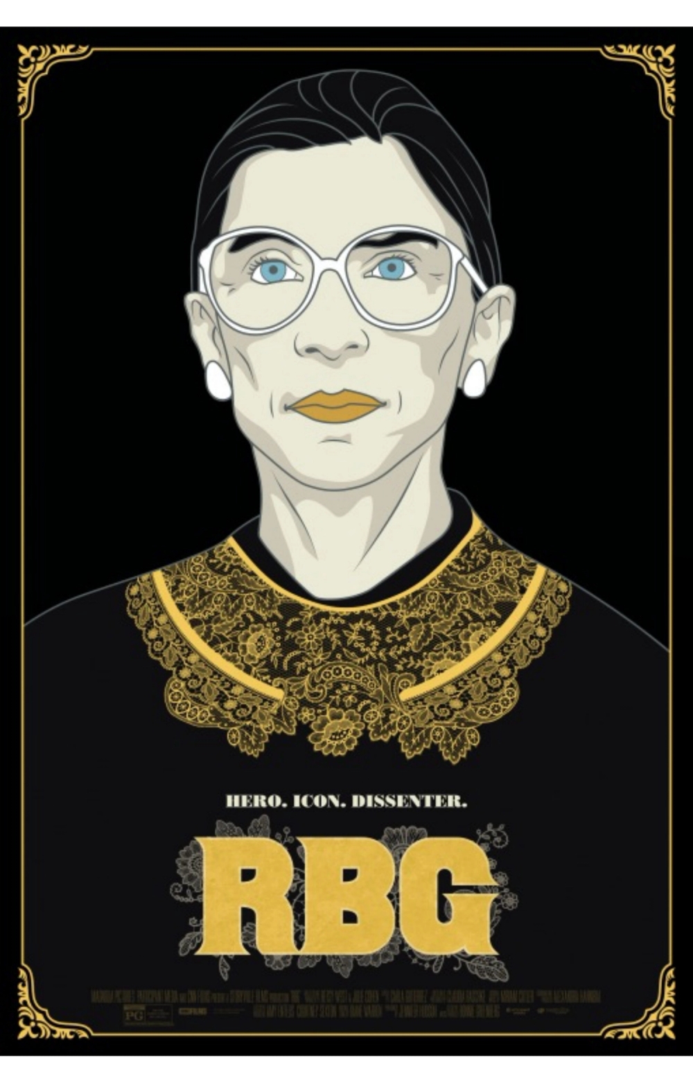
RBG
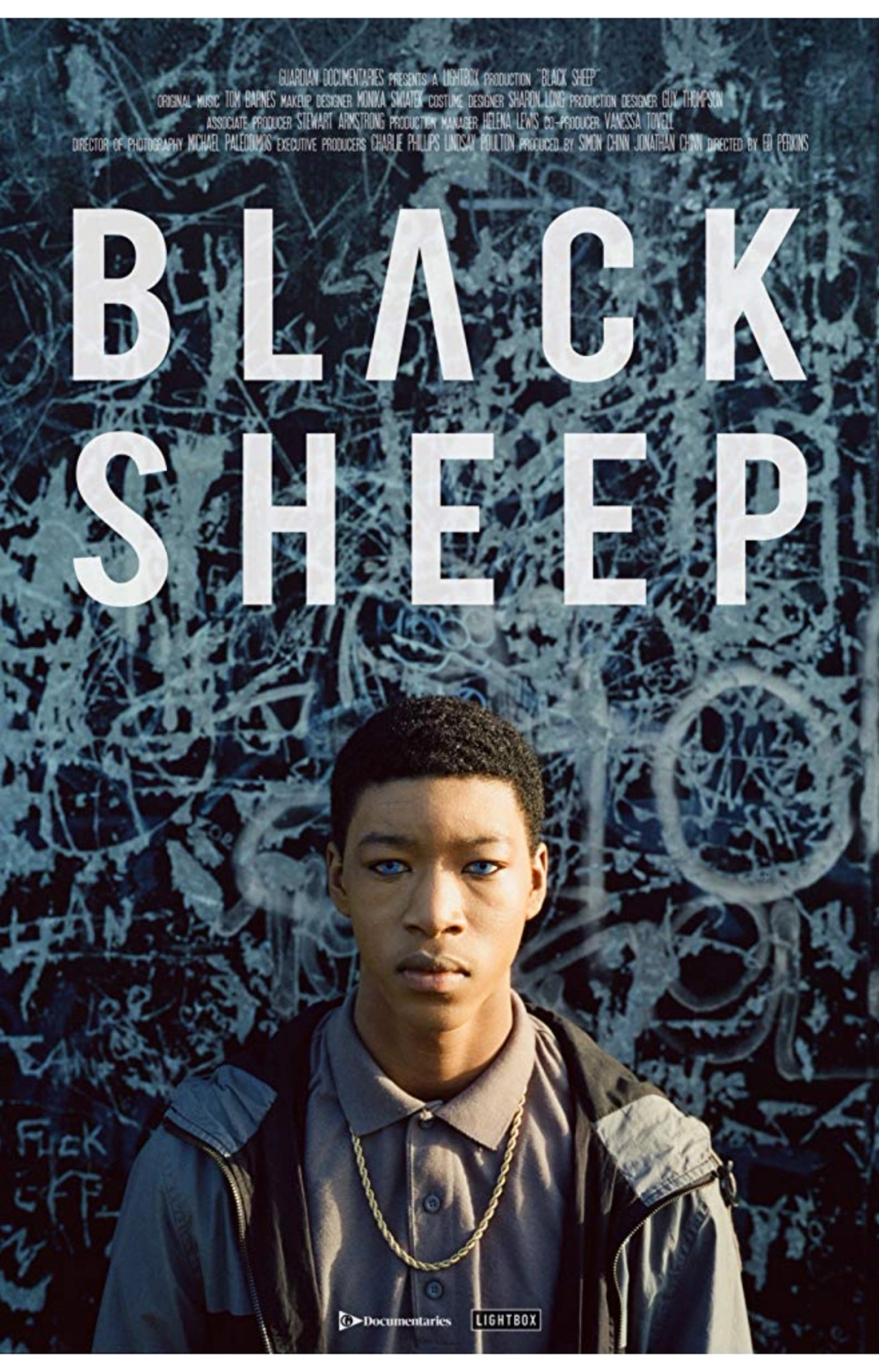
Black Sheep
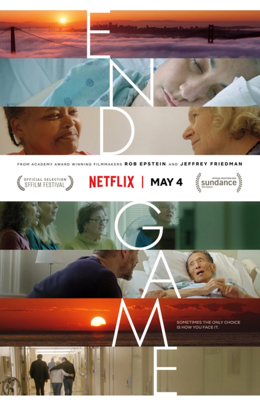
End Game
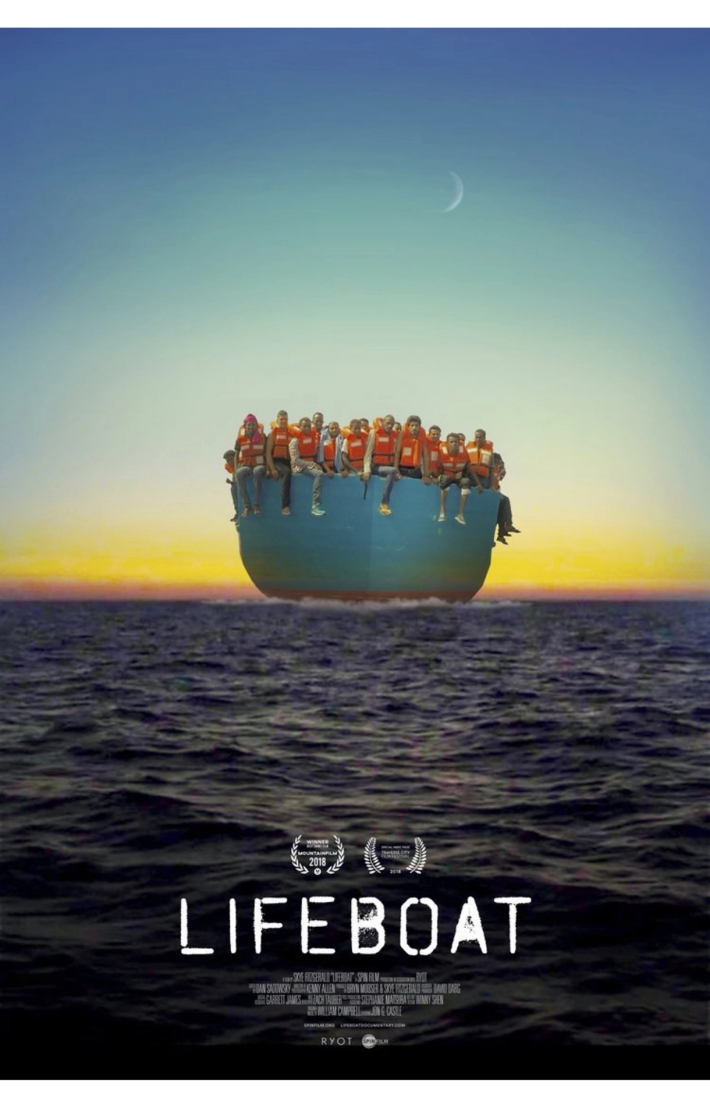
Lifeboat
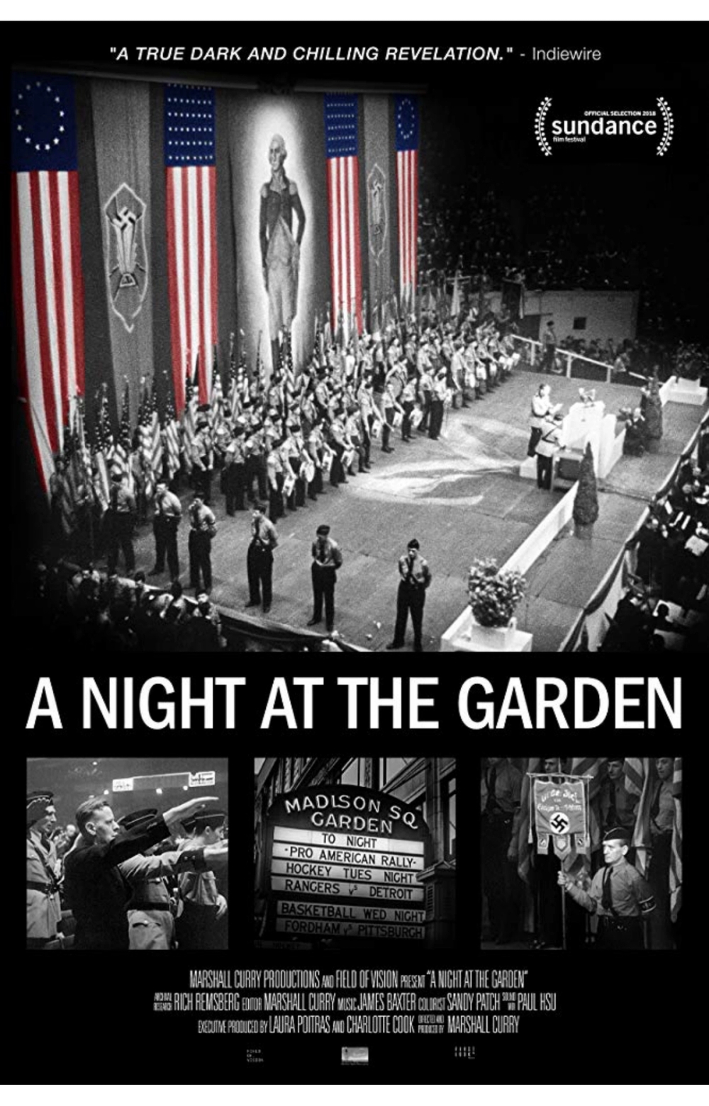
A Night at the Garden
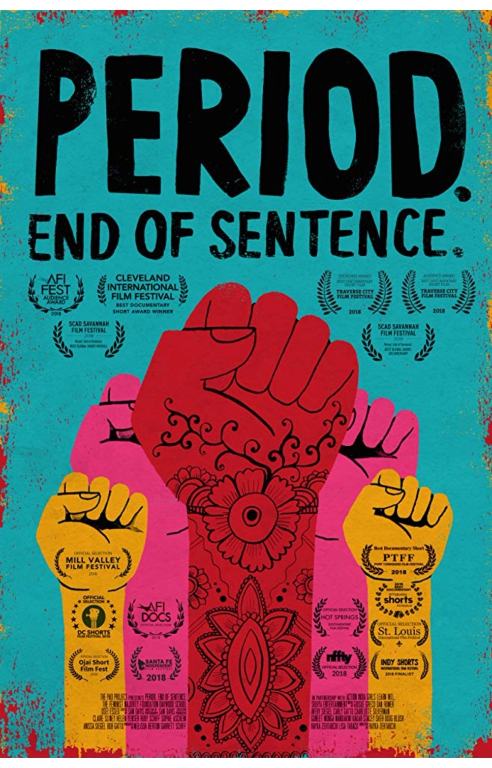
Peroid. End of Sentence.
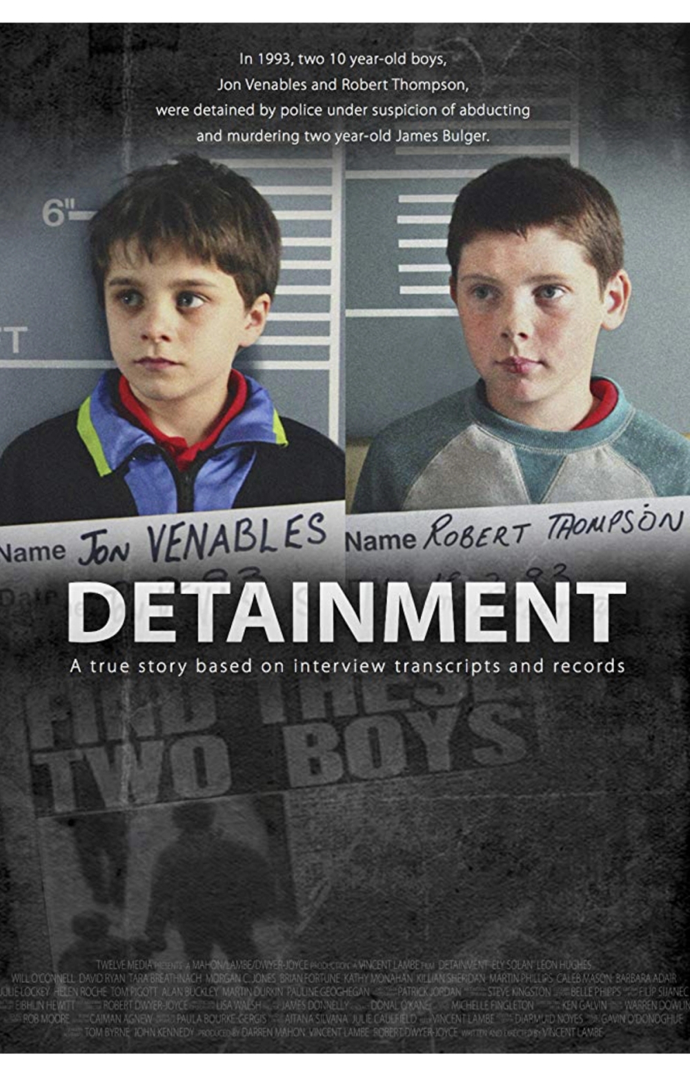
Detainment
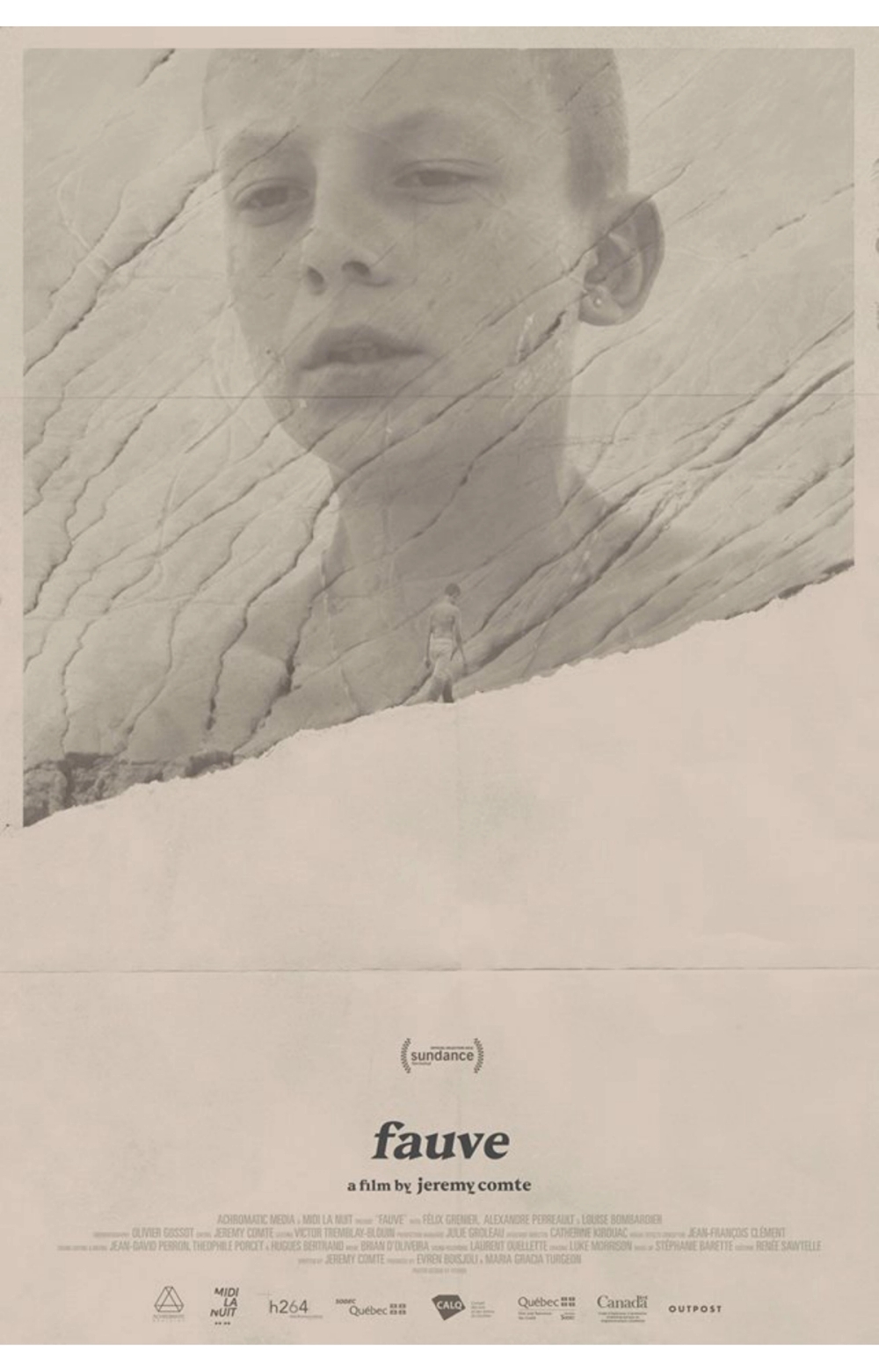
Fauve
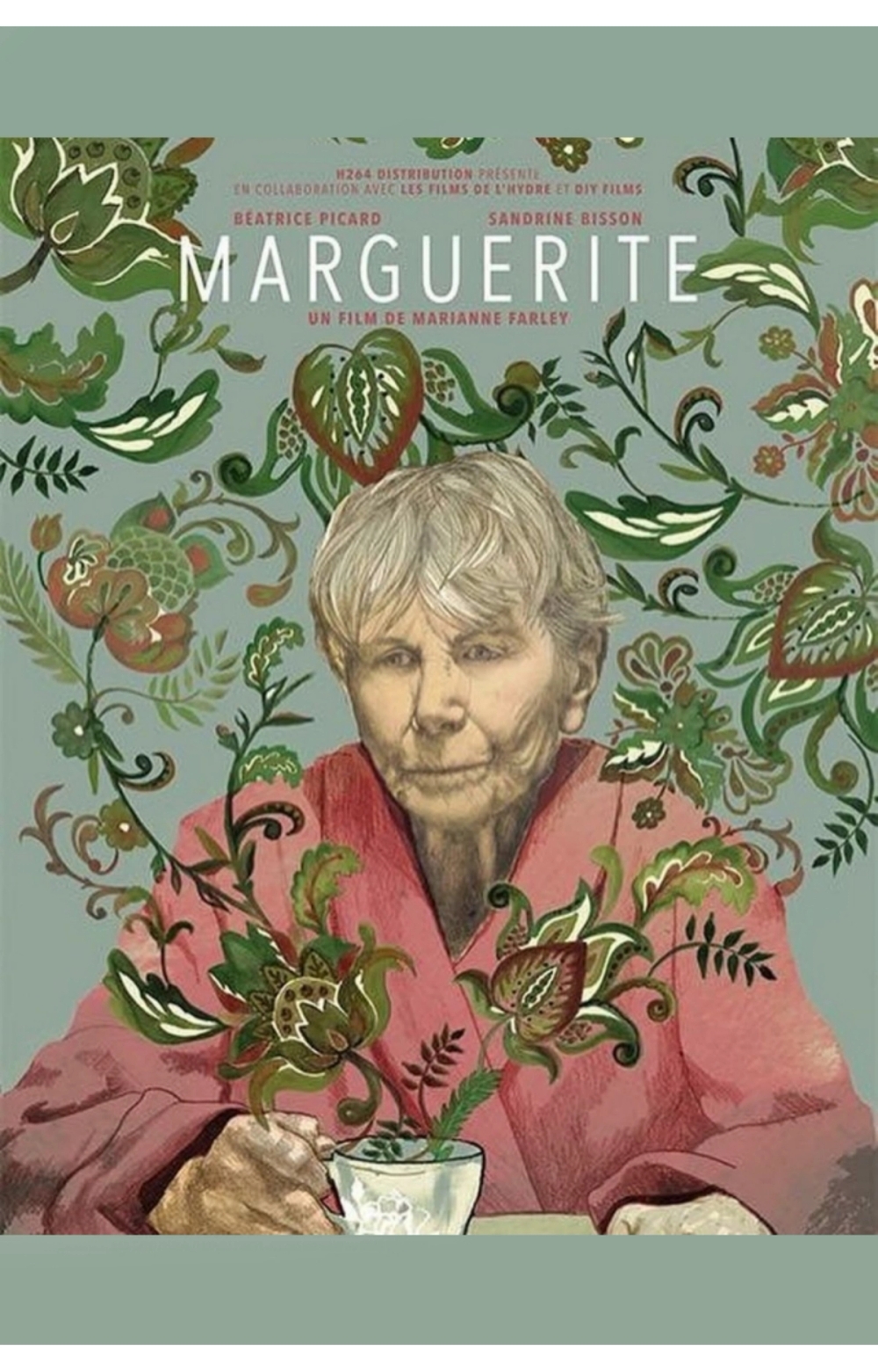
Marguerite
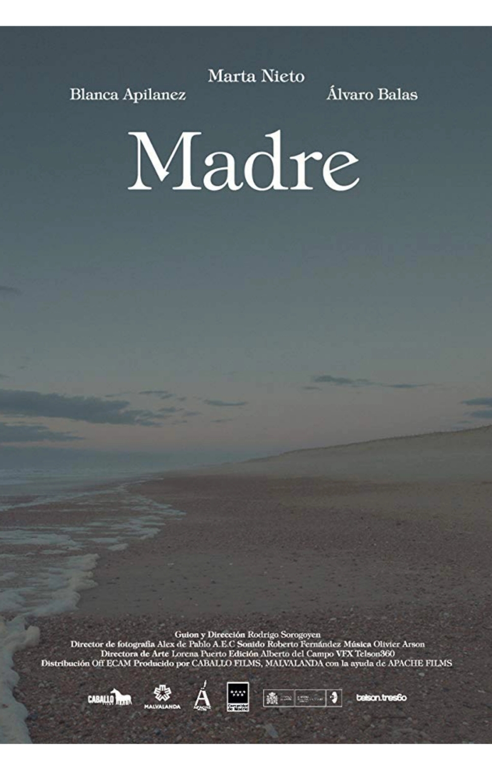
Mother
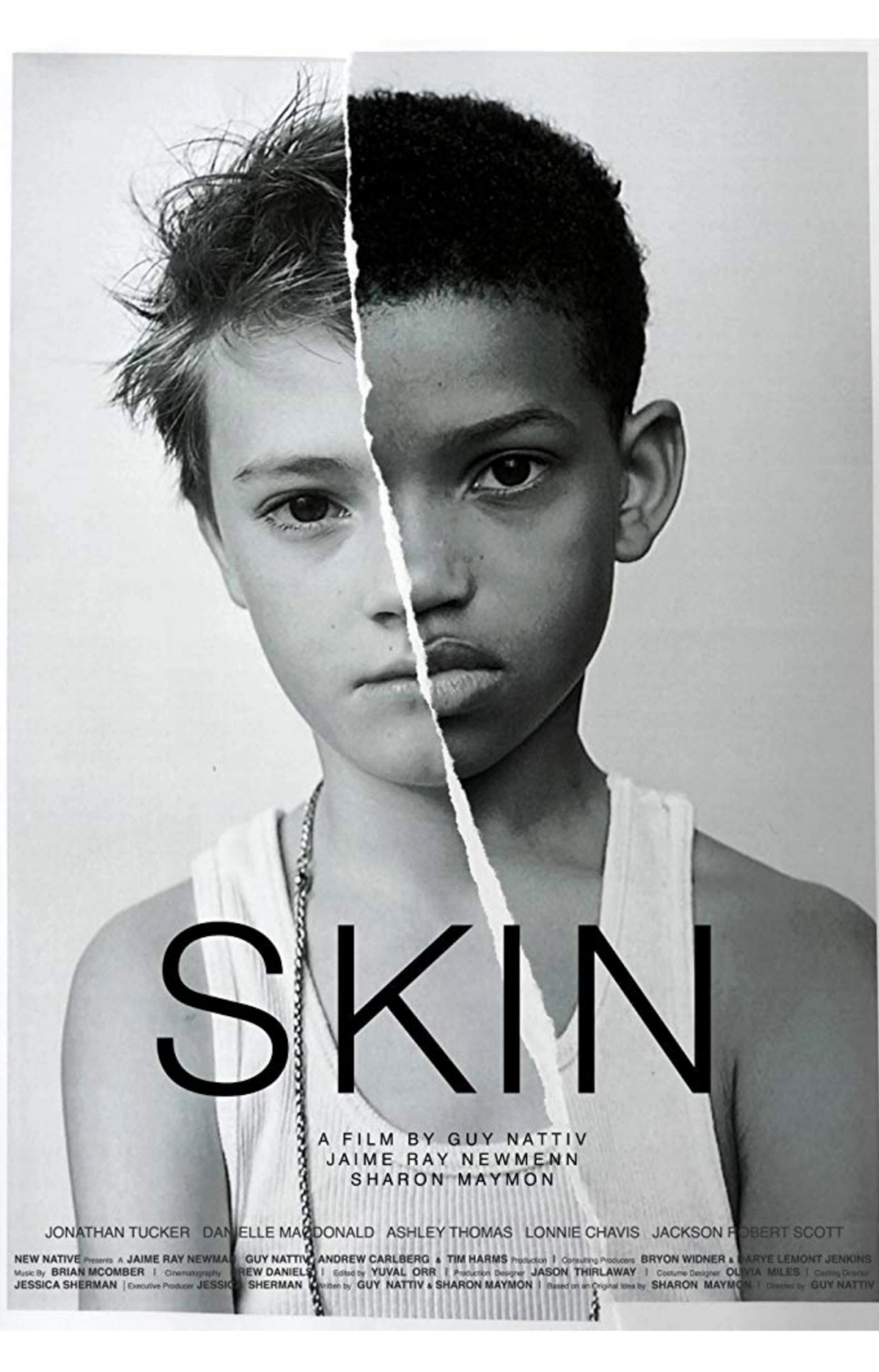
Skin
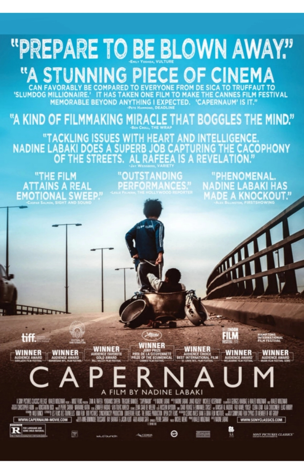
Capernaum
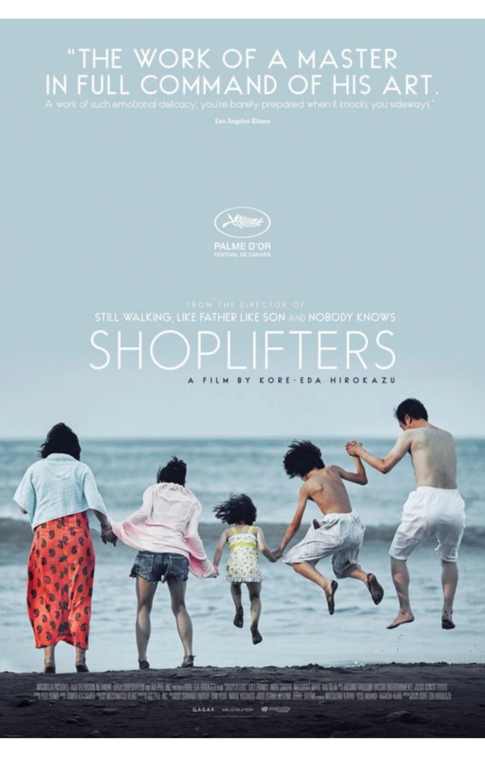
Shoplifters
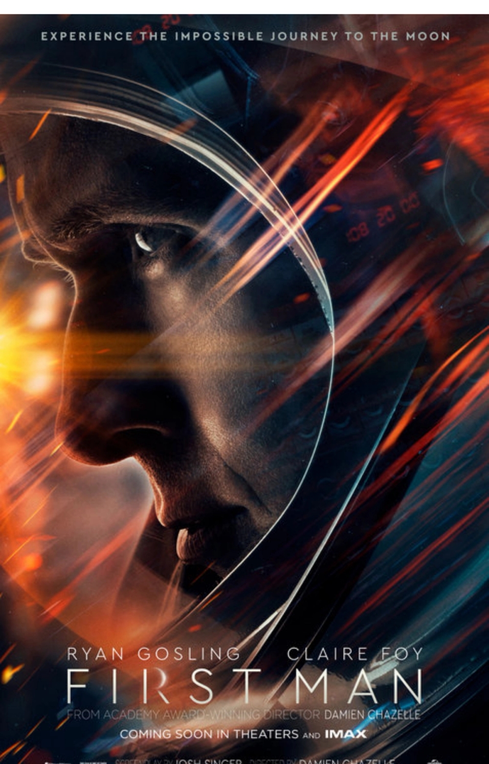
First Man
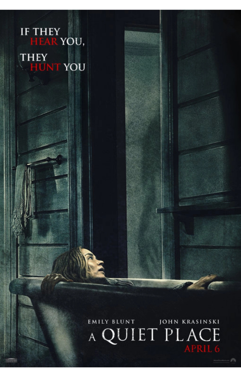
A Quiet Place
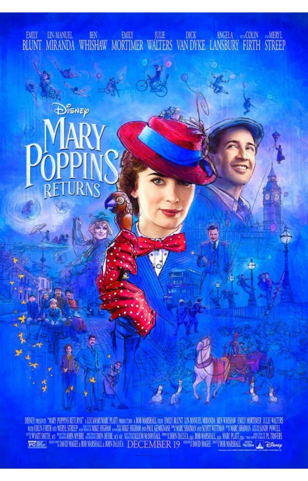
Mary Poppins Returns
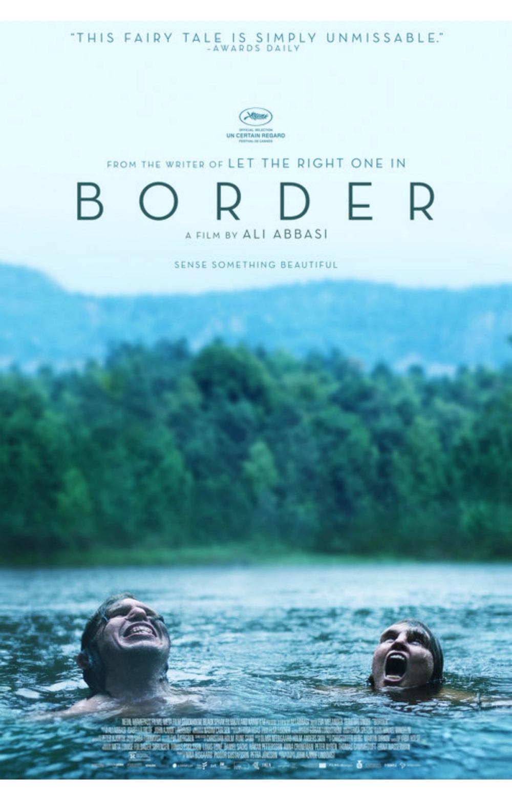
Border
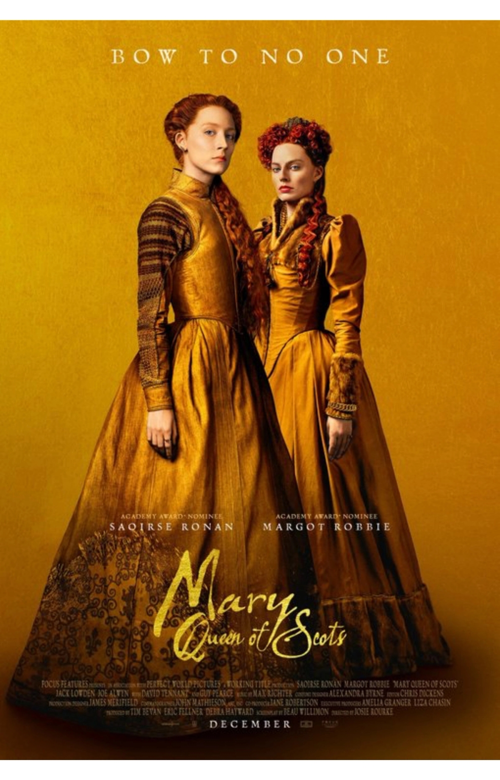
Mary Queen of Scots
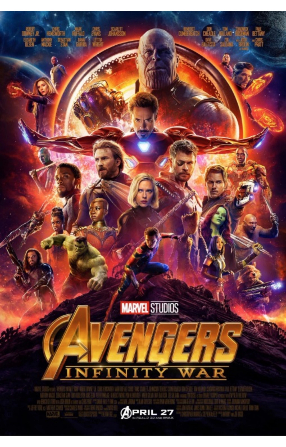
Avengers: Infinity War
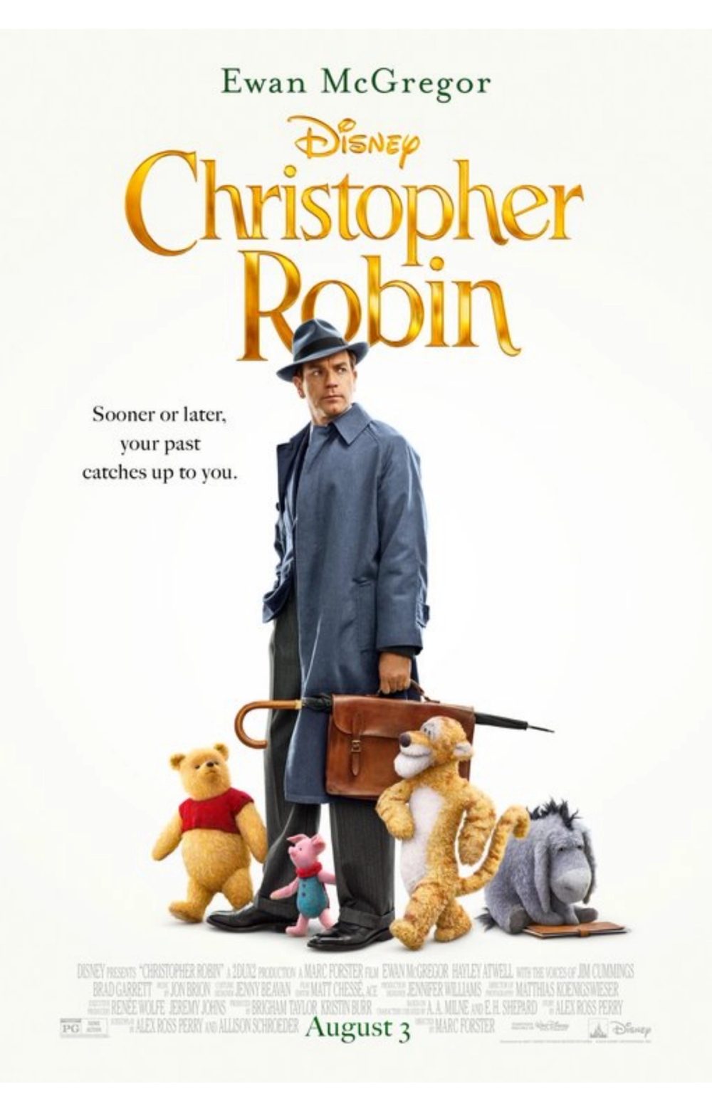
Christopher Robin
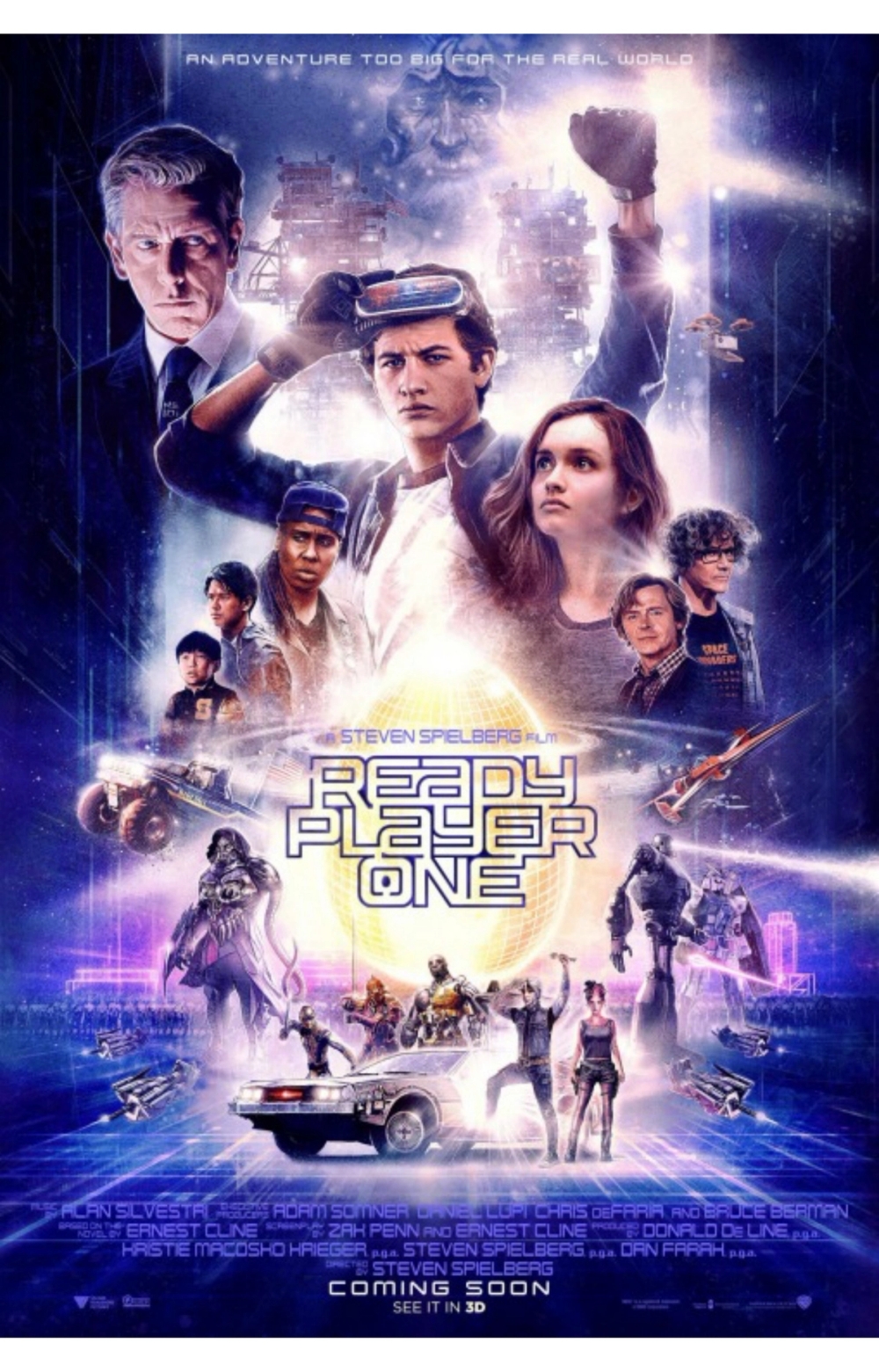
Ready Player One
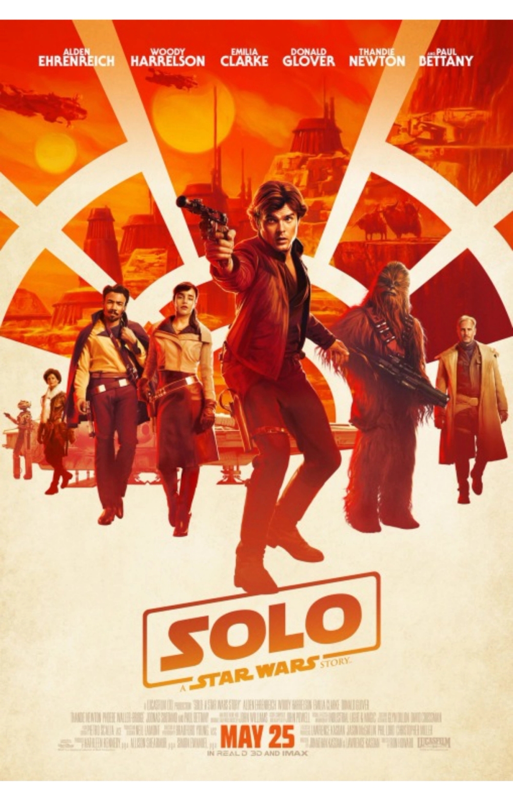
Solo: A Star Wars Story
Trends
1. Whimsical Graphics
You could expect to see whimsical graphics on posters for animated movies and shorts like Bao and One Small Step, but this trend is moving into live-action films too. RBG, Mary Poppins Returns, and Marguerite use creative details to attract the eye and allude to the tone of the films.
2. Sans Serif Fonts
There is a popular serif font called Trajan that has been featured on more than 400 posters. It is touted as the one design element that appears the most. This popular serif font was created by Carol Twombly and became THE font for nearly every genre in the 90s and early 2000s. However, a new trend is emerging, one that has relegated Trajan to horror and B-movie categories. Sans serif fonts are the new go-to. In this list, 32 of the posters uses a sans serif font and one, Bohemian Rhapsody, uses both serif and sans serif.
3. Groups of People
In the past, only the big names were shown on a movie poster, so you might see two stars looking at each other, back to back, or their disembodied heads floating among other graphics. Now, though, designers have to contend with fitting more stars on the advertisements as the number of ensemble casts grows. Ensemble posters aren’t just for superhero movies like Avengers and Black Panther anymore—Roma, Ready Player One, and Shoplifters also feature the trend.
4. The Forward-Facing Star
Studios know that fans are committed to movie stars, so featuring them prominently on the poster is usually a good advertisement for the film. Of the movie posters above, 27 of them have one or more of their stars forward-facing with views either peering out at the audience or slightly askance.
5. Faded, Muted Colors and Simplified Color Schemes
The color scheme of a movie poster is as important to the tone of the show as is the font. Two trends stand out in 2018: faded, muted colors and simplified color schemes. Nineteen of the posters use faded and/or muted colors, and it goes across genres. Another 19 use a simplified color scheme comprising of one to three shades like Solo with orange, Mary Queen of Scots with yellow, and Fauve’s white-and-gray scheme.

What Stands Out
Bohemian Rhapsody’s poster goes against the grain using both serif and sans serif fonts, bold colors, and the black outline of its star. When most others rely on the face of the star to instantly attract the audience, Bohemian Rhapsody relies on the outline to remind people of a once bright star and the greatest performance in history.
Disney’s Christopher Robin is another poster standout. It is a family movie, and posters for family movies are usually quirky and creative, but the minimalism of this poster goes against the grain and allows the audience to enjoy the simplicity of a childhood favorite.
In a sea of faces, movie posters like A Ballad of Buster Scruggs and Period. End of Sentence offer graphical clues to the movie and leave it at that. The uplifted hands of Period. are analogous with empowerment; the trails leading away from the title in Ballad suggest several stories winding their own paths.
Creating a standout design that impacts its target audience and incites a reaction is the purpose of graphic design. The process doesn’t begin at movie posters—it goes across industries through logos, advertisement campaigns, and brand identity.
Superside designers are selected based on their proven design skills through rigorous testing. They must prove they are constantly working on the cutting edge of design and continually evolving so that they can bring you the dynamic look you expect. Our dedicated account managers are standing by 24/7 to connect you with a brand that stands out.


