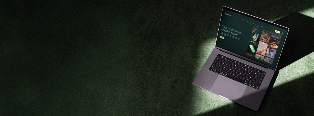
A new Superside has arrived—and it's spectacular. We've completely redefined our entire look and feel to capture exactly how we bring the world's leading enterprise brands a whole new universe of creative freedom. Curious? The suspense is over and all the details are below. (You didn't think we'd spill everything in the TL;DR, did you?)
The eagle has landed! Our brand now reflects who we are: The world’s leading AI-powered creative services company, transforming how enterprise teams approach design.
Over the past decade, Superside has grown from a scale-up to a global creative powerhouse, working with tech giants like Amazon, Vimeo, Meta, Salesforce and Reddit.
We’re proud to work with the best brands on the planet. The one thing they all have in common? Incredible in-house creative teams brimming with world-class talent—and all strapped for time and resources.
Our mission: To help enterprise creative teams dream bigger, move faster, scale smarter and build iconic brands.
Your Creative Team’s Creative Team™
Today, we're unveiling a completely reimagined look and feel. Don’t worry—we’re still Superside, with the same fun-loving, kind and clever spirit.
As for everything else? That’s been thoroughly rethought to showcase the remarkable talent of our Supersiders and the groundbreaking work we create for our customers.
Our Rebrand—100% In-House
This rebrand? Dreamed up, designed and brought to life by our very own Supersiders—from the very first brainstorm to the final pixel.
Before, I go on, let me properly say hello. 👋
I’m Jen Rapp, Superside CMO. Fun fact: I was a Superside customer before joining the team. Previously, I led brand marketing at Klaviyo and, in 2021, our creative team was, to put it lightly, underwater. We hired Superside to help bridge a growing bandwidth gap.
Bringing Superside on as our "Creative Team’s Creative Team" gave our in-house team the space to focus on the incredible high-end design we hired them to do. They had more creative breathing room, more bandwidth and—frankly—more joy back in their day.
Now, back to the rebrand...
As I settled in here at Superside, I noticed our visual identity didn't reflect the remarkable work we create for our customers—brands like Strava, Forter, Databricks and Microsoft. Our founders agreed. Their only ask was that we do it entirely in-house. We are a creative services company, after all.
I’ve led two major rebrands in the past—DoorDash and Klaviyo—and both were done in partnership with an external agency. The idea of doing it “totally in-house” seemed daunting.
How did we do it?
Well, it helps that we employ the top 1% of creative talent globally. We brought together an incredibly talented group of designers and strategists from the client side of the business (Yep, people, you can work with too!) to work with our in-house team. Mixed in the magic of an AI-first brand system. The result is what you see today. And we did it 100% in-house.
Pushing Creative Boundaries With AI
When reimagining our brand, we embraced AI as our primary creative tool. Our team developed a carefully crafted prompt architecture that became the foundation of our new visual identity.
The approach was comprehensive, letting us define every conceivable parameter—from image elements and color palettes to subject styling, lighting, shadows and camera angles. The result? High-quality, on-brand imagery that precisely captures our desired tonality, texture and narrative.
What Changed?
And what’s stayed the same? Here are some of the bigger transformations:
The Superside logo—refined, not reinvented
Let’s start with the easy part: The Superside logo isn’t new, but it’s improved! We’ve made subtle tweaks, refining our already iconic logo by condensing the signature Superside squiggle. It’s sharper, sleeker and just as fun—especially now that it’s brought to life with motion design.
Photorealistic imagery replaces illustration
Perhaps the biggest change we’ve made is moving away from illustrations and leaning into photorealistic AI imagery. But instead of going the stereotypical AI route of neon colors and whimsical scenarios, we’ve grounded everything in the natural beauty of the world around us.
Beyond the artistry, photorealistic AI imagery lets us showcase our design sophistication. Any designer knows that getting humans and nature “right” with AI is challenging. One small mishap can completely dismantle an image.
Our astronaut came to life
Keeping a brand’s DNA intact during a rebrand is crucial. One element we carried over from our original brand is our space explorer. While we loved our illustrated mascot, we wanted it to evolve alongside the brand.
That’s why we brought our space traveler to life. Now, our astronaut looks real and exists in the same universe as you and me. Our space person understands the gravity of everyday creative demands and they're driven by the ambition of touching the stars.
Our astronaut will be around to help us visually tell the story of our services, create buzz at activations and events, and generally serve as the “face” of our brand. We love that our rocketeer harkens back to our fun and quirky personality while demonstrating our passion to reach further and deliver more.
Now, Let's Talk Details
With any good rebrand, the devil is in the details. We put meticulous thought into every aspect of our new identity, including our colors, fonts and iconography.
Nature-inspired colors
In staying true to our photorealistic imagery, we wanted to work with a color palette that reflected the natural world, with occasional accents to keep things fresh. Our primary colors pay homage to the clouds, leaves, earth, and sea, and we occasionally bring in peach, lavender and mint to add some spice.
Dynamic fonts
When choosing fonts, we selected a combination of sans-serif and serif fonts—Inter Tight and Instrument Serif—to bridge the connection between the human and tech aspects of our positioning. This dynamic pairing also lets us emphasize specific phrases and words for greater impact.
On a practical level, the combination of Google fonts ensures that anyone across our organization can use them on any application, enabling greater brand consistency.
Line-drawn icons
We’ve done away with illustrations in favor of beautifully crafted iconography. Our new line drawings offer a simple, streamlined way to visually represent anything.
What's Next?
As we put our new brand into practice, we'll continue refining our models and feeding original data into our AI systems. This will ensure that imagery is consistent and that our brand remains uniquely us—creative pioneers looking to make an enormous impact.


