


Most people judge a brand’s credibility by its website. Discover why exceptional website design is essential, how to select the proper layout for your business goals, and explore 12 website layout ideas that will help you develop a website that not only looks great but also performs.
Your website’s design says a lot about your brand, and believe it or not, 75% of people admit they judge a company’s credibility just by how its website looks.
The good news is that every $1 invested in user experience (UX) can return $100, an incredibly high ROI. Even a modest increase in your UX budget (just 10%) can lead to an 83% rise in website conversions.
Whether you run an enterprise-level online store or a non-profit organization, excellent web design is more likely to earn trust and drive results.
Curious what great layouts look like in action? In this article, we explore 12 tried-and-tested website layout ideas that could inspire and kickstart your next web design process.
Why does a good website layout matter so much?
Your website layout plays a key role in how people experience your brand, remember it and take action.
Here’s why:
This is the quality you can create with Superside
Discover how Supersiders help global brands
launch high-impact campaigns at scale with top design.
We're your creative team's creative team.
1. First impressions are brand impressions
A clean, intuitive layout signals professionalism and builds trust, while clutter and ineffective design drive users away.
At Superside, for example, our UX/UI design services help brands implement layouts that combine visual impact with strategic structure to highlight value propositions, guide user attention to key call-to-action (CTA) buttons, and build trust from the get-go.
2. Consistency builds credibility
A consistent visual and navigational structure enhances user confidence and facilitates more straightforward navigation of your site.
Consistency across platforms (including your website) can boost revenue by up to 23%. This is especially important for enterprise-level companies with multiple products, services, audience segments and platforms.
3. Good layout drives conversions
Specific layouts, such as grids and Z-patterns, enable users to quickly scan pages. When used strategically, these layout patterns can increase conversions as they simplify how visitors find what they need.
How do you know if your layout hurts conversions? Red flags usually include high bounce rates, low time-on-site, poor mobile performance or customer feedback that shows confusion.
Conversion-focused design, in turn, yields real improvements. For example, pages built around a clear information hierarchy typically see average conversion rates increase from 2.35% to as high as 11%. That’s nearly a 5X return.
4. The right layout supports better UX
User experience is also about function. Clear layouts reduce cognitive load (i.e., people don’t have to think so hard), improve navigation and encourage deeper engagement. Responsive design also guarantees your brand delivers a seamless experience across tablets and mobile devices.
Sites that adapt well to mobile phones typically experience a drop in bounce rates of up to 30%. And since 53% of users leave a site if it takes more than three seconds to load, good responsive design is key.
Top UX/UI and web design
We use atomic design methodology to
create cohesive, scalable and high-performing
digital experiences.
Our accessibility-first approach creates
unique assets, made to engage and convert.
How do I choose the best website layout for my brand?
A good website layout always starts with clear goals. Whether you want to boost conversions or impress stakeholders, your website composition should reflect your brand, speak to your audience and scale with your content.
If you don’t know where to start, focus on your users and business objectives.
Here are four practical tips to guide you:
1. Map your user journey: Talk to your customers and other target audiences, gather feedback on navigation and iterate on wireframes. Keep in mind that your site should evolve with your business.
2. Use different layouts for different goals: Your homepage, blog and product pages don’t need the same layout. Keep templates consistent within sections, but pick formats that best support each page’s purpose. For a blog, you can use a single column. For products, a grid works well. To drive conversions on a landing page, try an asymmetrical or Z-pattern layout.
3. Design for how people scan pages: Since most people scan rather than read, use layouts that follow natural eye movements (more about this later).
4. Plan your information architecture first: Map your navigation before you build wireframes. Clear menus help visitors find what they need and stay engaged longer.
At Superside, we help enterprises build web layouts that look incredible and deliver ROI. Our web design, UX/UI and landing page design services support everything from full site builds to modular updates.
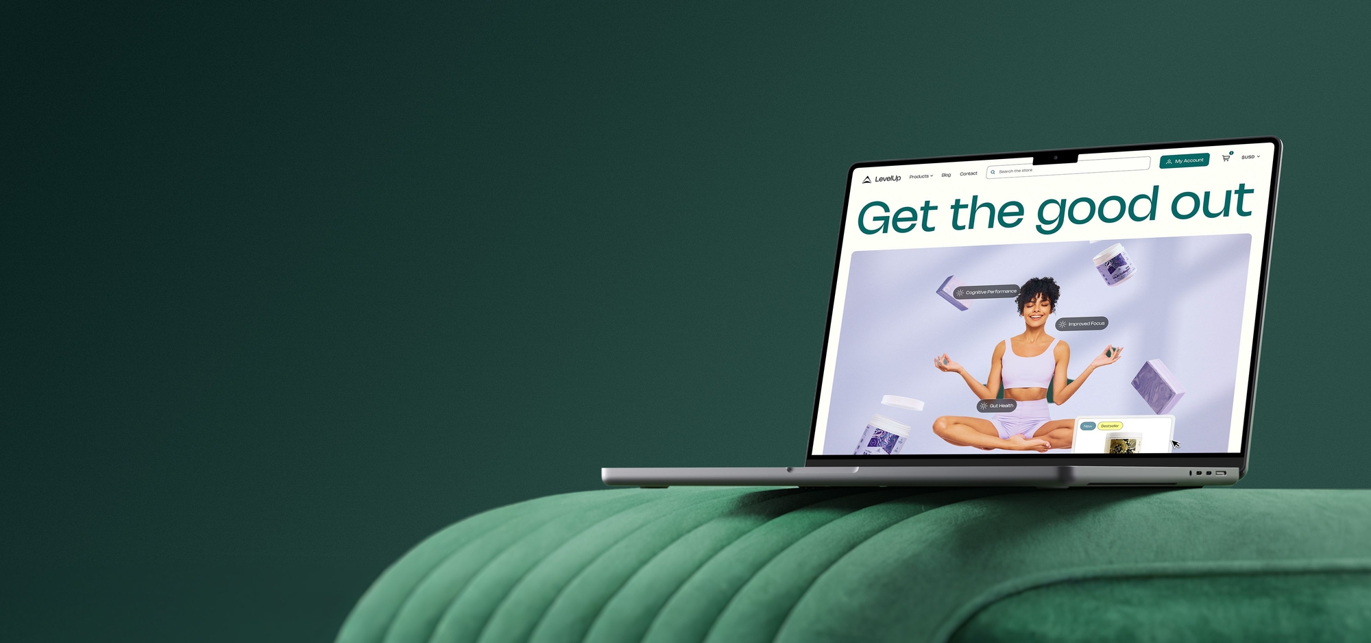
Take Anyroad, for example. This Superside customer needed a website that could reflect their growth in the experience relationship management space. We collaborated with their team to refresh their visual identity and shift their color scheme from dark greens to vibrant purples and pinks.
Together, we built modular layouts that prioritized education, clarity and consistency. We also created a custom icon library that brought cohesion across the site.


Your creative team's creative team
Choose the world's leading AI-powered creative service
and get high-performing ads, videos, experiences and
more at scale, on your schedule and to your standards.
12 website layout ideas to spark inspiration
There’s no one-size-fits-all approach when it comes to web design. From simple single-column formats to immersive interactive templates, different layouts suit different goals.
Whether you plan to build a new website or update your current website, these 12 ideas will help you think differently and explore what’s possible.
1. Split screen
A split-screen layout is exactly what you think it is: A design that divides the user’s computer screen into two.
It’s great for websites with two equally important messages (e.g., a fashion brand that wants to showcase men’s and women’s lines for its two different audience segments).
Pandora uses this layout effectively with a full split-screen slider that features two videos (each plays independently).
As users scroll, one side moves up while the other moves down. This results in a smooth animation and an engaging experience that draws visitors into the brand’s creative vision.
Why it works:
- The layout gives visitors another way to easily navigate the website.
- It highlights two key messages equally.
- When executed well, this layout offers a clean page that’s easy to scan.
- It makes a strong first impression, which helps to increase interactions and conversions.
Best for: Fashion, travel or service-based businesses with two distinct products, services, lines or audiences.
2. Grids
Website grid layouts are ideal if you want to display multiple pieces of content or products in a clear and intuitive manner. Grids can vary by size, spacing, columns, card style, text amount and use of carousels.
For eCommerce companies with a wide variety of products, like Sephora, a grid layout places a wide range of products in front of customers. Within the grids, Sephora further categorizes cards into categories.
Why it works:
- This layout makes it easy to browse and find products or content, which supports product discovery and increases the chances of conversion.
- It works well on different screen sizes, like phones and tablets.
- The layout helps visitors explore content within a neat, organized structure, which can boost engagement metrics.
Best for: eCommerce, marketplace or other businesses with extensive product inventories.
3. Asymmetrical layout
Asymmetry is when text or graphics are arranged unequally on either side of a central line. However, an asymmetrical layout can still be balanced. For example, a single, dominant element on one side of an invisible central line can balance several smaller elements on the other side.
Though less common, asymmetrical layouts offer a strong way to engage and convert users, especially on landing pages for eBooks, webinars and whitepapers.
Nauto places detailed information on the left, from the use of a bigger font to draw attention to the “free eBook” promo, to the smaller text focused on what the reader will learn if they download the eBook. On the right, the CTA directs users to the next step (to complete a form).
Why it works:
- This layout naturally draws attention to key CTAs or conversion points.
- It offers creative flexibility and balance.
- Spotlighted offers with bold visual contrast encourage high-intent users to convert.
Best for: B2B services, SaaS landing pages and brands that want to generate leads through whitepapers, webinars or eBooks.
4. Single column
Arguably one of the simplest designs, the single column layout places all content in a vertical column. This is one of the easiest layouts for users to navigate and scan through. Their eyes don’t have to move from left to right; they only need to follow the page from top to bottom.
While the single-column layout is simple, it’s far from dull. Its strength lies in its clarity.
Medium’s article pages offer a great example of the style with a clean, vertical flow that keeps the viewer’s focus on the content.
Why it works:
- Single column layouts make it easier to design, develop and optimize for mobile. They also work well for homepage design.
- It guides the user through content on the page because there’s only one direction to scan (top-down).
- The layout forces designers to be simplistic in their designs, yet it still allows for creative freedom.
Best for: Blogs, personal portfolios and content-heavy websites.
5. Z-pattern layout
This layout mirrors the natural way our eyes scan a page. They start at the top left, move across to the right, then diagonally down to the bottom left, and finish at the bottom right. A layout in the Z-shape makes it easier to structure information in a way that matches how people instinctively consume content.
Typically, the logo sits in the top left corner with navigation and a strong CTA in the top right.
The diagonal stretch of the Z is where the real magic happens. It’s the perfect space for a strong visual element paired with a punchy copy line that communicates what your brand or product is about. The bottom right usually holds the primary CTA.
LinkedIn uses this layout effectively. The eye starts on the headline and then moves downward and to the left to the copy above the CTA buttons. From there, it travels along the second horizontal line, lands on the key “675M+” stat and moves across the page to the other figures.
Why it works:
- The layout style follows natural eye movement, which makes it easier to absorb information quickly.
- It lets you place content and CTAs where people are most likely to look.
- It’s ideal for visual landing pages or campaigns with a clear, single goal.
- The style guides customers toward an action without a sense of overwhelm.
- It helps boost lead capture and click-through rates (CTRs) through persuasive storytelling.
Best for: Startups, fintech or app-based companies that want to drive sign-ups or product interest on landing pages.
6. F-pattern layout
This layout is also based on how people typically read web pages, especially ones filled with text. When we scan a page, our eyes naturally move across the top horizontally, then drop down slightly and scan again along a horizontal line to form an F shape. This pattern enables us to quickly find key information.
Typically, designers would place the most important content, like headlines, menus and main messages, along these paths for maximum visibility. Secondary information is generally placed lower or to the right, where attention tends to drop off.
This layout works particularly well for content-heavy pages. Think blogs, news sites or any pages designed for quick takeaways. Superside’s blog pages are a good example.
Why it works:
- The layout matches how we read and makes it easy to scan text.
- It prioritizes key messages along the top and left side, where users look first.
- The structure is ideal for text-heavy pages that need to balance readability and content hierarchy.
- It enhances skimmability and strengthens content hierarchy, both of which are essential for SEO and AI optimization.
Best for: News outlets, media platforms or other websites with text-heavy content.
7. Magazine layout
Inspired by printed newspapers, this design uses a multi-column grid to create a clear visual hierarchy. This means web designers can highlight big headlines and important stories, and display secondary articles in a clear and organized way.
The size of your visual elements is an important consideration (larger images and headlines catch the eye first). Placement also matters. Usually, the article at the top of the page is the one people notice and read first.
This type of layout also supports how people naturally scan pages. The eyes move from left to right across the top, then down the left side.
Wired is a great example. They use a large hero image and bold headline to grab attention for their top stories. Below that, content is organized by topic and recency to keep users engaged and informed.
Why it works:
- The magazine layout creates a clear structure that guides users to key content first.
- It breaks up large amounts of information into easy-to-read sections.
- It works well for content-heavy sites, such as news platforms and blogs.
- It keeps users engaged as they’re presented with different ways to explore content.
Best for: Editorial brands, online magazines, lifestyle publishers and digital newspapers.
8. Interactive
If you want to make your website experience unforgettable, an interactive layout might be the answer.
This type of layout responds to what users do, i.e., it changes with a click, a swipe, a scroll or a hover. These page elements turn a passive experience into something far more dynamic and interesting.
Obys Agency uses scroll-triggered animations and motion effects to bring its portfolio to life. Site visitors follow a narrative journey that feels fluid, playful and immersive.
Used well, interactive layouts increase engagement and keep visitors on your site longer. Just be sure to balance creativity with usability, as too much motion or too many elements can quickly overwhelm the user.
Why it works:
- The layout creates an interactive experience that draws users in.
- It can help you to tell strong visual stories and creatively showcase products.
- It feels modern and sophisticated.
- When executed well, it can boost time on site and user engagement.
Best for: Creative agencies, tech startups or companies with digital products that benefit from narrative or immersive experiences.
9. Card
A card layout is a great way to organize content for product pages, blogs and galleries. It uses boxes called “cards” to show images, titles and sections of information.
Each card typically features a picture or icon accompanied by a brief description or overview. When users click on a card, they can see more details or go to another page.
We effectively use this type of layout in our web design services section. Each card highlights a specific service with a bold visual, headline and short description.
Why it works:
- The layout organizes content into easy-to-scan boxes.
- It helps visitors quickly find what they want.
- It encourages interaction and deeper exploration.
- It’s ideal for pages with many products, articles or images.
- It supports modular updates and scalable design.
- It increases time on site as it promotes clicks and hovers.
Best for: eCommerce, SaaS platforms, media libraries, catalogs of services or products.
10. Parallax and micro-interactions
This type of layout design enhances the user experience through parallax scrolling (where background and foreground elements move at different speeds) and micro-interactions (animations triggered by scrolling or hovering). It engages users through motion and surprise.
Rive effectively demonstrates its animation design tool with interactive scroll and motion. As you scroll, important elements animate and change in real-time to show the power of their product directly on the site.
Why it works:
- It engages users through motion and interaction.
- It adds a modern, premium touch.
- It offers a great way to showcase product demos and immersive experiences.
Best for: Tech demos, creative portfolios or premium brand launches or campaigns.
11. Full-screen layout with minimal navigation
This layout features a full-screen image, video or animation at the top of the page, often with minimal navigation and a strong CTA. It’s designed to immerse users in the brand’s identity or offer.
Apple frequently uses full-screen hero layouts to spotlight its newest product launches. The navigation is stripped back, and the visual dominates. This draws users into a clean, immersive experience.
Why it works:
- The layout creates a strong emotional impact through immersive visuals.
- It’s ideal to showcase a single product, campaign or story.
- It helps draw attention to the core message without distractions.
Best for: Luxury goods, campaign microsites and new product launches.
12. Side-scrolling
This type of layout replaces the usual vertical scroll with a horizontal one, so content flows from left to right. This layout works especially well for category pages, portfolios and image galleries.
Instead of top-to-bottom stacked elements, the side-scroll creates a clean, linear experience that feels modern and dynamic. As most users expect to scroll down, it’s essential to use visual cues, such as arrows or subtle animations, to guide them.
Take Netflix, for example. Its homepage features rows of movies and series that scroll sideways so that users can browse easily without distraction. The layout remains tidy and prompts users to explore the content further with a simple swipe or click.
Why it works:
- The layout creates a modern, visually dynamic experience.
- It offers a novel experience that encourages curiosity.
- It keeps vertical real estate tidy and focused.
- It supports the presentation of visual content in a linear, engaging format that encourages repeat interactions.
Best for: Design portfolios and creative studios with standout visual content.
Build layouts that deliver with Superside
When paired with other design elements, the right website layout can make your brand more credible, help your company stand out and engage your audience better.
But great websites rarely stick to just one layout. The most successful sites adapt their layout to each page’s purpose, whether that’s to sell products via a grid or showcase a strong story across the screen.
How do you bring all of this together? You use a partner like Superside, who becomes your creative team’s creative team as you design and develop the perfect website for your brand. Work with us, and we’ll scale your in-house capacity with top global talent and AI-powered workflows that’ll help you move fast, affordably and at a high standard.
We’ve designed landing pages and web experiences for some of the world’s top brands. Let’s just Superside it!


How 500+ brands get more work done, without doing more
They Superside it. Fast, high-quality creative from the
AI-powered creative service that handles it all.
Key takeaways: Website layouts drive business results
- 75% of people judge a brand’s credibility based on its website. A good layout sets the tone for trust from the first click.
- Every $1 invested in user experience (UX) can return $100 (an incredibly high ROI).
- A consistent visual and navigational structure enhances user confidence and facilitates more straightforward navigation on your website.
- Layouts that mirror how users read and scan pages online can increase engagement metrics and conversions.
- There are at least 12 tried-and-tested website layouts enterprise brands can use to their advantage. The purpose of the page should determine the layout.
- Superside helps enterprises build web layouts that look great and function strategically. Our web design, UX/UI and landing page design services support everything from full site builds to modular updates.


