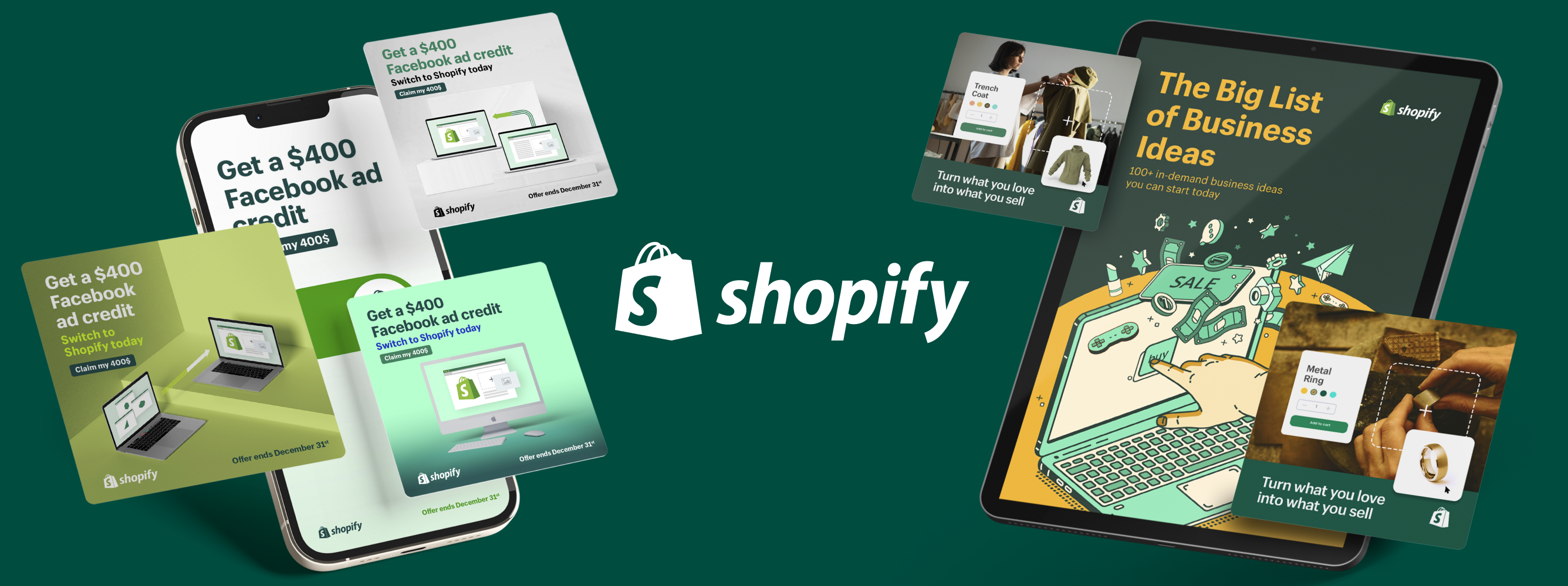
Why You Haven’t Experimented With Illustration in Your Marketing and How to Get Started


A picture is worth a thousand words—if done right.
Illustrations articulate the gaps that copy reveals, they liven up a bland landing page and stop scrollers in their tracks.
A sort of marketing sleight of hand, illustration’s one-two punch makes marketing and advertising efforts more effective, allowing marketers to express, emphasize, and influence in one fell swoop.
But many brands are hesitant to experiment with illustrations.
Let’s get into the power of quality illustration, and how to navigate the objections marketing teams face when weighing its pros and cons.
Get drawn into the content
Illustrations are a risk to my brand
I don’t speak Adobe. How am I supposed to write an illustration design brief?
Illustrations cost too much money (and time)
- Illustrations offer the perks of influencer marketing without the cost
- So, experiment through the “spectrum” of illustration
Illustrations are a Risk to my Brand.
Yeah, you might be right. Sometimes an illustrative style doesn’t align with a brand’s image. It wouldn't make sense for a funeral home to have a fun ad with weird characters alongside their list of casket offerings.
That said, illustration can help you evolve your brand and break away from stereotypes with new ways of seeing things not possible when using humans or photography. This differentiator helps your brand stand out in your market.
Check out how Security Risk Advisors (SRA), a cyber security company, was able to develop their sub-brand, VECTR™, using illustrative elements:
"We were incredibly happy with what Superside came up with for our sub-brand, VECTR™. We went for this Asteroids-esque retro videogame look that really catches your eye and allows us to stand out in our industry.
The hacker in the hoody look is so ubiquitous in the cyber security space, and to be able to get away from that cliche and still come up with a fun ‘good guys vs. bad guys’ concept was refreshing." -Douglas Webster, Marketing Manager at Security Risk Advisors
You don’t need a whole brand refresh, either.
Smaller internal projects, like company culture initiatives, can be a great place to start when dipping your toes into illustration—especially if you're being held back by strict brand guidelines.
Here are some internal project ideas that give you an opportunity to be more creative with the assets you produce:
- Brand emojis for your Slack channels
- Characters for your employees to use on LinkedIn
- A comic strip to showcase some of your persona’s pain points
- Or, how about a badge for employee merch that gets your brand out into the world?
SRA infused illustration into their company culture with badges for their VECTR™ brand. They feature a cheeky nod to “purple teaming,” a cyber security exercise their platform helps facilitate for free, alongside the VECTR™ branding.
Purple team badges designed with the VECTR™ branding SRA used Superside to create.
While these badges were initially a fun side idea for employee merch, they evolved into a simple yet effective community-building marketing tactic.
“We gave a bunch of these badges to a couple of instructors at SANS who lead courses about purple team tactics, in which they recommend using our free software, VECTR™. They give them away to students as a little badge of honor after they complete the course.” - Douglas Webster, Marketing Manager, Security Risk Advisors
These small projects can slowly and safely socialize the idea of illustration before experimenting with more external-facing projects.
Illustrations Allow You to Show, Not Just Tell.
Illustrations help you maximize your brand’s impact and become more empathetic to your audience. They create an immediate connection to your brand—allowing you to blend your messaging into a delicious visual smoothie your audience can chug.
It's a great way to make strong points without compromising clarity—if done well. It can be hard to make copy empathetic when you’re saddled with a character count and countless value props that are fighting to make the cut.
Security Risk Advisors used Superside to create a spectacular office mural chock full of story and character. The main objective of this project was to illustrate SRA's core values:
- It’s Personal. “Everything is about relationships. SRA treats teammates as human with great benefits and transparent leadership.”
- Level Up. “We want each teammate to grow in professional and personal ways every day.”
- Punch Above Your Weight. “When you are growing every day within relationships of trust and support you are able to punch above your weight. This looks like taking risks and stretch projects.”
But it also includes over a dozen easter eggs for employees to spot, showcasing their unique culture in a playful way, bringing a sense of unity and pride into their workspace. (Can you spot the Mario Cart reference?)
It tells our story and is meaningful to the people who built SRA.
Illustrations Can Help Your Brand Evolve from Stagnation
You might be taking more of a risk if you don’t experiment with your brand.
Successful brands experiment—they evolve. Explore the potential of your brand by pushing its limits to help prevent brand stagnation and encourage your brand’s evolution.
Let’s take Oyster, a global employment platform, for example.
Oyster’s e-book, The Employee Expectations Report 2022, exemplifies this approach to branding. Their brand guidelines are tight but flexible enough to empower their design team to explore interesting possibilities. They made a deliberate choice to illustrate their eBook in a distinct style—one that doesn’t exactly match their core branding.
Oyster used Superside to create the illustrations for The Employee Expectations Report as well as the social ads to promote it.
Check out the differences between Oyster’s core brand illustration style (left) versus the style for their Employee Expectations e-book (right)
By using a similar color palette Oyster ensures the style of their internal eBook still ties into Oyster’s strong and vibrant brand identity, while distinctly different from the more sketchy, human-centric style you see on their homepage.
It allows us to breathe more life into the brand identity and push the brand in a meaningful way.
In the world of human resources, an eye-catching brand stands out and grabs attention.
I Don’t Speak Adobe, How am I Expected to Write an Illustration Design Brief?
We get it. It’s hard to put together a good design brief, let alone invest the time to choose the perfect illustrator, both of which are key when chasing down good illustrations.
And yes, even when you nail your brief and find your perfect illustrator, to get the most out of it, your illustration must be workshopped.
And that takes time.
But, creating a good brief is still simpler than you think—if you set the right expectations.
Remember Oyster’s amazing e-book? The brief might look simple, but to get this right, Justin Rands, Director of Brand at Oyster, and his dedicated Superside CPM (Creative Project Manager), Lourdes, sat down for half an hour to work through the style expectations of the eBook before getting to work.
What's the most important element of an illustration design brief?
References. References. References. Every creative I spoke with for this article said the same thing: attaching references to your brief ensures your creative is on the same wavelength when it comes to your desired style. This is especially important when you’re struggling to describe the style you want to achieve.
This minimizes revisions and even gives your creatives more space to be, well… creative, because they can spend more time expanding your ideas’ potential rather than just hitting your expectations.
Just take a look at the mood board Oyster put together for their eBook and how it inspired the final product:
Here are Superside Design Director, Jon Saude's, four steps to putting together a great design brief:
- If your brand already uses illustration and has a defined style, send over your illustration guidelines. If it doesn’t, try to narrow down the illustration style you want to use
- Send over some references/mood boards
- Try to articulate the feeling you want the viewer to feel when they look at your illustration alongside the business objective of the illustration. The two might be similar, but you might use different words to describe each perspective.
- Consider whether you want to include human figures. People connect to people, so it can make your illustrations more powerful, but only if their inclusion makes sense.
Illustrations Emphasize the Details and Simplify the Complex
As a marketer, you know the details that differentiate your product and resonate with your audience.
illustration helps you express these details in fresh new ways:
- It helps pain-aware prospects visualize the problem they’re facing, making the ad resonate deeper than a block wall of text and an uninspired stock image.
- It can be as distinct as your unique selling point.
- It gives you the ability to manipulate every detail of your message, no matter how small or complex.
This is what makes it a great medium to experiment with more targeted marketing tactics.
Consider integrating some illustration into your next A/B ad test—an accessible way to discover the gains a simple illustration can offer your campaigns.
The ability to play with scale, visualize abstract concepts, and intentionally highlight or deemphasize every single detail makes illustration incredibly powerful.
The yellow header (above) communicates collaboration, ideas, dialogue, and teamwork. By tweaking the color palette (below), Adriana Amaya, a Superside Creative Team Lead, is able to communicate all of those ideas but also bring diversity to the foreground. By simply playing with purple hues, the diversity of the characters pops.
Jon Saude, also recommends starting with a limited color palette when illustrating a complex idea:
Colors themselves have meaning and connotations, they contribute to the story you’re trying to tell. These idioms were complicated concepts to illustrate, so we opted for a limited color palette to create balance in the illustration while grabbing the attention of the viewer.
Illustrating with a limited color palette forces you to break your message down to its essential parts, reassembling them in a different configuration making your best assets pop in ways you hadn’t thought of before.
Here’s another great example of how illustration can magnify important details where photography may fall short.
Above is a still from a L’Oréal ad that uses illustration to showcase differences between hair textures in a simple, but effective, way.
By using a minimalist/modernist illustration style, Superside Illustrator, Lais Alves, was able to place the focus on the figures’ hair. By illustrating something as minuscule as single strands of hair, from straight to tight coils, she is able to underscore how L'Oréal's products cater to a wide range of hair types in a polished, yet subtle way.
I'm fascinated by the intersection between design and play, on how to convey complex ideas with powerful deceptively simple solutions that also makes people smile.
This is also what makes illustration so powerful when communicating a long, complicated process. Whether you're reinventing one or introducing the latest disruptive innovation, visually representing the steps of a complex idea makes it more digestible and sticky.
Take, for example, Superside’s approach to DesignOps for an illustration project:
Stages of an illustration design project with Superside
Taking an illustration request from brief to close can take hours of revision among multiple stakeholders. As Illustrated above, you can clearly see the logical process and efficiency each stage creates.
Imagine trying to explain this process in a long slack message versus sending over this image (and using a designOps platform like Superside makes it even easier).
Illustrations Cost Lots of Time and Money
You’re right. Creating purposeful illustrations requires time to get right. Because you can manipulate every detail, it’s easy to get lost in revisions, in the attempt to get it just right.
From brief to final version, Oyster's Employee Expectations eBook visuals took 3 weeks to produce—this included:
- The gorgeous eBook cover
- 8 spot illustrations
- A handful of icon-sized illustrations
- Social ads for the eBook
- Oyster's eBook's landing page design
But as we established before, that level of control can be an advantage, especially if it levels up the quality of leads you convert.
For Oyster®, investing in illustration made their insightful data all the more accessible, appealing, and engaging.
Illustrations Offer the Perks of Influencer Marketing Without the Cost of Actual Influencers
The success of influencer marketing can’t be overlooked. It highlights that people are drawn to other people, and when your customers are people… well it’s a fact you need to seriously consider when putting together your go-to-market strategy.
In some cases, illustrations can be the more cost-effective way of getting the message across to your audience.
In an increasingly remote world, including humans in your marketing becomes a nightmare: coordinating producers, talent, and crew. Illustration gives you access to the many advantages of using people in your marketing, and at a much lower cost.
Take a look at Oyster's site where they infuse their diversity across their pages through illustrations like these ones:
The world is made up of many types of beautiful people in all shapes, sizes, and situations. Since our team, as well as our customers, are distributed all over the globe, we want to make sure we're reflecting this by representing everyone and being as inclusive as possible.
For another example of this, check out how Signa, a digital platform for patients with chronic health problems, was able to prioritize representation and diversity in something as simple as their pre-set avatars.
The wonderful thing about illustration is that your audience can see themselves in it.
Spot illustrations are a great way to start small with illustrations. Whether it’s icons or blog art, it gives your copy or product character (pun very much intended) and livens up the user interface (UI).
Signa worked with Superside illustrator, Lais Alves, to create inclusive profile avatars for users on their platform.
So, Experiment Through the “Spectrum” of Illustration
While Illustrations offer creative potential, investing in them can be intimidating. To wrap all of this up, let’s go through some examples of illustrations that might spark some ideas on how to integrate them into your marketing.
Shmoon, Superside’s unofficial mascot, can be seen in a lot of public-facing assets but also features prominently in internal channels. It’s a fun little character that contributes to the richness of company culture and is simple enough to be repurposed into a set of company emojis.
Shmoon, however, is a great example of how a simple illustration can add meaning, versatility, and fun to a brand—turning an “expense” into an “investment.”
Shmoon is a testament to the power of even the smallest of illustrations. Other small efforts have seen tremendous impact. Superside’s own Astrodog came to life as a spot illustration in a digital ad that performed extremely well:
The pupper is now a core character in Superside’s designverse, with a spot on our homepage!
Illustrations can be a way to level up your performance marketing tactics from copy A/B tests to testing more subconscious design considerations and maximizing the conversion potential.
With growing confidence in the creative process of illustration projects, you’ll develop foundational elements that make future illustration work more streamlined, and less time-consuming.
Whether it’s a color palette, layouts for common assets, or a little character like Astrodog or shmoon, developing a brand’s illustration style is an iterative process—therein lies their true magic.
Start small, if need be, and the opportunities to showcase illustrations in larger projects will naturally reveal themselves. Once you back it up with positive performance data, you can move on to pitch bigger illustration ideas.
Mural used Superside to create an illustration style of their brand’s community. See more great brand community examples.
And perhaps you’ll find yourself pitching a whole re-brand that places illustration on the main stage as Superside did.
Are Your Creative Juices Flowing?
Superside is ready to kick start your first illustration project, and take your marketing, company culture collateral, and social media ads up a notch. Book a call to discover the opportunities a full-scale design team acting as an extension to your own can bring.
Laurella is a Product Marketing Specialist at Superside. With a background in B2B SaaS and a penchant for mind maps, she’s written content tackling everything from gender-biased design to partnership strategy. At Superside, she helps unearth nuggets of customer insights and makes them shine in case studies and articles. As a pandemic graduate, she finds the idea of watercooler-slack-channels scary but is always eager to send you a well-crafted meme. Connect with her on Linkedin.
You may also like these

The creative power of data: How to go beyond numbers
Over the last ten years, access to marketing data has gone from a slow drip to a virtual tsunami of performance data, social media metrics and marketing analytics. Creative teams are swimming in data—unfortunately, without lifeguards.We've talked to over 200 creative leaders who, like you, wish data came with a mute button. In our Overcommitted Report, 76% of leaders said they feel burned out, and 78% say the demands on their teams are exceeding their capacity.The solution? Using data to improve workflows and inspire your team.The problem? Knowing how to cut through the noise (and the data points) to focus on what matters.Simply put, it's not how much data you have but what you do with it. We were lucky to have two creative leaders, Malik Sulieman, Creative Director at Cash App, and Ryan Hammill, Creative Director at ServiceNow, join us on our Overcommitted Virtual Summit to share how they pair data and creative insights to reduce burnout and help their teams create fantastic work.
Enterprise Graphic Design RFP Best Practices (Checklist Included)
For enterprise and mid-market businesses looking to enhance their creative capabilities and scale overall capacity, issuing graphic design RFPs are an essential part of the formalized procurement process for agencies, contractors and other external partners.RFPs create a structured, transparent framework for assessing and comparing service proposals from different outsourced creative partners.As an internal stakeholder, your opening role is to lay out your creative needs and timelines, communicating efficiently to prospective partners exactly what you’re looking for in a business relationship.In turn, these prospective creative service partners are asked to put their best feet forward demonstrating why their capabilities, capacity, skills, tools and scale are the best fit.On average, respondents spend around 30 hours of writing time developing their proposals. While it varies, you can expect to put just as much time into writing your RFP, evaluating the responses, communicating with procurement and selecting the winner of your work and budget.
13 best marketing design services for enterprises in 2025
Marketing at the enterprise level isn’t simple—especially when brand consistency and global reach are at stake. Large-scale enterprises must be able to tap into streamlined marketing design services to ensure consistent brand messaging across all platforms.Fast-growing brands also need to deliver digital marketing campaigns that work globally and feel relevant locally. This level of adaptability demands a nuanced understanding of cultural differences and consumer behavior, which many traditional agencies struggle to deliver today.Partnering with a team of the world’s creative leaders undoubtedly guarantees the best results. This article shows you key considerations for selecting a first-rate marketing design partner and lists the world’s top marketing design services companies to help you find the best fit. Let's go!Key considerations for selecting a marketing design partnerChoosing a design partner is a big decision that will have lasting impact on your marketing success. Use this checklist to help you evaluate potential partners:
