12 successful Instagram ad examples to inspire your 2025

Want to create scroll-stopping Instagram ads? Check out standout examples from industry leaders and tailor your strategy to your unique audience. We've rounded up top-industry ads to inspire your next campaign. Dive in and take notes!
Running Instagram ads is a great way to amplify your message and deliver it to the people who will get the most value from what you offer. However, getting your ideal customer to stop scrolling and look at your ad is no easy feat.
If you’re looking to create captivating and click-worthy Instagram ads, the best place to start is to look at what other industry players are doing and take some notes. Your creative should always be specific to your business and audience, but taking inspiration from others who are nailing their Instagram ads is a great place to start.
To save you some time, we’ve compiled some of the best Instagram ads examples we could find and given you our two cents on what makes them stand out. Keep reading to get some ideas for your next social campaign!
What types of Instagram ads you can run?
Before we dive into the Instagram ad examples, it’s key to know that based on the ad format, you can run different types of ads on Instagram, including:
- Images: May appear in square, landscape, or vertical formats in the feed.
- Videos: Appear in square or landscape formats (excluding Instagram Stories).
- Carousel: Appears in square or vertical format in both feed and Stories. This is the most common format for Collection, Explore and Shopping ads.
- Flexible: Ads can appear as images, videos or carousels based on the format likely to engage users.
Also, depending on the place you want the ad to run, you might have some ad placement-specific requirements:
- Instagram Stories: Full-screen vertical (9:16) assets are recommended, but feed-friendly dimensions are also supported (aspect ratios from 16:9 to 4:5).
- Instagram Reels: Only full-screen vertical (9:16) assets are supported.
On the Meta Ads Manager, you can preview Instagram ads to see how they’ll appear across different placements.
The formula for successful Instagram ads
All formulas always translate into hard work, but hard work performs better with practice, inspiration and baselines to do even more. Here are a few key tips you should keep in mind with Instagram ad design.
- Movement matters. If you’re designing creative for Instagram Stories, opt for video or some type of motion graphic to catch viewers’ attention. Animating the ad copy, making a GIF or filming a simple Boomerang are all simple yet effective ways to incorporate movement into your ads.
- Always be testing. For example, if you’re running ads on Instagram’s main feed, try testing out a single image placement against a carousel-style ad. Carousel ads are great if you have multiple products or services or want to tell more of a story through your ad creative.
- Take advantage of Instagram Shopping. This feature allows users to purchase products directly from the platform, perfect for product-based, B2C businesses. You’ll just need to set up a Business account and connect your product suite to Instagram.
- Match your ad style to the placement. Your ad should match the typical viewing experience of a particular channel. For example, vertical videos work great for mobile placements like Instagram stories, whereas a 1x1 ratio may work better for ads in the feed creative.
- When in doubt, think mobile-first. Research shows that mobile-shot Instagram Stories ads outperform more professional-looking ads. The most successful Instagram ads often look and feel very native to the platform. You can capture this aesthetic by adding Instagram stickers and fonts to your ad creative.
- Don't forget about your ad copy. As much as the design matters, if the copy you're using in the ad (or in the ad description) falls flat, then your ad is being set up for failure. You can follow these ad copy tips to ensure your message is displayed loud and clear.
All this being said, the one thing we have to stress is that a great ad campaign will always involve testing the creative. Although we mentioned that mobile-shot videos tend to work better on stories, it’s also possible that something more high-end with cool animations would suit your brand and audience better.
So, test, test and test some more—and document all of your data!
Instagram video ads examples
As you likely know, video is KING on social media. From organic to paid posts, video continues to prove itself as an effective medium for campaigns. Scroll on to check out some of the best Instagram video ads. We took a varied approach to show different styles of videos and why they work.
1. PicsArt x Superside
Key takeaways:
- Multiformat impact: The famous photo & video editing app for creators used Superside to help them create powerful, at-scale content assets for their Meta ads. These videos were used for both Facebook and Instagram in multiple formats that elevated their social media campaign outcomes.
- Shows PicsArt in context: These pieces had the goal of demonstrating how easy it is to produce, design and edit content with PicsArt. It also showcased all its professional benefits and features that make it one of the most-used editing apps in the industry.
- Easy to digest: All the content pieces were not only made for multiple formats within the same social channel, but they were seamlessly designed to show the value and quality of the app in a few seconds, which made people understand the product and convert.
2. Imperfect Foods x Superside
Key takeaways:
- User-generated content (UGC): UGC is key for every growing brand. By collaborating with their fans, Imperfect Foods created multi-touch attribution ads that converted thanks to their authenticity and high quality.
- Motion graphics: By using motion graphics and localized content, it allowed them to repurpose static ads with motion-based text overlays tailored for different states, creative performance in action.
- Value-focused copy: The copy clearly illustrates what they do and the value of their offer and ends with a simple call to action (CTA). It provides just enough info to guide a user to the next step in the customer journey.
Want to see more of our work with Instagram Ads and other paid channels? Learn how Superside helped multiple brands boost their ads with powerful designs that led to conversions and increased return on ad spend (ROAS).
3. Adobe Photoshop
Key takeaways:
- Shows product in action: The video ad is essentially a stylized screen share, allowing viewers to see how the product works.
- Use of music: The chill, lo-fi background music adds a hip flair that aligns well with Adobe’s creative-focused brand.
- Highlights one feature: Trying to convey everything Photoshop can do in one ad is nearly impossible, so Adobe keeps it simple by only focusing on one crucial element to drive ad viewers to sign up.
Instagram image ad examples
Let's take a look at some successful Instagram image ads. Imagery (whether custom shot, illustrated or otherwise) will always have a place in any digital marketing design strategy. Without relying on motion or multiple cards, there's something to be said about Instagram image ads that capture your attention and drive you toward action.
4. Elementor
Key takeaways:
- Bright, high-contrast colors: The navy and turquoise color scheme pops and stands out in Instagram’s main feed.
- Clear and concise copy: The straightforward ad copy helps viewers understand precisely what they’re going to see when they click the call to action.
- Bit of mystery: The ad is directing viewers to check out a ‘website transformations showcase but doesn’t include any examples, encouraging viewers to click through to the landing page to see what it’s all about.
5. Wix
Key takeaways:
- Complementary colors: The bold color combo of navy blue and tangerine orange is especially dynamic and pleasing to the eye.
- Informative visual: The abstract-style infographic conveys the topic of the ad cleanly and artfully.
6. FabFitFun
Key takeaways:
- Shows off the product: The ad creative includes a styled version of a FabFitFun box, packed with tons of great products, so viewers can get a sense of what they would get when they sign up.
- Attractive offer: Who doesn’t love a good deal? The ad lets users know that they can get a box valued at over $160 for free. While it may seem too good to be true, it’s certainly enticing enough for people to want to learn more.
- Timely campaign: By tying in Women’s History Month, FabFitFun shows its support for women-founded companies while also taking advantage of increased interest in women-focused offers.
Instagram carousel ad examples
Carousels are interactive, encouraging audiences to swipe with each frame, which can boost overall engagement, keep users on the ad longer and connect even more with your brand.
You can sequence images or videos to guide viewers through a narrative, making it easier to communicate complex ideas or build emotional connections.
Never tried before? See below why you should consider carousels in your next campaign.
7. Otta x Superside
Key takeaways:
- Tells a story: By combining different kinds of motion graphics, Otta partnered with Superside and leveraged over 10 carousels that catered perfectly to their growing markets and job categories, while also elevating their brand identity and awareness to new users.
- Use of color: Otta uses multiple colors to catch attention and communicate multiple messages to its target audience. The use of pastel, bright colors resonates with a brand that showcases opportunities for multiple candidates across industries.
- Clever copy: Otta and Superside implemented a tested, creative copy that resonated with its key audience and made them sign up for a possible life-changing opportunity.
Looking to scale your ad creative to the next level? Try Superside for your next marketing strategy with the help of world-class, multi-talented designers, backed up with AI-powered tools to boost creative production.
8. Moo
Key takeaways:
- Minimalist design: The carousel ad shows the notebook in four different colorways, allowing the product to speak for itself.
- Shows off the product: The close-up of the notebook highlights some of its key selling features (e.g., premium paper, hardcover) without needing a lot of copy or other design elements.
- Value-focused copy: Rather than driving users to action, the copy highlights the product’s more premium elements.
9. Clearbit
Key takeaways:
- Tells a story: Clearbit uses the carousel format to walk users through the ‘what,’ ‘how’ and why of their product. Clearbit uses the carousel format to walk users through the ‘what,’ ‘how’ and why of their product.
- Use of arrows: The cyan arrow encourages users to swipe through the ad and engage with the content.
- Clever copy: While the creative copy is very concise and to the point, they use the text that appears below the ad visual to add a bit more personality and highlight the value of downloading their guide.
Instagram story ad examples
Now onto one of the behemoths of Instagram ad formats. It's hard to believe that there was a time when Instagram Stories didn't exist.
First inspired by Snapchat, Stories has become an avenue for brands to really stand out and reach their target audience. From more organic-looking camera shot videos to custom flashy animations, brands are trying whatever they can to get noticed on IG Stories.
10. Pernod Ricard x Superside
Key takeaways:
- Animation: In a multiformat setting, Superside helped Pernod Ricard elevate their brand design using animated elements for its new awareness campaign, giveaways and engaging content. Ultimately, we planned and designed a new concept for the brand: Pernod Ricard’s Bar Card Personalities.
- Bring audiences together: These personalities, published in both stories and posts, led people to engage with the brand and fill out a quiz to know theirs, elevating engagement rates, followers and organic traffic in the process.
- Motion graphics: The stories use animated text and elements to make sure users are given the correct info at the right time and also guide them to the final CTA.
11. Felix Health
Key takeaways:
- Minimalist design: The plain white tube on the salmon-colored background is very aesthetically pleasing, and its simplicity helps it stand out from the crowd.
- Clever copy: The copy highlights the company’s value while also injecting a little humor that aligns with its youthful brand.
- Use of negative space: Unlike some of the other ads on this list, Felix Health’s ad doesn’t fill up space with a lot of text or graphics. It lets its bold visuals do the talking.
12. Community
Key takeaways:
- Shows off product: The ad uses phone screen mockups to give users a glimpse at the user interface.
- Use of statistics: The ad includes stats to show how its product compares to its competitors, highlighting its value.
- Motion graphics: The moving graphics and text help underscore the ad’s key message.
Power and scale ROAS with Superside creative
While each has its unique flair, the best Instagram ads share some common traits that you can quickly adapt to your next campaign. If you want to optimize your Facebook and Instagram ad creative, try going bold with your color palette or experimenting with motion or storytelling. And don’t forget to show off your product!
Otherwise, you can always get in touch with Superside and let us showcase how our advertising design services can assist your business.
Join the future of design today. Book a call.
FAQs
Emanuel is a Content Specialist at Superside. With the knowledge that three languages (and counting) and digital marketing can serve a creator, he has helped B2Bs from multiple industries to write, optimize and scale their content game with compelling pieces that answers questions and solve problems. On Superside, Emanuel streamlines content ideas into powerful articles that guides you on how to use Superside multi-powered services to scale your business to the max.
You may also like these
The budget-boosting playbook: 6 creative stunts that amplified Gong’s brand
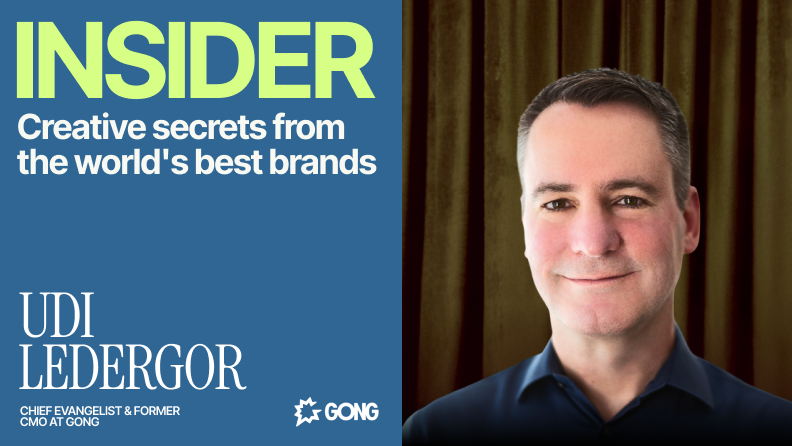
Every marketer wants to make an impact, especially when they’re working to launch a bold brand campaign.It’s a challenge that Udi Ledergor knows well. Ledergor is the Chief Evangelist and former Chief Marketing Officer at revenue intelligence leader Gong. During his time as CMO, Ledergor led the company from a new startup on the scene to becoming an industry leader.Taking a company from zero to millions of dollars in revenue is no easy feat. And even in large enterprises, where every marketing dollar is scrutinized, finding ways to maximize brand impact without overspending is more relevant than ever.So, how did he do it? Ledergor got creative by making bold bets to capture his audience’s attention while keeping Gong’s finance team in the black.Ledergor joined us in June for our INSIDER Virtual Summit, where he shared how marketers can use bold brand plays to create an outsized impact. From unexpected billboards to Super Bowl hacks, Ledergor reveals his playbook for making small bets feel like big brand moments.
10 best newsletter design services and platforms to use (2025)
Newsletters have evolved far beyond simple news updates. In 2025, they serve as strategic touchpoints in which enterprises share brand content, product news, thought leadership, customer stories and more.Open rates vary by industry, but numbers between 31% and 40% are standard, which makes newsletters one of the most effective ways to reach target customers. Yet, many teams struggle to achieve consistent newsletter success. This is no surprise when you consider that 61% of readers give your email eight seconds of their time. Another 23.5% will skim it for two to eight seconds. The rest? You’ve got under two seconds to pull them in. The subject line and visual design might be all they see.To be that one email your subscribers click on when they open their inboxes in the morning, you need more than a decent email template. You need thoughtful design concepts, brand consistency, excellent copy and good data that makes personalization easy.That’s where good support and outsourced email design come in. Keep reading to know the best design services and platforms for email newsletters in 2025.
12 top global ad creative agencies for enterprises in 2025
Demand for high-quality ad creative has never been higher. At the same time, new technologies and platforms create more avenues for scaling production and reaching new audiences.But this surge in opportunity brings the risk of burnout and unsustainable workloads for creative teams.Our recent “Overcommitted” report found that 76% of creative leaders or their teams have experienced burnout. Growing creative demand tends to outstrip enterprise teams’ capacity, and many teams lack the internal support to plug this gap.What’s more, traditional ad agencies often fail to meet enterprises’ high-volume creative needs, with only 13% of agency users reporting their partnership is truly effective.In 2025, AI-powered creative services—paired with strategic human oversight—offer a cost-effective solution for those in the know. Read on for a curated list of 2025’s top ad creative agencies and discover why Superside is a cut above the rest.

