


4 Landing Page Ideas to Drive More Conversions

Are you looking to grow your email list? Drive more sales? Get more attendees for your next event? A landing page can help you do all that and more—if you nail the design.
What exactly is a landing page, you ask? If you’re unfamiliar with the concept, a landing page is a webpage that a person “lands'' on after clicking on an ad, an email link or some other digital channel. The landing page should encourage users to take a particular action, such as subscribing to your email list, signing up for a free trial or purchasing a product.
Landing pages work by eliminating the paradox of choice, which is the idea that having too many options to choose from, rather than making us happier, can cause stress and lead people not to choose anything at all—also known as “analysis paralysis.” Compared to a website homepage which has many different next steps for users, a landing page should just have one single call-to-action. Keeping things simple and focused ensures that your viewers don’t get distracted from the choice you want them to make.
Now that you understand what a landing page is and how it works, we want to help you nail your design with our landing page design services. Keep reading for some design best practices and some landing page ideas to help inspire your next campaign.
Landing Page Design Tips
- Keep it simple and minimal. A good landing page doesn’t need a lot of bells and whistles. The best ones have very clean, simple layouts with plenty of white space to keep people focused on your offer and call-to-action.
- Use contrasting colors. Using contrasting colors for your backgrounds and buttons – like a dark navy paired with tangerine orange – will help your CTAs really pop, which will visually guide your user to take the desired action.
- Keep your most important info above the fold. If your users have to scroll too far to find the information they need, you’ll lose ‘em. Make sure to include a headline and a CTA right at the top of the page. You may also want to include a brief sentence or two of body copy if you feel the need to add more context or information.
- Add trust signals. Testimonials, reviews, usage statistics, and company logos act as stamps of approval which can help reassure visitors that your offer is as good as you say it is and encourage them to take the next step. Just make sure that these elements don’t distract from your offer. Some companies decide to put testimonials right at the top in the header, while others may include them below-the-fold as a means of social proof.
- Add video. Experts say that a direct face-to-face’ conversational format that directly addresses the viewer/prospect and focuses on the ‘big idea’ of the page works best. They also recommended adding some low-volume background that can help make the video more engaging (and mask audio inconsistencies) and captions so your page visitors can still watch with the sound off. For more on this, we love this article by Wistia that shares tips for how to use video on landing pages to maximize conversion (and delight).
Landing Page Ideas with Examples
It’s one thing to learn about what makes a great landing page – it’s another to see one in action. Lucky for you, we put together this quick list of landing page examples that you can use to help inspire your next project (or spruce up any existing landing pages!).
1. Thinkific: Straightforward Messaging and Clear CTA
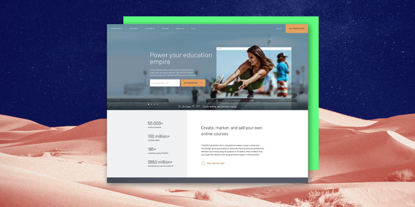
Why it works:
- Strong hero image: The visual of an athletic woman popping out of a web browser page in the website header is a great visual representation of how Thinkific helps creators turn their knowledge and experience into digital courses.
- Contrasting colors: The orange CTA button really pops against the blue background, drawing the users’ eye directly to the action Thinkific wants them to take (“Start a free trial”).
- Social proof: The landing page includes captivating statistics (“50,000+ course creators using Thinkific, $650 million+ earned on our platform”) to generate FOMO and underscore the offer’s value.
- Optimized above-the-fold section: The rest of the page includes more information about Thinkific’s subscription plan and how it works, but the above-the-fold contains the critical info user would want to see to make a decision: a strong headline, clear CTA, and social proof.
2. HoneyBook: Building Trust Through Social Proof
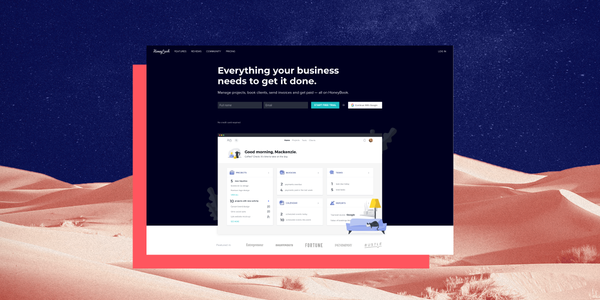
Why it works:
- Contrasting colors: The dark background with white text and teal CTA button makes the page easy to read and directs the page visitor to take the desired action of starting a free trial.
- Product screenshots: HoneyBook gives visitors a peek into the product’s user interface by including screenshots on the landing page, coupled with illustrations for added visual interest.
- Trust signals: The landing page includes customer logos (greyed out to fit with the visual language of the page) and customer testimonials to build trust.
- Video: HoneyBook includes video customer success stories that act as an additional trust signal and add a human element to the page.
3. Wistia: Colors and Visuals that Pop (& Video!)
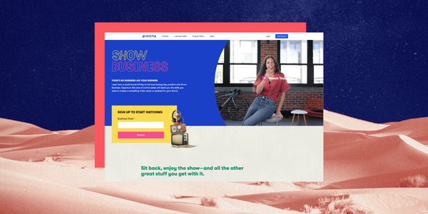
Why it works:
- Eye-catching colors: This ain’t your average landing page. The bold and vibrant colors and hero video immediately draw the viewer in.
- Clever copy: The conversational copy and show business references (“There’s no business like your business”) really highlight the brand’s friendly, down-to-earth personality.
- Video, video and more video: The landing page peppers high-quality trailers throughout the page, enticing users who need a little more info before they commit by giving them a taste of what they’re going to get when they sign up.
4. Notion: Using Illustration and Motion to Stand Out From the Crowd
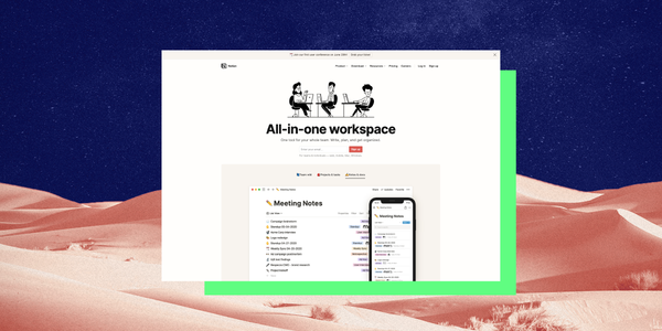
Why it works:
- Use of illustrations: Notion uses illustrations in the hero and throughout the landing page that add a touch of whimsy and visual interest.
- Motion graphics: Instead of using screenshots, Notion uses animations to give viewers a more engaging and true-to-life idea of what it’s like to use the platform.
- Social proof: The landing page features customer logos, testimonials, and tweets from real Notion users to add credibility.
Final Landing Page Design Advice
Landing pages can be a powerful tool to generate leads and drive sales, but the wrong design can seriously hurt your conversion rates. According to research from Adobe, 38% of users will stop engaging with a website if they find it unattractive. Remember: the best landing pages are simple, minimal, and focused. While you can (and should!) consider adding some video or graphics to make your page pop, a landing page isn’t the place to spend a ton of time educating your audience on who you are and what you do.
From the copy to the design to the CTAs, everything on your page should support one common goal: driving conversions.

You may also like these
Top 10 UI design services in 2025 to boost conversions & enhance UX
Over the last few years, customer experience (CX) has emerged as a key differentiator for brands seeking a competitive edge. Of course, the foundation of good CX is excellent user interface (UI) design and user experience (UX).Good UI design allows users to interact with a digital product easily and intuitively, minimizing friction and cognitive load. This leads to increased user satisfaction, engagement, and, ultimately, better business outcomes.Unsurprisingly, 94% of web users feel straightforward website navigation is essential, while 83% appreciate attractive, up-to-date websites.Get these design elements wrong, and suffer the consequences: 42% of web users will leave a website if the functionality is poor, while 38% will bounce because of unattractive content or design.In turn, good UI design can boost conversion rates by up to 200%, while good UI UX design can up these rates by up to 400%. Those are big numbers that equal big revenue.
5 New Web Design Trends for 2025 (Expert-Vetted)
As businesses prioritize a standout customer experience (CX) from the moment a lead lands on their website through their first purchase, top website performance is a priority for constant success and reduced churn rates.Just last year, the global web design market was valued at $56.8 billion. Top brands know the power of modern web design at each step of the customer journey... And they won't risk it.Did you know that 39% of website visitors lose interest when they step on slow-loading images? Enterprises lose $2.6 billion annually only on this bad practice.The latest web design trends for 2025 not only help your brand avoid bad web design practices, but they’re crucial to delivering amazing brand experiences that translate into positioning and higher returns on investment (ROI).Keeping pace with current web strategies helps companies attract users’ attention and makes their journeys smoother. Whether your company is launching a new website or needs a full redesign, Superside has the expertise to support you with a key website design that speaks for your brand and empowers customers to take the next step with you.
9 New Examples of Effective Website Homepage Design to Inspire
You can have the most beautiful website in the world, but if it doesn’t convert your leads into customers when you need it to, then there’s something lacking in your homepage design. After all, your homepage is likely one of your highest trafficked and converting pages.If you’ve been looking for inspiration on ways to bump up those website conversions by tweaking your homepage elements, then you’re in the right place.In this blog post, you’ll find the best home page design examples, made to convert prospective customers and make a great first impression. We’ve also outlined some quick homepage tips and tricks that you can take with you to start optimizing one of the most important pages of your website right away.The ROI of Homepage Design in 2025The ROI of a well-designed homepage goes beyond aesthetics—it directly impacts brand trust, user engagement and conversion rates. Your homepage serves as the digital front door to your business, often influencing a visitor’s decision to explore further or leave within seconds. A strategic homepage design combines intuitive navigation, optimized visuals and compelling calls-to-action to guide visitors seamlessly through their journey, resulting in measurable business outcomes.